
A redesign can start with a promising homepage mock-up and still become an expensive mess. The navigation changes after development has begun, the copy arrives late, a form fails on mobile, and someone discovers that the pages customers use were never included in the testing plan. By launch week, the team is debating colours while essential decisions remain unresolved.
A reliable web design process prevents that drift. It connects commercial goals, user research, content, accessibility, performance, development and conversion work from the first conversation to the weeks after launch. The strongest process isn't a sequence of hand-offs between isolated specialists. It's a controlled set of decisions, with clear evidence required before the project moves forward.
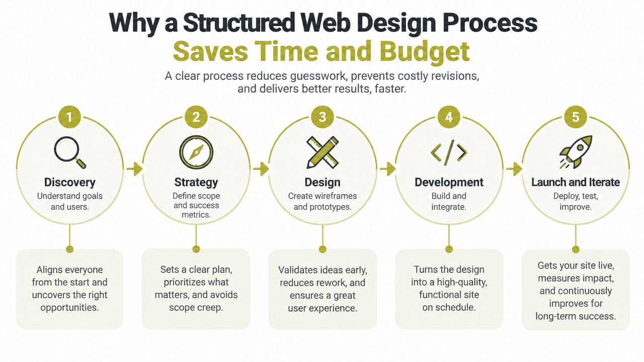
Why a Structured Web Design Process Saves Time and Budget
A founder usually doesn't waste budget because the team can't make an attractive page. Budget disappears when the team designs the wrong page, approves it too early, then rebuilds the structure once real content, technical constraints or user needs appear.
A structured process treats every stage as a risk check. Discovery tests the business assumptions. Strategy defines what the website must achieve. Wireframes expose weak journeys before visual polish makes them expensive to change. Development turns approved decisions into a working system, while testing checks whether the result works for real people rather than only looking correct in a presentation.
The cost of skipping decisions
A common SME redesign begins with a visual brief, a handful of competitor screenshots and a request to “make it feel more premium”. That sounds efficient, but it leaves questions unanswered:
- Audience: Who needs to act, and what doubts stop them?
- Content: Which pages support those decisions, and who owns the copy?
- Conversion: Is success a phone call, enquiry, booking, download or purchase?
- Access: Can people move through, read and submit forms using different abilities and devices?
- Performance: Which page elements are essential, and which are decorative weight?
When those questions surface during development, the project has already paid for decisions that may no longer stand. A good process brings them forward, when changing direction is still inexpensive.
Practical rule: Don't approve a visual direction until the team can explain the user journey, the content required and the action each important page should support.
This approach also creates better collaboration. Stakeholders review structure before decoration, writers receive a clear brief instead of a blank page, and developers understand the intended component behaviour before they build. For a useful independent overview of the sequence, Figr's guide to the steps in UX design provides a helpful reference point.
Carlos Alba Media approaches web work with newsroom discipline and performance focus. Its specialist nature comes from combining web design and development with digital content marketing, SEO, UX and brand strategy. Everyone who works for Carlos Alba Media is a former national news journalist or has agency experience of working with international brands. That background matters because strong websites need more than attractive layouts. They need clear information, persuasive content and decisions made under real commercial constraints.
The rest of the process should leave you with practical records, not just a collection of design files: a discovery summary, defined scope, page priorities, wireframes, component rules, content responsibilities, QA evidence and a post-launch improvement plan.
Discovery and UX Research That Defines Success
The first design deliverable shouldn't be a homepage. It should be a sharper understanding of the business, its audiences and the decisions the website needs to support.
Start with stakeholder interviews. Ask the owner what the business needs to change, then ask sales and customer-facing staff what prospects misunderstand, where enquiries stall and which questions appear repeatedly. Marketing teams often describe the desired brand impression, while sales teams reveal the information buyers need. Both perspectives belong in the brief.
What to investigate before drawing screens
Review existing analytics if they're available, but don't pretend weak data is precise. Look for patterns in landing pages, internal searches, exit points, device use and paths to enquiry. If the site has little traffic, use customer interviews, call notes, CRM records and support emails instead. A small amount of direct evidence is more useful than confident assumptions dressed up as research.
Audit competitor websites for structure rather than copying their appearance. Note how they explain the offer, prove credibility, handle objections, organise services and make contact possible. A competitor's layout may suit its sales model and not yours.
Map the main user journeys in plain language:
- A visitor arrives with a need or question.
- They look for evidence that the business understands it.
- They compare risk, value and credibility.
- They choose an action, or leave because the next step isn't clear.
Then identify variations. A local service buyer may need location and availability information, while an investor or procurement team may need governance, credentials and downloadable documentation. Accessibility belongs in this map too. Record how users will find headings, operate navigation, complete forms and understand errors.

A discovery checklist that limits scope creep
Capture the following before wireframing:
- Business objective: What commercial problem must the website address?
- Primary audiences: Which groups matter most, and what do they need to know?
- Priority journeys: Which routes lead to the most valuable actions?
- Content inventory: What exists, what needs rewriting and what must be created?
- Technical constraints: Which CMS, integrations, tracking tools or compliance requirements apply?
- Success measures: Which actions and quality signals will show progress?
- Ownership: Who approves content, design, legal wording and launch decisions?
- Exclusions: What won't be included in this project?
A concise scope can state: “For [audience], the website will help them [task] so the business can [outcome]. The initial release includes [templates and functions]. It excludes [items]. Success will be assessed through [agreed measures].”
That wording protects both sides. It gives the designer enough direction to make decisions and gives the client a basis for declining attractive distractions. More practical guidance on research-led interface decisions is available in Carlos Alba Media's user experience design best practices.
Wireframing Visual Design and Building Your Design System
Wireframes answer a simple question: can someone understand what to do on this page before the team spends time making it beautiful?
Begin with low-fidelity layouts. Place the heading, supporting explanation, proof, objections, action and related navigation in the order users need them. Keep the treatment plain enough that stakeholders comment on structure rather than debating a shade of green. If a service page doesn't make sense as a rough outline, visual design won't rescue it.
Design the system before the page set
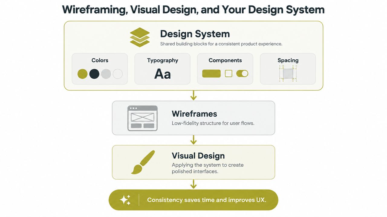
A component library should develop alongside the wireframes, not after every page has been individually styled. Define the rules that repeat across the site:
- Colour: Choose text, background, action and status colours with contrast in mind.
- Typography: Set heading hierarchy, body text, link treatment and readable line lengths.
- Components: Document buttons, cards, alerts, navigation, forms and content blocks.
- Spacing: Establish a consistent rhythm so pages don't become collections of arbitrary gaps.
- States: Show hover, focus, disabled, loading, validation and error behaviour.
- Responsive behaviour: Describe what changes at smaller widths, rather than shrinking everything.
Accessibility is a design decision at this stage. Define visible focus states, meaningful heading order, labels that remain associated with their inputs, and image alt-text responsibilities. Don't leave these to a developer working through a checklist at the end. UK monitoring found 29,787 accessibility issues across monitored public-sector sites and apps between January 2022 and September 2024, covering 1,203 websites and 21 mobile apps. The Government Digital Service monitoring report shows why documentation, testing and remediation need a place in the workflow.
Review decisions, not decoration
Run a wireframe review with the people who understand customers and operations. Ask them to complete realistic tasks, such as finding a service, comparing options, locating evidence or submitting an enquiry. Record disagreements as decisions to resolve, not as a growing list of subjective preferences.
Prototype interactions when behaviour affects understanding. Menus, filters, multi-step forms, pricing selectors and error messages deserve more than static screens. A clickable prototype can expose confusion before development turns it into code.
Visual design then applies the approved system to priority templates. It shouldn't introduce a new button style on every page. A clear introduction to the relationship between hosting, platform and design is available in UpTime Web Hosting's design guide, while Carlos Alba Media's best practices for web design offer a further UK-focused reference for structure and technical discipline.
Development Content and Integration Without the Handover Headaches
Development works best when it starts with a shared model, not a large design file thrown over a wall. The developer needs component rules, responsive behaviour, content requirements, interaction states and acceptance criteria. The content team needs page purpose, target audience, search intent and evidence to support each claim.
Build a staging version that resembles the eventual production environment. Developers can then implement templates, connect the CMS, configure forms and test integrations without exposing unfinished work to visitors. Use short review cycles, with each cycle focused on a defined group of components or templates rather than asking stakeholders to inspect everything at once.
Treat content as part of the build
Placeholder copy causes avoidable trouble. A short temporary heading can make a layout look balanced, while the explanation wraps onto several lines and pushes the call to action below the point where it works. Supply realistic copy and image dimensions early, even if the wording still needs editorial refinement.
An SEO-ready content handover should identify the purpose of each page, its primary topic, title and description requirements, internal links, heading structure, image descriptions and calls to action. Writers should use plain language and answer the questions that appeared during discovery. Search optimisation isn't a reason to produce awkward copy. It should make useful information easier to find and understand.
Media needs deliberate handling. Crop images for their intended contexts, use appropriate formats, provide meaningful alternatives and avoid loading decorative assets before the content users came to read. Developers should check whether third-party scripts, embedded media and tracking tools earn their performance cost.
Integrate compliance and measurement before release
A modern UK build may need analytics, structured data, HTTPS, a CMS workflow and UK GDPR cookie consent. These aren't launch decorations. They affect scripts, forms, content governance and user choice, so the team should test them in staging.
Use clear quality gates:
- Template gate: Each page type renders correctly with realistic content.
- Interaction gate: Forms, navigation, search, filters and third-party services behave as intended.
- Content gate: Approved copy, metadata, links and media are present.
- Tracking gate: Required events record correctly without undermining consent choices.
- Performance gate: Unnecessary scripts, oversized media and blocking resources are addressed.
- Approval gate: Named stakeholders sign off against agreed criteria, not personal preference.
Content migration deserves its own plan. List existing URLs, decide what stays, changes or retires, preserve valuable content where appropriate and prepare redirects for changed addresses. Check links and page status on staging. A rushed migration can erase useful search visibility and create support problems even when the new interface looks polished.
Testing for Accessibility Performance and Real User Experience
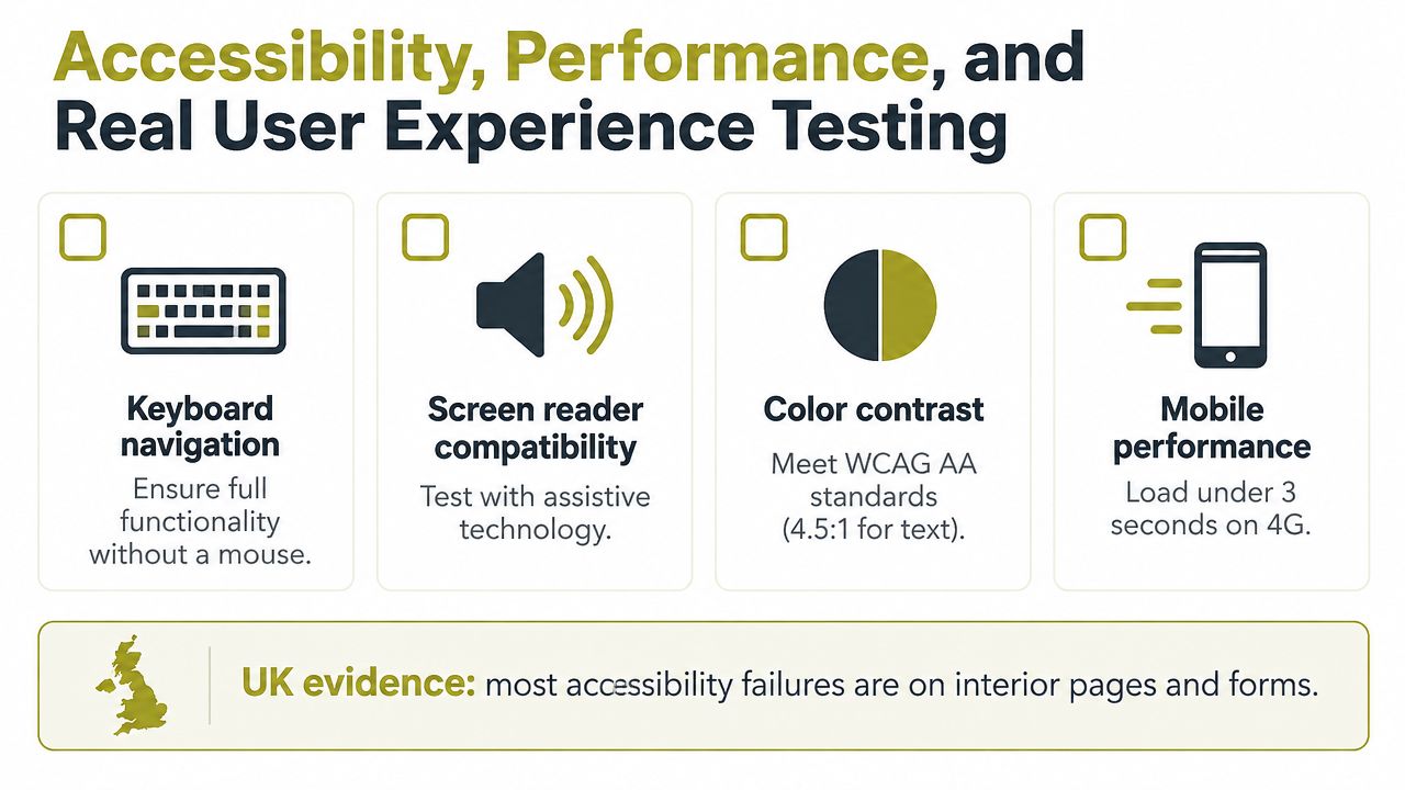
The homepage is often the most reviewed page and the least representative testing sample. Interior pages and forms contain the repeated patterns that create widespread problems: service templates, article layouts, contact fields, error messages, calls to action and navigation states.
UK evidence makes the risk difficult to dismiss. The Digital Services monitoring programme recorded 16,482 issues fixed as a direct result of monitoring, while 85% of monitored sites and apps had published an accessibility statement during the period from January 2022 to September 2024. The same report found that Scotland represented 12.2% of monitored locations, confirming that accessibility is a live concern across UK public-sector digital services, including Scottish services.
Further evidence points to persistent homepage failures. AudioEye reported that 94.8% of the top one million homepages had detectable WCAG failures in 2025, with an average of 51 errors per page in the same analysis, and its 2026 reporting identified low-contrast text on 83.9% of homepages, compared with 79.1% in 2025. These figures come from different monitoring contexts, so they shouldn't be treated as a universal score for every website. They do show why visual approval isn't equivalent to accessible delivery.
Test the patterns that repeat
Run an expert review early, then test key journeys with disabled users before launch. Automated tools can identify detectable issues, but they won't judge whether link text makes sense in context, whether an error is understandable or whether a journey feels confusing with a screen reader.
Check every important template for:
- Keyboard operation: Can users reach, operate and leave every control without a mouse?
- Focus visibility: Does the active element remain obvious as the user moves through the page?
- Structure: Do headings, landmarks and link names communicate the page's organisation?
- Forms: Does each input have a clear label, useful instructions and an intelligible error?
- Contrast: Can text, controls and focus indicators be distinguished in varied conditions?
- Images: Does each informative image have suitable alternative text, while decorative images stay out of the reading flow?
- Responsive behaviour: Does content remain usable when text enlarges or the viewport narrows?
- Performance: Do mobile users receive the essential content without unnecessary delay?
For broader context on speed, rendering and the relationship between technical quality and user experience, see Carlos Alba Media's guide to what is web performance.
The comparison below reflects the practical priority of testing repeated interior patterns rather than concentrating only on the homepage.
| Page Type | Typical Failure Density | Priority Fix |
|---|---|---|
| Homepage | High visibility, but only one instance of many patterns | Test navigation, hero content, contrast and primary action |
| Service or product page | Repeated content and conversion components | Test headings, proof, links, media and calls to action |
| Form page | High interaction risk | Test labels, keyboard flow, validation, errors and confirmation |
| Article or resource page | Repeated editorial structure | Test heading hierarchy, links, images and reading order |
| Account or booking journey | Complex states and task pressure | Test focus, status messages, errors and recovery paths |
Playwright or Cypress can support repeatable browser checks, axe can help identify common accessibility issues, and Lighthouse can highlight performance opportunities. None replaces manual testing, assistive-technology testing or observation of real users. A website passes its QA gate when the evidence covers the templates and journeys that matter, not when one homepage screenshot looks finished.
Launch Optimise and Keep Your Website Converting
Launch is a controlled release, not the moment the project stops. Before publishing, check the approved content, navigation, forms, consent behaviour, metadata, structured data, redirects, analytics, backups, security controls and monitoring. Test the main journeys on real desktop and mobile devices, then repeat the checks immediately after the domain points to the new site.
Performance needs a measurable target. One UK-focused source recommends aiming for a Largest Contentful Paint under 1.2 seconds, while also treating conversion rate as a key commercial measure, with a cited goal range of 3% to 5% depending on industry in its UK web design guidance. Those figures aren't guarantees. They're useful prompts to agree what “fast enough” and “working commercially” mean before launch.
Improve the page instead of restarting the project
Review analytics, form completions, search behaviour and session recordings after launch. Look for friction in the actual journey, not just traffic volume. A page with strong attention but weak action may need clearer proof, a shorter form, better prioritisation or a more visible next step.
A UK-focused conversion analysis cites an average website conversion rate of roughly 2% to 3%, with the top decile closer to 11%, and describes a disciplined optimisation loop based on analytics and session recordings, documented hypotheses, testing with at least 95% statistical confidence and a pre-set sample size, then iteration based on results. See the UK conversion rate analysis for the full method. For a smaller SME, the important principle is not to chase a benchmark blindly. It's to define one meaningful action, record the baseline and change one defensible thing at a time.
Don't plan a full redesign every time a page underperforms. Fix the component, copy, journey or form state responsible, then monitor the result. Specialist support earns its place when the team needs senior judgement across content, UX, development, accessibility and reputation rather than another isolated visual refresh.
Carlos Alba Media is a Scottish-led PR and digital marketing consultancy with teams in London and Glasgow. Its service mix includes newsroom-led media relations, web design and development, digital content marketing, social media, media training and crisis management for organisations across Scotland, the wider UK and internationally. That combination suits SMEs that need a website to carry a clear story, support conversion and withstand scrutiny after launch.
The practical web design process is therefore a loop: discover the problem, define the journey, design accessible components, build with realistic content, test interior templates and forms, launch carefully, then improve using evidence. Keep the records from each stage, and the next change becomes a decision rather than a guess.
If your website needs clearer structure, stronger content journeys and a build that prioritises accessibility, performance and conversion from the first wireframe, visit Carlos Alba Media to discuss web design and development support. The team works with start-ups, SMEs and established organisations across Scotland, the UK and international markets, combining former national newsroom journalism and international-brand agency experience with practical digital delivery.