

Your website's first job is no longer to look good, it's to work fast, read clearly, and remove friction before a visitor even thinks about leaving. That matters because 94.8% of the top 1 million homepages globally still fail accessibility checks according to WebAIM's February 2025 findings, and in the UK the legal and usability bar has been set much higher than most businesses realise, especially for public-facing organisations that need to meet WCAG standards and serve real users without barriers (Figma resource on web design statistics). For SMEs, that gap is a commercial opportunity as much as a compliance issue. A site that is easier to use on mobile, easier to scan, and easier to trust usually performs better across search, enquiries, and repeat visits.
At Carlos Alba Media, that perspective comes naturally. The agency is specialist by design, and everyone who works there is either a former national news journalist or brings agency experience with international brands. That mix changes how web design gets judged. Instead of asking whether a page is merely attractive, the standard becomes whether it supports reputation, visibility, and measurable growth.
1. Mobile-First Responsive Design
A desktop-perfect layout can still fail the first real test. If a homepage becomes hard to scan on a phone, the visitor sees friction before they see the offer, and that usually shows up in weaker enquiries, shorter sessions, and missed media opportunities. Mobile-first responsive design sets the right order of priorities by making the smallest screen do the hardest work first, then expanding the layout for larger devices.
For UK audiences, that approach matters because mobile use has been dominant for years, and Figma's guidance on web design fundamentals makes the same point from a design standpoint. A newsroom page for the BBC, a destination page for VisitScotland, or a property listing for Scotia Homes all need the same discipline. The content must stay readable, the tap targets must stay usable, and the page must still feel credible on a small screen.
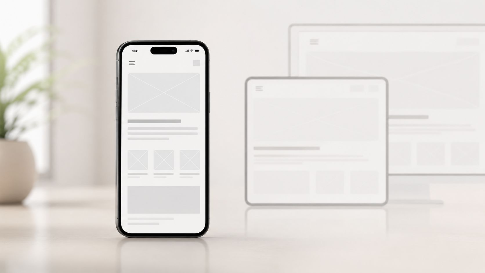
Practical rule: If a button is awkward to tap with one thumb, it is not ready for mobile users.
The agency rule is simple. Build with responsive grids, keep controls large enough for touch, and make sure images adapt without slowing the page down on weaker connections. The page should also support the main business action without forcing users to hunt for it. For teams using Divi, the practical guidance in 9 tips for responsive Divi is a useful reference point.
A good mobile build also respects the basics behind the interface, including viewport settings and content hierarchy. That means the first screen should show the core task clearly, whether the goal is a booking, a call, or an enquiry. For a closer look at how responsive design should support performance and usability together, see our guide to web performance basics for business sites. Real-device testing matters here, because touch response, scrolling, and rendering issues often appear only when someone uses the site in the wild.
2. Fast Page Load Performance
Speed is one of the few design decisions that directly affects user patience, search visibility, and conversion at the same time. Industry research shows that users form an opinion about a website in about 5 seconds, 39% stop engaging when images load too slowly, and websites loading in 1 second can triple conversion rates compared with slower competitors (DesignRush web design statistics). That's not a vanity metric. It's the difference between a lead and a lost visit.
For Carlos Alba Media clients, speed is never just a technical issue. A luxury retail site like Hamilton & Inches, or a content-heavy newsroom-style property, has to balance visual quality with performance discipline. Heavy scripts, oversized hero media, and third-party clutter often do more harm than good.
What to remove before you optimise
- Large image files: Compress aggressively and use modern formats where possible.
- Excess scripts: Strip out unnecessary analytics tags, widgets, and trackers.
- Bloated templates: Simplify page sections that don't support a booking, purchase, or enquiry.
- Weak hosting: Upgrade infrastructure if your site is held back by the server rather than the design.
Google's Core Web Vitals guidance keeps the focus on real-user performance, not aesthetic preference, so the right approach is to preserve the page's purpose while cutting what slows it down (Tiller Digital best practices). For tactical benchmarking, use Carlos Alba Media's web performance guidance alongside PageSpeed Insights and field data. The best-performing pages usually feel calm, not busy, because the user can get to the point without waiting for the page to catch up.
3. Clear Information Architecture and Intuitive Navigation
People don't browse websites to admire your menu structure. They browse to find something, compare it, and decide whether they trust you. That's why information architecture has to be built around how visitors think, not how an internal team organises departments or product categories.
The University of Houston's web best-practices guidance is blunt about the mechanics, important information should sit higher on the page, content should be broken up with headings so it's easy to scan, and concise H1, H2, and H3 headings should help users understand hierarchy (University of Houston web best practices). In practice, that means an SME site should guide visitors from problem to proof to action with as few decisions as possible. Apple does this through minimal navigation, while Wikipedia shows how a large catalogue can still feel navigable when structure is consistent.
For service businesses, the biggest mistake is overloading the top-level menu. Five to seven items is usually enough for the main navigation, with deeper layers handled through progressive disclosure or well-built mega-menus. A tourism site such as VisitScotland needs visitors to move from regions to attractions to booking paths quickly. A financial services site such as NatWest has to organise complexity around user goals, not product departments.
The best navigation feels invisible because it answers the question before the user has to ask it.
That's where newsroom discipline helps. Former journalists are trained to surface the lead, then support it with context, then remove anything that distracts from the point. On a website, that means clean labelling, consistent terminology, and a sitemap planned before the build starts.
4. Strategic Calls to Action and Conversion Optimisation
A website can look polished and still fail the business. If visitors reach a page and never get a clear next step, the design has done half the job and left the revenue case unfinished. Every layout decision, from button placement to form length, should support one conversion path the business wants.
Strong CTAs are usually plain language. “Get a quote”, “Book a consultation”, and “Start your project” work because they remove guesswork and tell the visitor exactly what happens next. That clarity matters on mobile, where attention is compressed and tap targets need to be obvious, not hidden behind clever copy or tiny controls.
For lead generation, the main action should appear above the fold and repeat where intent is strongest. In ecommerce, the ask belongs near product details and checkout moments. For service businesses, it works best beside proof, case studies, and testimonials, because users are more likely to act when the next step sits next to evidence.
Use Carlos Alba Media's landing page guidance to tighten the conversion path, then test wording and layout against the Keyword Kick conversion playbook. Slack and LinkedIn both place action prompts where intent is already warm, not after attention has cooled. SMEs should apply the same discipline, with fewer distractions and a clearer commercial goal.
5. High-Quality Visual Design and Brand Consistency
Strong visual design does more than make a site look polished. It tells visitors they are dealing with a brand that pays attention to detail, and that signal matters when a business wants to look credible, premium, or established enough to earn trust fast. For SMEs, visual consistency can shape how prospects judge everything else, from service quality to responsiveness.
A brand feels stronger when colour, typography, spacing, and imagery all follow the same rules across the site. Apple's minimalist language works because it stays recognisable page after page, while brands such as Hermès and Rolex use refined visual cues to reinforce premium positioning. VisitScotland takes a different route, using photography to sell place and atmosphere first, then letting the information support that feeling.
Where brands usually go wrong
- Too many colours: A loose palette makes the site look unfinished.
- Mixed type styles: Switching fonts or weights without a system weakens recognition.
- Poor imagery: Low-quality visuals pull the whole brand down.
- Inconsistent whitespace: Crowded pages feel cheaper and harder to read.
The practical test is simple. If a page looks elegant but the text is hard to read, the design is failing the business. Contrast and legibility still matter more than decorative flourishes, and the U.S. Web Design System design principles treat accessibility as part of design, not an afterthought. That is why polished sites should avoid text baked into images unless there is a clear, controlled reason to use it.
Good brand consistency also protects performance in subtle ways. Sales teams, press contacts, and first-time visitors all make quick judgments, and visual drift can make a company feel less organised than it really is. A disciplined design system gives your content, proof points, and calls to action a better frame, which helps the whole site do its job without noise. For teams trying to optimize sites built with AI, that consistency matters even more, because automated layouts often need tighter human control to avoid looking generic.
6. SEO Optimised Content and Technical Implementation
SEO sits at the point where design, editorial clarity, and search visibility all meet. A site can look polished and still underperform if search engines cannot read the structure or if the content is buried inside decorative layouts that make it hard to scan. For SMEs, that means missed enquiries, weaker brand visibility, and less value from every page already published.
The work starts with the fundamentals. Descriptive page titles, accurate meta descriptions, logical heading hierarchy, clean URLs, internal links with meaningful anchor text, and schema markup all help search engines understand a page's purpose. Those elements only deliver their full value when the design supports them, so text remains easy to scan and the page keeps a clear content order.
Use Carlos Alba Media's SEO audit checklist as the practical starting point, then judge each page by the business role it plays. A service page should guide visitors towards related evidence or support material. A blog post should reinforce a core offer rather than sit in isolation. A location page should move users from interest to enquiry without forcing them to hunt for the next step.
Good SEO design doesn't cram keywords into a page. It makes the page worth indexing.
The editorial discipline we use in a newsroom also helps here. Clear subheads, tight copy, and a sensible hierarchy give search engines a cleaner read while helping human visitors find the point faster. That balance matters because a page that matches search intent and still reads naturally is far more likely to support reputation, leads, and repeat visits.
Partnering technical SEO with content design also means checking how your build handles indexing and structure. Teams that want to optimize sites built with AI often need that extra layer of review, because automated layouts can look tidy while still hiding the signals search engines and users rely on.
7. Accessibility and Inclusive Design
Accessibility starts before launch, because inaccessible design cuts people off and creates avoidable business risk. In the UK, public-sector websites and apps have had to meet WCAG 2.1 AA since the 2018 accessibility regulations took effect on 23 September 2018, and government guidance now points public-sector websites towards WCAG 2.2 AA under the Public Sector Bodies accessibility framework.
That legal baseline matters because the audience is far larger than many teams assume. The DWP's Family Resources Survey estimated 16.1 million disabled people in the UK in 2022/23, so inclusive design affects a substantial customer base, not a narrow edge case. For charities, schools, councils, public bodies, and SMEs selling to broad markets, accessibility is part of market reach and brand reputation.
The practical work is clear. Semantic HTML should give the page a sensible structure, images need descriptive alt text, forms need labels that screen readers can interpret, and keyboard users must be able to move through the site without friction. Captions and transcripts widen access too, especially for people in noisy environments or for anyone who uses audio content in a different way.
Accessibility also affects conversion quality. A site that is easier to read, easier to operate, and easier to complete reduces drop-off for all users, including people with disabilities, older users, and anyone on a rushed visit. That is why accessibility belongs in the first wireframe, alongside content hierarchy and user journeys, rather than being added after complaints start to arrive.
8. Strategic Content Marketing Integration
A website without strong content is just a polished shell. It may look complete, but it will not give people enough reason to stay, return, or trust the business. Content marketing turns a site into a useful destination, not just a digital flyer.
The strongest sites connect design and content from the start. HubSpot, Buffer, and VisitScotland all show the value of building around useful information rather than limiting the site to a sales message. That approach works because people do not arrive with buying intent alone. They arrive with questions, comparisons, and uncertainty, and the site needs to answer those moments quickly.
For SMEs, the opportunity is practical. A service page can introduce the offer, a guide can explain the process, a case study can show proof, and a blog can capture search demand that the homepage will never reach on its own.
Content should also match the user's stage. Early visitors often need context, not a hard sell. Later visitors may want proof, reassurance, or a clear route to enquiry. If the site treats every page like a sales page, it creates friction instead of momentum.
Content that supports design usually has three clear jobs
- Explains the offer: It reduces confusion before the enquiry stage and helps visitors understand what the business does.
- Supports SEO: It gives search engines more relevant material to index, which improves the chances of being found for the right searches.
- Builds trust: It shows the business understands the problem in detail and has real experience worth paying attention to.
Carlos Alba Media's digital content marketing approach is built around that principle, because the structure of the site should support authority, not sit apart from it. For a PR and digital marketing agency run by former journalists, this matters even more. Good content does not just fill space. It gives journalists, prospects, and search engines clear evidence that the business knows its market and can explain it well. The practical win is straightforward. Clear content gives users a reason to stay, and a well-designed page gives that content the attention it deserves.
9. Data Security, Privacy Compliance, and User Trust
Trust collapses fast when a website feels unsafe. Users hand over contact details, payment information, and behavioural data with the expectation that the business will handle it properly. If the site looks careless about security or privacy, many visitors won't proceed.
HTTPS should be standard, not a premium extra. Privacy policies need to reflect actual data handling, not generic copy pasted from elsewhere, and consent tools have to work properly for non-essential cookies and tracking. For e-commerce, that's obvious. For service businesses, it still matters because enquiries often involve personal information, and one poor experience can damage reputation.
The wider point is that privacy and design are linked. Forms that ask for too much data create hesitation. Hidden consent prompts create confusion. Overly aggressive pop-ups make the site feel untrustworthy before the user even reads the offer.
Security also matters in reputational terms. The 2017 Equifax breach exposed 147 million people and led to major settlement and reputational damage, which is a strong reminder that digital failures become brand failures very quickly. The NHS ransomware attack in 2017 showed the same pattern in a public-service context, where technical weakness turned into operational disruption and public scrutiny.
A strong site feels controlled. It shows care in the details, from clear policy pages to secure forms and regular software updates. That reassurance isn't cosmetic. It's part of conversion.
10. Analytics Implementation and Data Driven Optimisation
Strong web design does not rely on guesswork. It is shaped by evidence, then refined as real users interact with it. Analytics separates pages that look effective from pages that support enquiries, sales, and brand credibility.
Google Analytics 4, heatmaps, funnel analysis, and event tracking reveal how people move through a site, where they hesitate, and where they exit. A homepage can feel polished in review meetings and still fail in practice if visitors ignore the main call to action or leave halfway through a form. That is the sort of finding that changes priorities for SMEs fast, because it points straight to wasted budget and missed conversions.
The best results come from focused testing, not broad experimentation. Measure one journey, adjust one element, and compare what happened. A revised heading can improve clarity. A shorter form can reduce abandonment. A different CTA position can lift response rates. The point is to make each change accountable.
A useful analytics setup starts with specific questions:
- Where do users drop off? That identifies the point where friction is hurting performance.
- Which pages convert best? That shows what content, layout, or offer deserves to be repeated.
- Which traffic sources perform well? That helps direct budget and effort toward channels that bring results.
- What do heatmaps reveal? That can expose buttons people miss, sections they ignore, or layouts that pull attention away from the main action.
For agencies like Carlos Alba Media, design work becomes measurable business strategy. The website stops being a static brochure and starts acting as part of the growth engine. Former journalists know the value of proof, because audience behaviour tells a clearer story than assumptions do, and that same discipline should guide web design decisions for SMEs.
Top 10 Web Design Best Practices Comparison
| Item | Implementation Complexity 🔄 | Resource Requirements ⚡ | Expected Outcomes 📊 | Ideal Use Cases 💡 | Key Advantages ⭐ |
|---|---|---|---|---|---|
| Mobile-First Responsive Design | Medium, planning + device testing | Moderate, front-end dev, device tests | Improved mobile UX, better mobile SEO | Mobile-first audiences, local SMEs | Single codebase, reduced maintenance |
| Fast Page Load Performance | High, performance engineering + monitoring | High, CDN, hosting, optimisation tools | Faster loads, higher conversions, lower bounce | E‑commerce, high-traffic or time-sensitive sites | Significant UX & SEO gains |
| Clear Information Architecture & Intuitive Navigation | Medium, user research + testing | Moderate, UX research, content strategy | Faster findability, lower support requests | Content-heavy sites, SaaS, complex products | Better engagement, easier scaling |
| Strategic CTAs & Conversion Optimisation | Medium, design + experimentation | Low–Medium, copywriters, A/B tools | Higher conversion rates, measurable lifts | Landing pages, lead-gen, ecommerce funnels | High ROI, quick measurable improvements |
| High-Quality Visual Design & Brand Consistency | Medium, design system creation | High, designers, photography, assets | Stronger trust, premium positioning | Luxury, tourism, brand-driven businesses | Differentiation, increased perceived value |
| SEO-Optimised Content & Technical Implementation | High, ongoing strategy + technical work | High, content creators, SEO specialists | Sustainable organic traffic, improved rankings | Start-ups seeking growth, content hubs | Long-term traffic, lower CAC over time |
| Accessibility & Inclusive Design | Medium–High, WCAG compliance & testing | Moderate, audits, captions, dev fixes | Legal compliance, broader audience reach | Regulated orgs, public sector, inclusive brands | Risk reduction, improved usability for all |
| Strategic Content Marketing Integration | Medium, editorial planning + production | High, writers, multimedia producers | Authority building, repeat traffic, backlinks | Thought leadership, PR-focused SMEs | Supports SEO & PR; nurtures leads |
| Data Security, Privacy Compliance & User Trust | High, security controls + legal processes | High, security tools, audits, legal support | Reduced breach risk, regulatory compliance | E‑commerce, regulated sectors, data-sensitive orgs | Reputation protection; legal risk mitigation |
| Analytics Implementation & Data‑Driven Optimisation | Medium, setup + analysis workflows | Moderate, analytics tools, analyst time | Actionable insights, continuous improvement | Growth-focused businesses, marketers | Measurable ROI; enables A/B testing and optimisation |
From Blueprint to Benchmark Your Next Steps
The strongest best practices for web design are not about chasing trends. They're about building a site that loads quickly, reads clearly, converts consistently, and supports your brand under real-world pressure. When those pieces work together, the website stops being a static brochure and starts behaving like a reliable commercial asset.
For SMEs, the order of work matters. Start with the fundamentals that affect every visitor, mobile responsiveness, load speed, information architecture, CTA clarity, and accessibility. Then tighten the layers that improve trust and growth, such as visual consistency, SEO, content depth, privacy, and analytics. If the site is already live, a disciplined audit will usually reveal a small number of fixes that deliver the biggest gains.
Carlos Alba Media approaches this through the same lens we bring to PR and digital campaigns, with newsroom precision, senior judgment, and a focus on outcomes that can be tracked. That means less guesswork, fewer decorative distractions, and more design choices tied to visibility, reputation, and conversion.
If your website looks decent but still underperforms, it's time to treat it like a growth channel, not a design project. Audit the friction, sharpen the messaging, and build a clearer path from visit to enquiry. The businesses that do that consistently are the ones that stay visible, trusted, and chosen.
If you want a website that performs like a real business asset, Carlos Alba Media can help you shape the design, content, and conversion path around measurable results. The team builds websites with the same senior editorial discipline and brand strategy that they bring to PR, content, and crisis communications, so your site works harder for enquiries, reputation, and growth.