Your Landing Page: First Impression or Final Nail?
You've invested in a promising ad campaign. Clicks are coming in, but conversions are flatlining. The culprit is often the one page you hoped would be your star closer: the landing page. For start-ups, SMEs, and founders, this isn't just a marketing problem. It's a resource drain that burns paid spend, wastes attention, and leaves good offers looking weaker than they are.
Most underperforming landing pages don't fail because the business lacks credibility. They fail because the page doesn't communicate that credibility fast enough. Visitors land, scan, hesitate, and leave. Sometimes the headline is vague. Sometimes the call to action asks for too much too soon. Sometimes the page looks polished on desktop but feels clumsy on mobile, where many buying journeys now begin.
At Carlos Alba Media, we approach this from two angles. Our team includes former national news journalists and agency practitioners who've worked with international brands, so we know how audiences judge trust in seconds. A landing page isn't just a conversion asset. It's a reputation asset. It tells visitors whether your business understands their problem, whether it feels credible, and whether it's worth engaging further.
That matters even more for founders and SMEs selling expertise, not just products. If someone is weighing a PR partner, a digital agency, a consultancy, or any higher-trust service, the page has to do more than collect clicks. It has to reduce doubt.
Here are 10 landing page best practices that consistently separate pages that look busy from pages that convert.
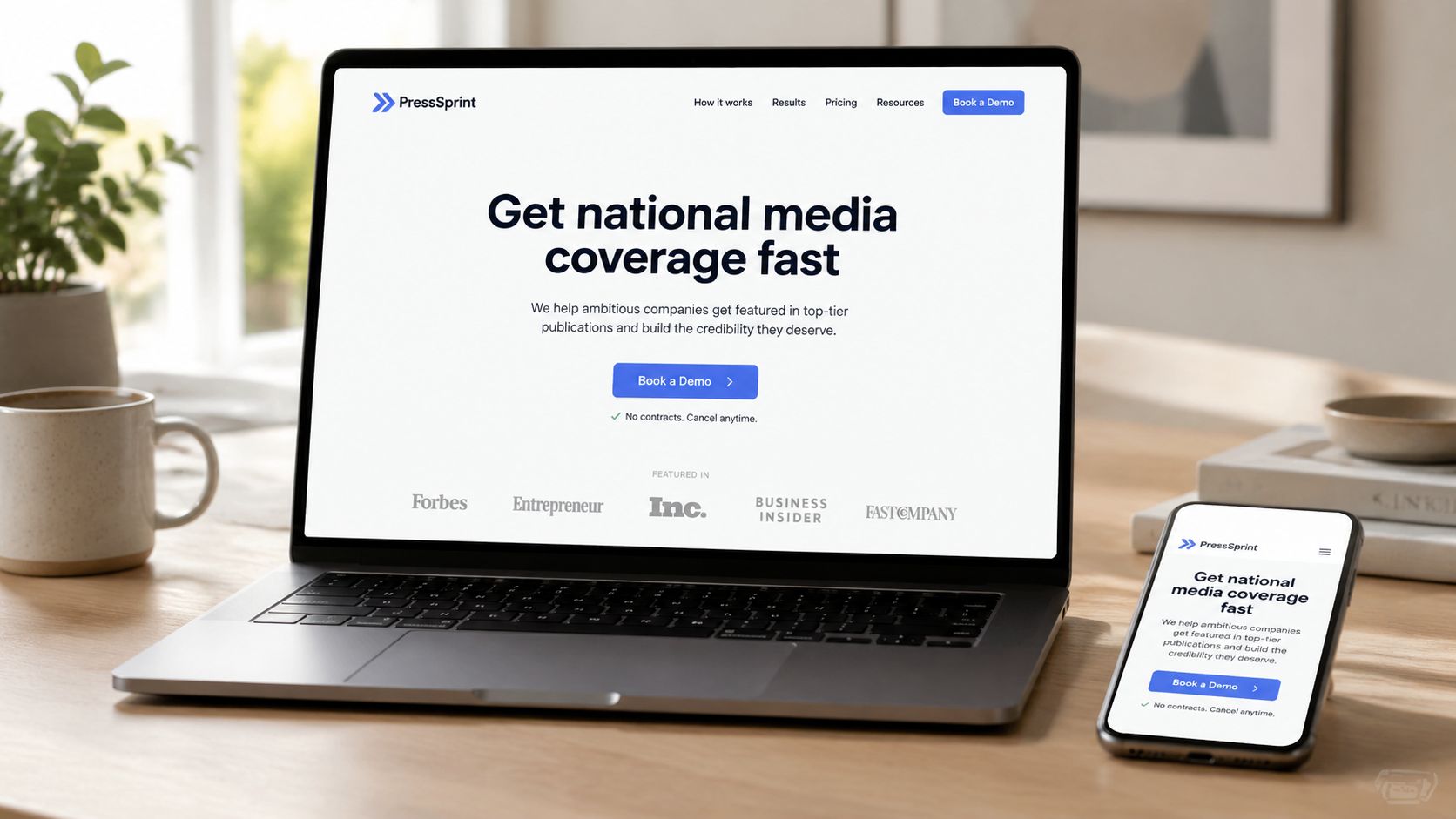
1. Clear Value Proposition Above the Fold
The first screen has one job. It must answer, quickly and plainly, why someone should care.
That sounds obvious, but plenty of landing pages still open with slogans that mean something internally and almost nothing to a new visitor. “Helping brands grow” is too broad. “Full-service marketing solutions” is even worse. A founder arriving from a Google search or paid ad wants an immediate sense of outcome, audience fit, and relevance.
A stronger opening behaves more like a sharp news standfirst than a brand manifesto. HubSpot's “The #1 platform for marketing, sales, and service”, Slack's “Where work happens”, and Mailchimp's “Turn clicks into customers” work because they compress the offer into a recognisable benefit. They don't force the visitor to decode the page.
What strong hero copy does
Your headline should lead with the result, not the service list. For a PR or growth-focused agency, “Get your brand in front of national media and decision-makers” is clearer than “Integrated communications and digital support”. The subheading can then add needed context such as sector focus, senior-level handling, or geographic relevance.
For SMEs, specificity matters even more because buyers are weighing risk. If you serve hospitality, regulated sectors, or Scottish tech firms, say so. Relevance is reassuring.
Practical rule: If a visitor can't explain your offer after a five-second scan of the hero section, the copy isn't finished.
At Carlos Alba Media, the newsroom instinct is useful here. Journalists learn to make the first line carry the story. Landing pages need the same discipline. Lead with the strongest truth. Leave cleverness for later.
A good test is to remove your logo and ask whether the hero copy would still make sense to a stranger. If it wouldn't, rewrite it until it does.
2. Single-Minded Call-to-Action with Minimal Friction
Too many landing pages ask visitors to make several decisions at once. Book a call. Download a guide. Watch a video. Explore services. Read the blog. Follow on LinkedIn. That isn't choice. It's drift.
A strong landing page picks one primary action and makes that action feel easy. Calendly does this well with “Schedule Your Demo”. Stripe's “Start Now” is direct. LinkedIn's “Try for Free” reduces commitment anxiety. The wording changes, but the principle doesn't. One page, one main ask.
Reduce the effort around the click
The CTA itself matters, but friction often sits in the form or process behind it. If your page asks for too much too soon, visitors hesitate. If the button says one thing and the next step feels heavier, trust drops.
The strongest pages align CTA language with intent:
- High urgency visitors: “Request a call back” or “Speak to our team today”
- Research-stage visitors: “See how it works” or “Get the overview”
- Service-led offers: “Book a consultation” often outperforms vague buttons like “Submit”
There's also a practical UX point. The button should appear within the first viewport and then return later on the page once proof and explanation have done their work. If you're improving the conversion path, this guide on website user experience is a useful companion.
A CTA doesn't need to sound aggressive. It needs to sound proportionate. If your audience is cautious, “Get a personalized recommendation” can be more effective than “Start now”.
For teams stuck on button wording, an online CTA generator can help spark options. Don't publish the first idea it gives you. Use it to generate angles, then rewrite for your audience, tone, and offer.
3. Social Proof and Credibility Elements
Visitors rarely take your word for your own credibility. They look for evidence around your words.
That's why testimonials, media mentions, recognisable client logos, awards, and trust markers matter so much on landing pages. They answer the unspoken question behind every click: why should I believe this business can deliver?
For higher-trust services, this isn't decorative. It's structural. The verified research behind UK landing page advice notes that trust concerns can suppress conversion, with a 2025 UK consumer study from the British Standards Institution finding that 42% of respondents had abandoned an online purchase because of trust concerns, as referenced in this Stensul summary of landing page best practices. That doesn't mean every page needs more clutter. It means reassurance has to be visible at the right moments.
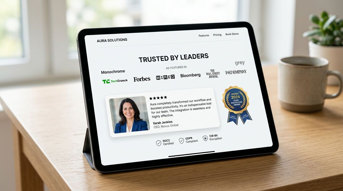
What proof should look like
Generic praise doesn't carry much weight. “Great service” is weak. A testimonial tied to a role, sector, or business problem is stronger because it feels situated in reality. The same applies to logos. A row of badges without explanation can look impressive, but a short line explaining why clients trust you often lands better.
Use proof that matches the visitor's concern:
- Capability proof: client logos, media placements, awards
- Risk reduction: confidentiality statements, regulated-sector experience, legal or compliance awareness
- Human credibility: founder background, senior team bios, named specialists
- Outcome reassurance: case studies, before-and-after problem framing, testimonial excerpts
Former journalists understand this instinctively. In news, unsupported claims don't survive scrutiny. On landing pages, unsupported claims don't survive buyer hesitation.
Place proof near points of doubt. That usually means below the hero, beside the form, and before a final CTA. Don't dump every badge you own into the footer and call it trust-building.
4. Benefit-Focused Copy Over Feature Lists
Feature lists are easy to write because they describe what you do. Benefit-led copy is harder because it forces you to explain why any of it matters.
That's exactly why benefit-led copy converts better in serious buying situations. Founders and decision-makers aren't buying “media outreach”, “technical SEO”, or “brand workshops” in isolation. They're buying clearer visibility, stronger reputation, easier stakeholder trust, and fewer wasted cycles.
Warby Parker's “Same quality, a fraction of the price” works because it translates product attributes into buyer value. Asana's “Move work forward” frames an outcome, not a toolset. The same discipline applies on service pages.
Translate service language into buyer language
A page for a PR consultancy shouldn't just say it offers media relations, messaging support, and campaign strategy. It should explain what changes for the client. Do they become more visible to investors? Better prepared for media scrutiny? More credible with customers and partners?
That's where storytelling earns its keep. Strong pages frame a problem, sharpen the cost of leaving it unresolved, and then present a credible path forward. If you want to strengthen that skill, Carlos Alba Media's guide to brand storytelling is directly relevant.
Good landing page copy sounds less like an inventory and more like a persuasive briefing.
A simple rewrite often fixes the issue:
- “We offer digital PR and SEO support” becomes “Build visibility that earns clicks and trust”
- “We provide media training” becomes “Prepare your spokesperson to handle interviews with confidence”
- “We design websites” becomes “Turn website traffic into enquiries with clearer structure and faster pages”
Benefits should still be credible. Don't promise outcomes you can't defend. But don't hide behind feature lists either. Buyers don't convert because they understood your service menu. They convert because the page made the next step feel worthwhile.
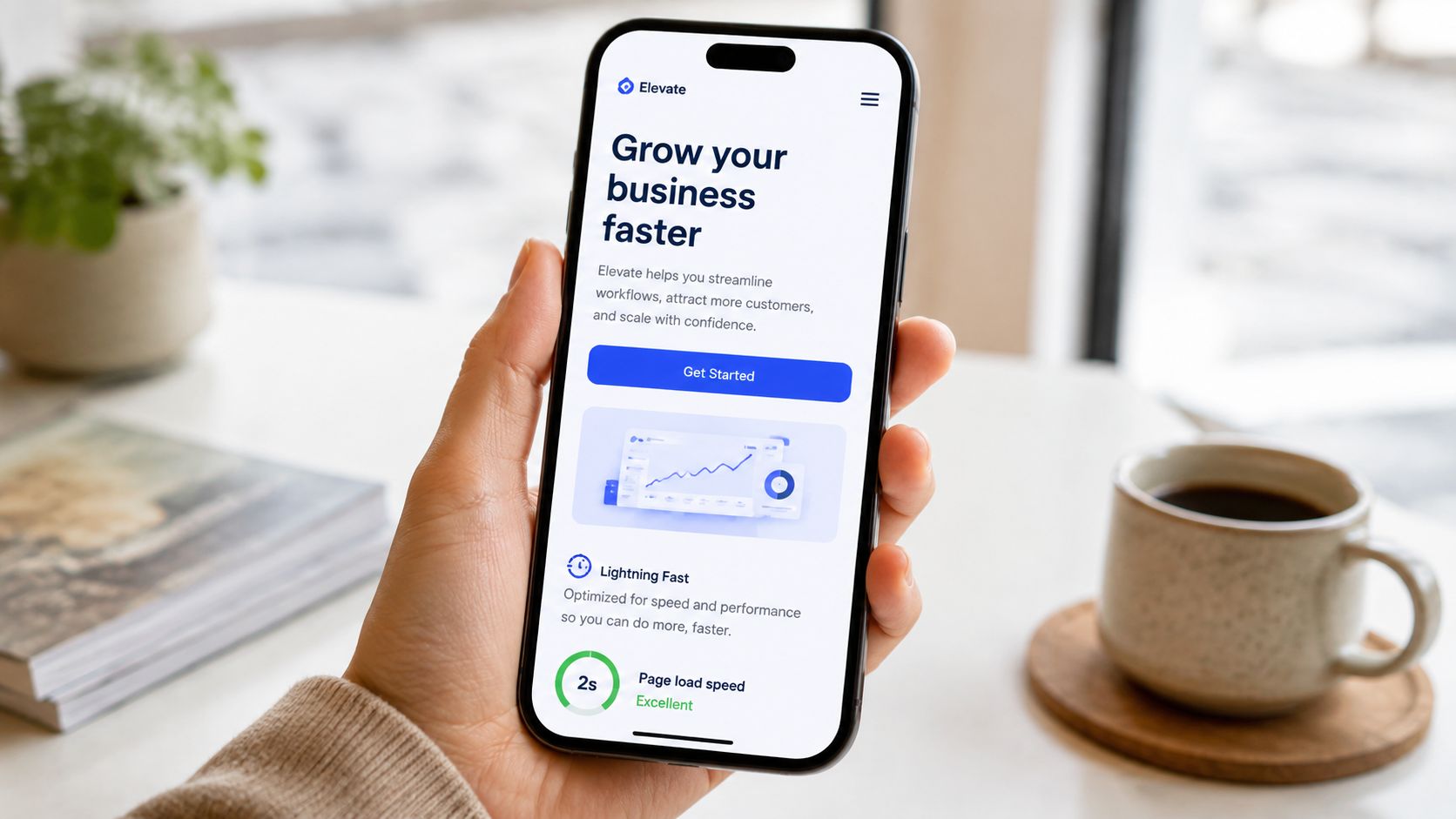
5. Mobile-First and Performance Optimisation
A landing page can have excellent copy and still lose because it feels slow, unstable, or awkward on a phone. That's common, especially when teams review pages on a large desktop screen and assume the experience carries over.
It usually doesn't. Mobile users have less patience and less room for error. According to the verified UK guidance provided, 70% of UK consumers will abandon a mobile landing page if it takes more than 3 seconds to load. That benchmark sits alongside Google's long-established recommendation that pages keep Cumulative Layout Shift under 0.1 for stability.
Performance is part of persuasion
If the page jumps while someone tries to tap a button, trust drops. If an oversized image delays the headline, the value proposition arrives late. If a pop-up covers the content before the visitor has even read the offer, the page feels self-defeating.
Google's practical thresholds for good user experience remain useful reference points here: LCP under 2.5 seconds, INP under 200 milliseconds, and CLS under 0.1, all captured in this landing page statistics reference from Involve.me. Those metrics aren't only for developers. They affect whether the page feels usable enough to convert.
The practical fixes are rarely glamorous:
- Compress images: oversized visuals often do more damage than teams realise
- Trim scripts: unnecessary third-party widgets slow interactions
- Design for thumbs: buttons need enough space and clear tap targets
- Stabilise the layout: reserve space for images, embeds, and banners before they load
If your page is being redesigned, this is where website design and development choices matter. A page that looks premium but performs poorly isn't premium. It's just expensive friction.
6. Strategic Use of Video and Rich Media
Video can help a landing page convert. It can also slow it down, distract from the CTA, and dilute the message if it's added because “video performs well” rather than because the page needs it.
The best use of video is targeted. A founder introduction can humanise a consultancy. A testimonial clip can make social proof feel more real. A short explainer can reduce confusion when the offer is new or nuanced. Grammarly, Loom, and HubSpot all use rich media to clarify products that might otherwise take too many words to explain.
A good rule is simple. If the video removes uncertainty faster than text alone, keep it. If it repeats what the page already says, cut it.
Here's an example of the sort of embedded media format many brands use when they want to add context without forcing a click away from the page.
Use media without harming the page
Google's landing page experience guidance has long been clear that auto-play videos with sound and intrusive elements hurt the user experience. That matters because rich media should support the conversion path, not interrupt it.
Keep videos short. Add captions because many users won't listen with sound. Host them through a platform built for delivery rather than loading large files directly from your server. Above all, place them where they answer a question. Don't let a video sit above the fold if it pushes the headline or CTA too far down the screen.
A video should explain, reassure, or demonstrate. It shouldn't compete with the page.
For service businesses, a sharp founder video can work especially well when trust is part of the sale. People often want to know who they'll be dealing with. A calm, well-framed clip can do that quickly, provided the page still loads cleanly and the CTA remains obvious.
7. Segmented Landing Pages and Personalisation
One generic landing page usually tries to serve too many audiences at once. Start-ups, established brands, crisis-response enquiries, and regulated-sector clients don't arrive with the same questions. If the page treats them as identical, relevance weakens.
Segmentation demonstrates its worth. Instead of one all-purpose page, build focused versions around intent, sector, or stage. Salesforce and HubSpot have done this for years with pages designed for different business types and use cases. The logic is straightforward. Relevance lowers friction.
Personalisation that actually helps
Personalisation doesn't have to mean complicated automation. Often it means disciplined page architecture.
Create separate pages when the audience differences are real:
- By business type: start-up, SME, enterprise
- By use case: launch support, reputation repair, lead generation, crisis communications
- By sector: hospitality, professional services, regulated industries, tech
- By traffic source: paid search, email campaign, local search, referral outreach
The value of that approach is rising as discovery becomes more fragmented. The verified brief also notes a gap in older guidance: many pages are still built around traditional ad-click journeys, while users increasingly arrive from AI summaries, rich results, or mixed-intent research sessions. The Accelity discussion of landing page shifts in AI-shaped search is useful background on that change.
On practical builds, this can be as simple as distinct slugs, source tracking via UTM parameters, and swapping proof blocks to match the audience. A founder searching for “PR for start-ups” should not land on a page written like a procurement portal for enterprise buyers.
When personalisation is relevant, it doesn't feel like marketing. It feels like competence.
8. Compelling Headline Testing and Copywriting Refinement
Landing page teams often redesign before they rewrite. That's backwards.
The headline is usually the most impactful piece of copy on the page because it controls whether visitors continue reading at all. Yet many teams settle for the first draft, usually a phrase that sounds polished in a meeting and vague in front of buyers.
Testing headline variations forces clarity. One version may stress speed. Another may stress certainty or sector fit. A third may anchor around a problem the visitor already feels. You won't know which one opens the strongest path until you test.
What to test first
Start with the highest-friction uncertainty on the page. Ask what a visitor needs to understand immediately. Then write versions that answer from different angles.
Useful directions include:
- Pain-led: “Struggling to turn ad clicks into enquiries?”
- Outcome-led: “Turn more visitors into qualified leads”
- Audience-led: “PR and digital growth support for ambitious SMEs”
- Trust-led: “Senior-level media and marketing support without big-agency complexity”
The important thing is discipline. Change one major variable at a time. Document what changed and what happened. Don't test six ideas at once and call the result insight.
For UK SMEs, there's another reason to keep testing. The verified benchmark notes that UK average landing page conversion sits at approximately 6.5% across industries, while the top 25% of landing pages globally achieve 5% or higher and double-digit conversion rates sit in elite territory, all drawn from analysis of over 100,000 landing pages in the 2026 Involve.me report. Used properly, that benchmark tells you whether your page is merely live or genuinely competitive. It also reminds teams that the gap often comes down to fundamentals such as clarity, relevance, and trust signals rather than dramatic redesigns.
A better headline won't rescue a broken offer. But it often rescues a good offer from bad framing.
9. Trust-Building Elements and Transparent Pricing or Process
Minimalist landing page advice often tells teams to remove anything that isn't strictly necessary. That can help. It can also backfire when buyers need reassurance before they're willing to act.
This is especially true in services where the decision carries reputational, financial, or operational risk. A founder considering crisis communications, PR, media training, or strategic digital support doesn't just want the button. They want to know what happens after the click.
Show people how working with you works
Transparent process is one of the easiest trust-builders to add. It lowers uncertainty and makes the service feel navigable. A simple sequence such as discovery, strategy, execution, and review often does more conversion work than another paragraph of abstract benefits.
So does selective transparency on pricing. Not every service needs a public price list, especially when scope varies. But pages should still help visitors understand whether they're entering a premium consultancy, a fixed-package offer, or a customized engagement. Ambiguity can protect margin. It can also repel serious buyers who are trying to self-qualify.
The same applies to team credentials. For a business like Carlos Alba Media, it matters that the team includes former national news journalists and people with agency experience on international brands. That tells buyers they're dealing with practitioners who understand both message discipline and public scrutiny. On a landing page, credentials should reassure, not boast.
Buyers don't need every detail. They do need enough clarity to feel safe taking the next step.
A useful trust block might include a brief process, lead contact expectations, confidentiality language where relevant, and named expertise. In regulated or sensitive sectors, this can matter more than stripping the page back to a single button and hoping simplicity does all the work.
10. Strategic Use of Landing Page Hierarchy and White Space
Some landing pages fail because they say the wrong things. Others fail because they say the right things in the wrong visual order.
Hierarchy controls what visitors notice first, second, and third. If everything shouts, nothing leads. If spacing is cramped, the page feels anxious. If the CTA is buried inside visually equal blocks, the visitor has to work too hard to understand the next step.
Apple, Stripe, and Asana are strong reference points here. Their pages tend to feel easy to scan because the typography, spacing, and contrast create a clear reading path. That calmness isn't ornamental. It communicates control.
Design for attention, not decoration
Founders sometimes ask for more movement, more colour, or more elements because they're worried the page will look too simple. Usually the opposite is true. A page with breathing room feels more confident.
The hierarchy should make these elements instantly distinguishable:
- Primary message: headline and subheading
- Primary action: main CTA
- Proof layer: testimonials, logos, endorsements, credentials
- Detail layer: process, FAQs, supporting explanation
One under-discussed issue in UK landing page practice is whether the rigid “single CTA, no navigation, above-the-fold form” formula always works best. The verified brief points out that this question is especially relevant in reputation-sensitive and regulated sectors, where trust and explanation may matter more than extreme minimalism. It also notes that Ofcom reported 92% UK internet access at home in 2024, so the challenge is less about basic access and more about clarity, trust, and device experience for a highly connected audience.
That's the trade-off. Simplicity helps. Over-simplification can make a serious business look thin. Good hierarchy solves the tension by making the page easy to scan while still giving careful buyers enough substance to continue.
Top 10 Landing Page Best Practices Comparison
| Item | 🔄 Implementation Complexity | ⚡ Resource Requirements | 📊 Expected Outcomes | 💡 Ideal Use Cases | ⭐ Key Advantages |
|---|---|---|---|---|---|
| Clear Value Proposition Above the Fold | Moderate, copy refinement and design testing | Medium, copywriter, designer, A/B tests | Reduces bounce 20–40%, improves ad Quality Score | Tech SMEs, startups, brands needing quick credibility | ⭐ Immediate clarity for executives; strong differentiation |
| Single-Minded Call-to-Action (CTA) with Minimal Friction | Low–Moderate, align copy, placement, intent mapping | Low, designer, copy, analytics | Conversion lift 20–90% depending on optimization | All segments; crisis and high-stakes B2B pages | ⭐ Direct action path; easier tracking and measurement |
| Social Proof and Credibility Elements | Moderate, collect assets and place contextually | Medium, client outreach, design, maintenance | Increases conversions 25–50% when authentic | Established agencies, high-ticket services, reputation work | ⭐ Builds trust and reduces purchase anxiety |
| Benefit-Focused Copy Over Feature Lists | Moderate, requires customer research and skilled copy | Medium, copywriter, research, testing | Engagement +35–50%; better emotional resonance | SMEs, startups, founder-led businesses, crisis positioning | ⭐ Communicates outcomes; lowers perceived risk |
| Mobile-First & Performance Optimization | High, technical optimizations and testing across devices | High, developers, DevOps, monitoring tools | 65–80% higher conversions on optimized mobile; SEO gains | All businesses; essential when mobile is primary channel | ⭐ Faster load times, better SEO, lower bounce |
| Strategic Use of Video and Rich Media | Moderate–High, production, hosting and optimization | High, video production, hosting, editing resources | Conversion lift 25–80%; higher engagement and shares | Media agencies, personal branding, thought leaders | ⭐ Builds emotional connection; demonstrates capability |
| Segmented Landing Pages and Personalization | High, multiple variants, tracking and CMS setup | High, research, copy, automation, maintenance | Conversion +20–50% vs generic pages | Agencies with diverse offerings and multi-segment markets | ⭐ Greater relevance and improved lead quality |
| Compelling Headline Testing and Copywriting Refinement | Moderate, A/B framework and statistical rigor | Medium, testing tools, traffic, copy resources | Conversion improvements 20–90%; actionable audience insights | High-traffic or paid-acquisition landing pages | ⭐ Data-driven improvements with compounding gains |
| Trust-Building Elements and Transparent Pricing/Process | Moderate, content, legal review, and upkeep | Medium, leadership input, legal, design | Reduces decision anxiety; better-qualified leads | B2B, high-ticket offerings, crisis management services | ⭐ Builds confidence via transparency and credentials |
| Strategic Use of Landing Page Hierarchy and White Space | Moderate, design expertise and UX testing | Medium, designer, UX researcher, tools | Comprehension +20–40%; perceived professionalism increases | Premium agencies, B2B professional services, luxury brands | ⭐ Guides attention; improves readability and trust |
From Page to Partner Your Next Steps
Implementing landing page best practices isn't a one-off tidy-up. It's an ongoing cycle of testing, editing, tightening, and removing friction. The page that converted six months ago may now be underperforming because audience expectations have shifted, mobile behaviour has changed, or your offer has matured and the messaging hasn't caught up.
The most useful starting point is rarely a full rebuild. Audit one high-value landing page and review it with brutal honesty. Is the headline clear within seconds? Is there one obvious action? Does the page earn trust before asking for commitment? Does it work properly on a phone, not just in a browser preview? If the answer is no in any one of those areas, that's your first fix.
There's also a practical order to this work. Start with message clarity, then the CTA, then proof, then page speed and layout. Teams often reverse that order because design changes feel productive. But changing colours before fixing relevance is like repainting a shop window when the sign above the door still confuses people.
For founders and SMEs, the bigger point is this. A landing page isn't just a conversion mechanism. It's often the first serious conversation your brand has with a prospective customer. That first impression carries commercial and reputational weight. If the page feels vague, cluttered, generic, or thin on trust, visitors assume the business behind it may be the same.
That's why newsroom discipline helps. Former journalists are trained to surface the core story fast, support it with credible evidence, and remove anything that muddies the point. Combined with conversion-focused design and UX thinking, that creates pages that don't just attract clicks. They help people feel informed enough to act.
At Carlos Alba Media, that blend of editorial judgement, PR credibility, and digital marketing practice shapes how landing pages should be built for modern UK businesses. The strongest pages don't shout louder. They communicate more clearly, reassure more convincingly, and make the next step feel proportionate.
If you take one action this week, make it concrete. Rewrite the hero section of your most important landing page. Cut one form field. Replace one vague testimonial with sharper proof. Compress the slowest image. Small improvements compound when they remove real hesitation.
A better landing page won't solve every growth challenge. But it will stop your first impression from becoming the final nail.
If you want a landing page that reflects your credibility as well as your offer, Carlos Alba Media can help with messaging, UX, design, performance, and trust-led conversion strategy shaped by newsroom and agency experience.