
A slow page can cost conversions quickly, and that risk matters for any SME that depends on enquiries, bookings, or online sales according to UX research citing Google and Akamai data. A confusing form or a clumsy checkout can do the same, because real intent disappears fast when people hit friction before they can finish a task.
Carlos Alba Media approaches user experience design best practices with the same discipline that good newsroom editing demands, clear priorities, clean structure, and no wasted words. That matters because the strongest UX work for start-ups and SMEs rarely looks flashy. It looks obvious once it is fixed. The brands that perform well usually remove friction, surface the right information at the right moment, and keep the journey simple enough for busy people on mobile.
For UK organisations, UX also carries compliance and trust implications. Accessibility guidance sets clear expectations for public-sector websites, apps, and mobile apps as set out in accessibility guidance. The UK's ICO also expects privacy-by-design and data minimisation to shape consent and form design, so UX decisions often carry legal as well as commercial weight in its guidance on privacy-by-design and data minimisation. In practice, the best user experiences help people complete tasks quickly, confidently, and without unnecessary doubt.
1. User-Centred Research and Discovery
Strong UX starts before anyone opens Figma. If you skip discovery, you end up designing for internal opinions, not for customers who are trying to book, buy, enquire, or compare under time pressure. That's where SMEs waste the most time, because they keep polishing the wrong thing.
At Carlos Alba Media, newsroom discipline is useful here. Journalists don't trust a headline until they've checked the facts, and UX teams shouldn't trust a homepage or booking flow until they've checked the behaviour behind it. For a tourism brand like VisitScotland, that means mapping the journey from first interest to final booking. For a housebuilder like Scotia Homes, it means understanding how buyers move from browsing to shortlist to contact. For a tech SME, it means listening to founders, buyers, and end users separately, because each group sees the product differently.
Practical rule: If a team can't explain who the primary user is, what they're trying to do, and where they get stuck, they're not ready to design yet.
Keep the research light enough to ship, but real enough to trust. Start with a handful of interviews, document phrases users use, and test rough prototypes early before the budget gets locked into the wrong layout. Then use analytics to confirm whether the patterns you heard in interviews also show up in behaviour. That mix of qualitative and quantitative evidence is what helps stakeholders move from opinions to decisions.
A useful rhythm for SMEs is to treat research as ongoing, not one-off. Markets change, users change, and your own service offer changes as you grow. If you're not revisiting assumptions regularly, the product slowly drifts away from the people it's supposed to serve.

2. Clear Information Architecture and Navigation
Navigation should feel boring in the best possible way. Users shouldn't have to think about where things live, whether a label means what they think it means, or how to get back to where they were. The moment they start guessing, confidence drops.
The best information architecture mirrors user intent, not internal department structure. A luxury retailer like Hamilton & Inches should group products by how customers shop, by category, occasion, or gifting need, rather than by the company's internal catalogue logic. A crisis communications template library should be organised by incident type, because in a live issue response, nobody has time to hunt through generic folders. The same principle applies to content-heavy websites, service pages, and online stores, if people can't predict where a page sits, they'll often leave rather than explore.
Small teams often overload the main menu because they fear hiding anything. That usually makes the experience worse. Keep the primary navigation tight, push secondary material into supporting sections, and use progressive disclosure when the structure gets complex. On mobile, clarity matters even more because screen space forces you to make decisions. That constraint is useful, since it exposes poor labelling very quickly.
Here's the practical test. If you asked three people outside the business to find the same page, would they choose the same path? If not, the architecture needs work.
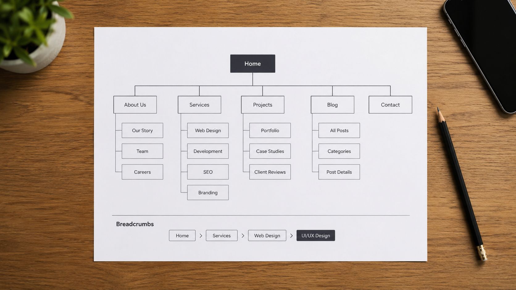
What to tighten first
- Main labels: Use language customers already recognise, not internal jargon.
- Menu depth: Keep top-level choices limited so users don't need to decode a maze.
- Long pages: Add breadcrumb trails where hierarchy matters.
- Mobile paths: Test thumb-friendly journeys before you assume desktop logic will translate.
3. Mobile-First Responsive Design
Start with the small screen and the rest becomes easier to judge. Mobile-first design forces you to answer a hard question early, what matters on the page? That's useful for SMEs because too many sites still try to cram desktop assumptions into a phone layout and then wonder why conversions sag.
Travel, hospitality, and service businesses feel this most sharply. A visitor searching for a booking, a founder checking a dashboard, or a customer reading a crisis update rarely has the patience to zoom, scroll sideways, or wait for decorative content to load. A mobile-first layout puts the call to action, the key reassurance, and the next step where people need them.
Designing for mobile also exposes unnecessary complexity. If a page only works when three columns are visible, it probably isn't structurally clear enough. If a form only feels manageable on desktop, the input strategy is probably too ambitious. Single-column layouts often win because they make the sequence of actions obvious. That doesn't mean desktop gets ignored, it means larger screens are treated as an enhancement, not the starting point.
Performance matters here too. Compress images, avoid heavy scripts, and lazy-load what users don't need immediately. If the first screen is slow, the rest of the design rarely gets a fair hearing. Mobile users judge fast, and often on the move.
Practical rule: If the mobile version feels like a reduced desktop version, the design process started in the wrong place.
That approach is especially useful for crisis communications, where users may be on unreliable connections and need the latest information quickly. The best responsive systems don't just resize content, they prioritise it.
4. Accessibility and Inclusive Design
Accessibility is not a specialist add-on. It is part of usable digital service, and it should be treated that way from the first wireframe onward. In the UK, public-sector websites and apps have had accessibility requirements for some time, and public-sector mobile apps were brought into scope later. as discussed in UX best-practice analysis For SMEs, the practical lesson is simple, if people cannot use your forms, navigation, or content clearly, you are building friction into the journey.
Teams often reduce accessibility to a checklist of contrast, alt text, and keyboard navigation. Those elements matter, but they are only the starting point. The harder, and more useful, question is sequencing: which fixes will remove the most drop-off first, and which changes can be folded into normal design and development work instead of becoming a separate project? That is the gap many guides miss, and the difference between a compliance exercise and a site people can use.
For a tourism business, that may mean accessible travel guides that help older visitors and disabled visitors plan with confidence. For a tech SME, it may mean plain-language labels, clear form errors, and captions on training videos. For media training content, it means transcripts, not just a video embed. Inclusive design helps more than the audience you are explicitly thinking about, because it removes ambiguity for everyone.
A useful habit is to test with real assistive technology, not just automated tools. Screen readers, voice control, and keyboard-only navigation reveal different problems from a colour contrast checker. They also expose the issues that slow people down in practice, broken focus states, unlabeled controls, unclear error messages, and layouts that collapse in ways the designer never saw. That is where the value sits, in the friction you would not catch on a standard design screen.
For teams planning the work, a useful reference point is what web performance means in practical terms, because accessible pages still need to load cleanly, present information in the right order, and stay usable under real-world constraints.
5. Performance Optimisation and Fast Load Times
Slow pages are a commercial problem, not a minor technical nuisance. If a site feels sluggish, people hesitate, and hesitation costs enquiries, bookings, and sales. For SMEs, speed work should sit alongside copy, layout, and form design as part of the conversion plan.
The mistake many teams make is obvious once you look at the build backlog. They polish visuals before they check the weight of images, scripts, and third-party tools. A site can look refined and still underperform if every page has to drag too much code and too many assets across the line. A simpler page often wins because users can get to the next step without waiting for the interface to catch up.
That trade-off matters most on pages that need action, not browsing. If a product page, service page, or landing page is meant to drive leads, then load time and responsiveness are part of the pitch. The same applies to landing page structure and CTA hierarchy, where the page has to support the promise above the button instead of slowing the user down before they reach it.
The practical discipline is straightforward. Set performance budgets, review Lighthouse and PageSpeed Insights regularly, and check real user metrics in production rather than relying only on lab results. Test on average mobile connections, not just office Wi-Fi. That point becomes sharper on crisis dashboards and time-sensitive updates, where delay creates confusion and makes people question whether the site can be trusted.
What web performance means in practical terms comes down to plain user experience. Faster pages reduce hesitation. Better responsiveness supports trust. Smaller assets and cleaner code usually beat flashy extras that look good in a pitch but slow the actual journey. The same logic applies to branding for B2B websites, because brand presence only helps when the page still loads fast enough for people to act on it.
Practical rule: Treat every extra script, oversized image, and third-party widget as a business cost until it proves its value.
6. Clear Calls to Action and Conversion Optimisation
A good CTA doesn't just sit there looking bold. It tells the user what happens next and removes the doubt that makes them pause. That's why wording matters as much as colour, placement, or size. “Get Started” usually works better than vague labels like “Submit” because it describes the action from the user's point of view.
Booking flows and enquiry forms often fail for the same reasons. The business asks for too much too soon, the button copy doesn't match the promise above it, or the trust signals appear after the form instead of before it. Scotia Homes-style property enquiry journeys and Johnnie Walker Experience booking flows show why clarity beats clutter. People respond when they can see the value, understand the next step, and believe the process won't waste their time.
Friction also needs trimming. Use the minimum viable form, and only ask for extra data when there's a clear reason. If the CTA is tied to a premium offer, add reassurance near the button, not buried in small print. For regulated or sensitive enquiries, make the next step explicit so people know whether they're booking a call, sending an enquiry, or starting a registration flow.
Landing page structure and CTA hierarchy should be designed around the promise above the button, not around what the business wants to ask first. That's especially relevant for branding for B2B websites, where confidence and clarity often matter more than visual decoration.
If the user can't tell what happens after the click, the button isn't finished.
A/B testing helps here, but only when the sample is meaningful enough to make the result credible. Test the message, the placement, and the friction together instead of changing ten things at once and pretending the winner is obvious.
7. Consistent Visual Hierarchy and Design Systems
Consistency is what lets users relax. When typography, spacing, colour, and component behaviour stay stable, people learn the interface faster and make fewer mistakes. When those patterns shift from page to page, each screen feels like a new product.
Design systems matter most when multiple people are shipping work. A client brand system at Carlos Alba Media works best when social, web, and print all follow the same visual logic, because the audience shouldn't have to re-learn the brand each time they encounter it. The same principle helps tourism boards managing partner sites and tech SMEs building dashboards across several modules. A shared system reduces drift, supports faster production, and makes maintenance simpler.
The most useful systems are documented clearly, not just stored in a component library. Explain when a button should be used, when a card should not be used, and which spacing rules are fixed. A simple grid, restrained font choices, and a defined colour palette are usually enough for most SMEs. You do not need a museum of design theory. You need a stable language that designers, developers, and content writers can all follow.
Best practices for web design become far easier to apply once a design system exists. It also makes cross-functional sign-off less painful because teams argue over fewer subjective details. That's the value, less rework, fewer surprises, and a cleaner handover from concept to build.
Practical rule: If a new page needs a new component every time, the system is too loose.
8. Intuitive Interaction Design and Feedback
Users need to know that the system has heard them. A button should react, a form should confirm, an error should explain, and a loading state should buy time without creating uncertainty. Without that feedback, people click twice, doubt the process, or abandon it altogether.
Checkout and dashboard flows make this especially obvious. If someone updates a cart, they should see the change immediately. If they submit an emergency alert form, they need a clear confirmation and the next step. If a dashboard is processing data, a skeleton screen or spinner is better than a blank pause, because it tells users the interface is working even when the content isn't ready yet.
The safest interaction patterns are the ones that behave predictably. Use motion sparingly, keep it short, and reserve confirmation dialogs for irreversible or costly actions. Don't hide failures behind generic error states. A specific message helps people fix the problem; a vague one makes them guess. That principle is especially useful in tech dashboards and service portals where users are already managing enough context without being asked to interpret the interface too.
The video below is a useful reminder that interaction design isn't just about beauty, it's about sequencing, feedback, and confidence.
9. Content Strategy and Copywriting Clarity
Good UX writing is newsroom writing with a product purpose. It cuts jargon, front-loads the important part, and gives people exactly enough context to act. That's why content quality directly shapes usability and trust, especially when your audience is trying to make a fast decision.
The strongest example is usually a boring one. A property listing that translates specifications into benefits helps people compare homes faster. A visitor page that focuses on the experience, not inventory, feels easier to use. A tech SME platform that writes for non-technical stakeholders reduces support questions because the language matches the audience's mental model.
Carlos Alba Media's editorial background matters. Former national news journalists are trained to find the point quickly, and that discipline translates well into UX copy. When the team understands both the story and the structure, the interface becomes easier to use. That's also why the UK press environment matters here, because the Editors' Code of Practice shapes the standards many newsroom-trained people work to across regulated UK press titles. That background tends to produce sharper judgement about clarity, risk, and tone.
There's also a cross-functional lesson from content design research. One recurring failure mode in product teams is that copy gets handed down too late, with no context, no room to shape the flow, and no shared understanding of the user journey as described in content design workflow analysis. That's when pages become noisy, inconsistent, and harder to trust.
Read the copy aloud. If it sounds heavy in your mouth, it'll feel heavy on the page. That test is still one of the quickest ways to catch the kind of wording that slows people down.
10. Usability Testing and Continuous Improvement
Usability testing is where assumptions meet reality. A team can be convinced the flow is obvious, then watch a user miss the button, misread the form, or hesitate at the exact point the business thought was clear. That gap is normal. The mistake is ignoring it.
Small tests are enough to start. Five unmoderated tests can reveal a lot of the major issues at low cost, especially if the tasks are realistic and the users are outside your organisation. What matters most is not quantity, it's whether the scenarios reflect what people came to do. If you sell luxury goods, test a real purchase path. If you run a tourism site, test a planning journey. If you manage a crisis portal, test a time-sensitive update flow.
The strongest teams don't treat findings as a report to file away. They feed them into the next sprint, fix what's practical, and measure again. That rhythm is how UX becomes part of delivery rather than a separate event. It also helps product, design, development, and content stay aligned, which is important because cross-functional collaboration often breaks down through separate decision-making procedures, different professional behaviours, and weak mutual understanding as highlighted in collaboration research.
If you want to keep improving, track before-and-after behaviour around the same task. That doesn't need to be elaborate. It just needs to be consistent enough to show whether the change helped users move faster, understand more clearly, or abandon less often.
10-Point UX Best Practices Comparison
| Practice | Implementation Complexity 🔄 | Resource Requirements ⚡ | Expected Outcomes 📊 | Ideal Use Cases 💡 | Key Advantages ⭐ |
|---|---|---|---|---|---|
| User-Centered Research and Discovery | High, 🔄🔄🔄🔄 | Moderate–High (time, participants), ⚡⚡⚡⚡ | Strong evidence-based UX improvements; fewer post-launch revisions, 📊⭐⭐⭐⭐ | Startups, product-market fit, Tourism & Hospitality | Reduces rework; improves conversions; stakeholder buy-in |
| Clear Information Architecture and Navigation | Moderate, 🔄🔄🔄 | Moderate (content strategy, validation), ⚡⚡⚡ | Better findability, lower bounce, improved SEO, 📊⭐⭐⭐ | Content-heavy sites, regulated orgs, tourism | Scales with content; reduces support; improves accessibility |
| Mobile-First Responsive Design | Moderate–High, 🔄🔄🔄🔄 | Moderate (device testing, responsive dev), ⚡⚡⚡ | Higher mobile engagement and better search ranking, 📊⭐⭐⭐⭐ | High mobile-usage products, startups, tourism | Consistent cross-device UX; simplified design; better SEO |
| Accessibility and Inclusive Design | High, 🔄🔄🔄🔄 | Moderate–High (audits, remediation, training), ⚡⚡⚡⚡ | Legal compliance, wider audience reach, improved SEO, 📊⭐⭐⭐⭐ | Public services, regulated orgs, tourism | Reduces liability; expands addressable market; benefits all users |
| Performance Optimization and Fast Load Times | High, 🔄🔄🔄🔄 | High (technical expertise, ongoing monitoring), ⚡⚡⚡⚡⚡ | Significant conversion and ranking gains; lower abandonment, 📊⭐⭐⭐⭐⭐ | E‑commerce, startups, crisis systems | Direct conversion lift; lower bandwidth costs; better mobile UX |
| Clear Calls-to-Action and Conversion Optimization | Moderate, 🔄🔄🔄 | Moderate (copy, design, A/B testing), ⚡⚡⚡ | Measurable uplift in conversions and revenue, 📊⭐⭐⭐⭐ | Acquisition-focused SMEs, e‑commerce, booking flows | Direct revenue impact; data-driven improvements; reduced friction |
| Consistent Visual Hierarchy and Design Systems | Moderate, 🔄🔄🔄 | Moderate–High (design system build & maintenance), ⚡⚡⚡⚡ | Faster development, consistent brand experience, 📊⭐⭐⭐⭐ | Agencies, scaling products, multi-team organisations | Reusable components; brand consistency; faster onboarding |
| Intuitive Interaction Design and Feedback | Moderate–High, 🔄🔄🔄🔄 | Moderate (UX design + front-end work), ⚡⚡⚡ | Fewer errors, higher task completion and perceived performance, 📊⭐⭐⭐⭐ | E‑commerce, dashboards, crisis communications | Reduces frustration; prevents mistakes; improves trust |
| Content Strategy and Copywriting Clarity | Low–Moderate, 🔄🔄 | Low–Moderate (writers, reviews, localization), ⚡⚡⚡ | Clearer messaging, better comprehension and SEO, 📊⭐⭐⭐⭐ | All clients, B2B, marketing-led initiatives | Improves decisions, reduces support, boosts conversions |
| Usability Testing and Continuous Improvement | Moderate, 🔄🔄🔄 | Moderate (participant recruitment, analysis), ⚡⚡⚡ | Rapid identification of issues; validated iterations, 📊⭐⭐⭐⭐ | All clients, iterative product teams, startups | Evidence-based fixes; culture of iteration; lowers redesign risk |
From Insights to Implementation: Your UX Checklist
Adopting these user experience design best practices isn't a one-off project, it's a way of running digital work with more discipline. The sites that improve steadily are usually the ones that make small, measurable changes, then watch how real users respond. That's especially true for SMEs, where time is limited and every design choice has to earn its place.
Carlos Alba Media sees the same pattern across PR, content, and web projects. The strongest results come from teams that blend editorial clarity with practical delivery. They don't wait for perfect conditions. They fix the journey that's causing the most friction, whether that's a slow page, a confusing form, or a message that doesn't make sense on mobile.
Start this week with one audit, not ten. Check your main landing page, booking flow, or enquiry form against just one principle from this list. If the page is slow, simplify the assets and remove anything that isn't supporting the conversion. If people are dropping off in a form, tighten the labels and reduce the number of decisions they need to make. If the copy is unclear, rewrite the top section in plain English and move the key action higher.
A practical UX programme should also be cross-functional. Design, development, content, and marketing need shared decision rights, or the work will keep slipping late in delivery. That's where smaller teams need the most discipline, because the absence of a large department shouldn't mean the absence of process. It should mean the process is lean, clear, and consistently used.
For UK SMEs, the upside is straightforward. Better UX can support stronger trust, smoother service delivery, and more completed actions, whether that action is a sale, a booking, or a lead. If you want a partner that combines newsroom precision with digital strategy, Carlos Alba Media works on UX, SEO, web design, and conversion-focused content for start-ups and SMEs across the UK. For more on the topic, read UX principles for Shopify apps and apply the same thinking to your own site this week.
If you want senior-level support on UX, content, and conversion-focused web work, Carlos Alba Media can help you prioritise the changes that matter most. Visit Carlos Alba Media to discuss how clearer journeys, faster pages, and stronger copy can improve your website's performance for real users.