

GOV.UK received around 1 billion visits and 2.3 billion page views in 2025, with mobile devices accounting for 61% of visits by December (Government Transformation). That isn't just a public-sector milestone. It's a useful answer to the question why is web design important for every UK organisation competing for attention, trust and action online.
A website now carries work that once belonged to reception desks, brochures, sales teams and customer-service departments. It explains what you do, establishes whether you look credible, helps people find the right information and creates the route to contact, purchase, sign-up or enquiry. If the structure is weak, visitors feel the friction before your team ever gets the chance to make the case.
For UK decision-makers, web design is therefore a commercial system. It connects brand reputation with accessibility, search visibility, mobile usability and conversion performance. The right design helps people understand and act. The wrong design makes them work unnecessarily hard, then leaves the organisation paying for lost demand.
The First Impression Is Now a Business Decision
A website can influence a customer, journalist, investor, regulator or prospective employee before any direct conversation begins. Visitors form an early view from the page's clarity, visual confidence and ease of finding an answer. That judgement affects whether they continue, investigate further or leave.
The UK context gives this first impression commercial weight. Online sales represented 26.5% of total retail sales in Great Britain in February 2025, and UK online retail sales were valued at £127 billion in 2024 (Magnetic London). Design therefore operates inside a major route to purchase. A cluttered product page, unclear delivery information or awkward mobile checkout can interrupt demand that was already close to conversion.
Trust is formed before the conversation starts
A browser tab signals whether an organisation is organised, current and serious about its audience. Typography, spacing, colour, photography and interaction patterns create that signal, while speed and hierarchy determine whether visitors can act on it. Visual polish cannot compensate for a page that hides the answer people came to find.
Mobile use has changed the conditions of that judgement. The GOV.UK usage data cited earlier shows a nationally important digital service moving from desktop-dominant patterns towards majority mobile use over time. UK businesses face the same practical test: can someone understand the offer and complete the next step on a phone, amid interruptions and limited screen space?
Strategic test: If a visitor sees only the homepage and one service page, can they tell who you help, what you offer and what to do next?
Discovery also extends beyond traditional search. Teams building a credible digital presence can use resources such as boost brand presence in AI search to consider how structured, clearly expressed information supports visibility in newer discovery environments. The foundation remains practical: an intelligible proposition, well-organised content and pages that answer real questions.
Carlos Alba Media applies a newsroom-style judgement to digital presence. That means asking whether the most important information appears quickly, whether context is clear and whether every prominent element earns its place. For UK founders and communications teams, this approach connects presentation with the decisions a site must support, from enquiry and purchase to media interest and recruitment.
The first impression is made repeatedly across devices and user journeys. Delaying design investment does not remove its commercial effect. It leaves pipeline, retention and brand equity exposed to choices no one has measured.
What Good Web Design Actually Means in 2026
Good web design isn't a visual layer added after the business strategy has been agreed. It's the process of deciding what a visitor needs to see, understand and do, then removing anything that distracts from that sequence.
Carlos Alba Media brings a newsroom perspective to that work. Everyone who works for Carlos Alba Media is a former national news journalist or has agency experience of working with international brands. That background matters because newsroom editing and effective digital design share a discipline: prioritise the essential information, establish context quickly and cut what doesn't earn its place.
Start with the decision, not the decoration
A credible site usually begins with five practical questions:
- Who is the audience? Separate customers, investors, journalists, partners and candidates where their needs differ.
- What decision must the page support? A product page, service page and newsroom article shouldn't force the same action.
- What evidence reduces doubt? Proof, process, credentials and clear contact routes should appear where uncertainty arises.
- What happens on mobile? Content hierarchy must survive narrow screens, touch interaction and shorter attention windows.
- How will success be measured? Enquiry quality, completed journeys, downloads and assisted conversions need tracking from the outset.
The build then turns those answers into an information architecture. Navigation should reflect how UK customers search and decide, rather than how the internal organisation happens to be divided. A visitor looking for pricing, eligibility, delivery information or a case example shouldn't need to understand your departments first.
The technical layer is part of the editorial judgement
Fast Core Web Vitals, responsive layouts, readable typography, useful metadata and structured data all affect whether the content performs. Accessible colour contrast, keyboard operability, semantic headings and properly labelled forms determine whether people can use the experience at all. The Government Digital Service says accessible websites and mobile apps are vital for 16.1 million disabled people in the UK (Government Digital Service).
That's why design and development need to work together. A designer who specifies an interaction without understanding implementation can create friction, while a developer who builds components without understanding the user's priority can produce a technically sound but commercially weak page.
Teams should also validate important decisions rather than relying on taste. Practical guidance on how A/B testing boosts revenue can help marketers connect layout and messaging choices to observed behaviour. For a deeper UX reference, see user experience design best practices.
Good design is therefore an editing system. It decides what earns attention first, what supports confidence second and what doesn't need to appear at all.
Five Ways Web Design Moves the Needle for UK Brands
Design earns its budget when its effect can be traced to a business outcome. For UK leadership teams, five levers provide a practical way to assess whether a website supports growth, reduces exposure or looks polished.
Credibility
Visitors decide whether an organisation appears trustworthy before they commit time to a conversation. Consistent typography, clear ownership of content, transparent contact details and a coherent visual system reduce uncertainty. Credibility comes from answering expected questions in a deliberate form, not from adding badges or making every page look expensive.
The test is editorial as much as visual. Can a visitor identify who is responsible, what the organisation offers and what should happen next? If those answers are unclear, visual refinement cannot compensate.
Conversion
Online retail gives design a direct relationship with revenue. The UK market recorded £127 billion in online retail sales in 2024, while online sales represented 26.5% of total retail sales in Great Britain in February 2025 (Magnetic London). Product photography, comparison information, delivery details, calls to action and checkout structure all influence whether intent becomes an order.
Service businesses usually have a shorter route. A well-designed landing page makes the offer legible, answers objections and provides an easy enquiry path. The key decision is the evidence a visitor needs before pressing the button, not the button's position alone.
Search visibility
Search engines need to interpret relationships between pages, topics and entities. Clear architecture, descriptive headings, crawlable code and structured data give search systems better information, while helping users select the relevant result.
Mobile-first design connects search visibility with actual use. A page built mainly for a large monitor can create discoverability and engagement problems on smaller screens. SEO architecture should therefore be agreed before visual design fixes templates, URLs or navigation patterns.
Accessibility
Accessibility affects reach, compliance exposure and reputation. The Government Digital Service's earlier finding on disabled people's reliance on accessible digital services shows why this cannot be treated as a finishing task (Government Digital Service).
Common failures include poor contrast, missing alternative text, weak form labelling and controls that do not work with keyboards or assistive technology. Each failure can exclude a prospective customer, increase support demand or create avoidable scrutiny. Accessibility belongs in content, design and development decisions from the start.
Performance
Performance is a user-experience decision with technical consequences. Heavy images, unnecessary scripts and poorly prioritised content delay the point at which a visitor can understand or use a page. Good performance work focuses on the critical path, mobile conditions and commercially important actions, rather than a vanity score in isolation.
For UK decision-makers, mobile behaviour is a planning constraint, not a secondary consideration. GOV.UK's reported traffic pattern, referenced earlier, illustrates the scale at which smaller-screen experiences matter (Government Transformation).
These levers overlap, but they should be tested separately. A site may look credible yet convert poorly, rank well yet exclude users, or pass a design review while loading badly on mobile. The newsroom-style judgement applied at Carlos Alba Media is useful here: decide what deserves attention, what evidence supports the next action and what friction the organisation is willing to accept.
Real UK Campaigns That Show the Pattern
Campaigns expose weak design quickly because attention arrives in a concentrated burst. A press mention, broadcast appearance or social post can send people to a page that wasn't built to explain the story or support the next action. The result is often blamed on the campaign, when the failure sits in the handover between attention and experience.
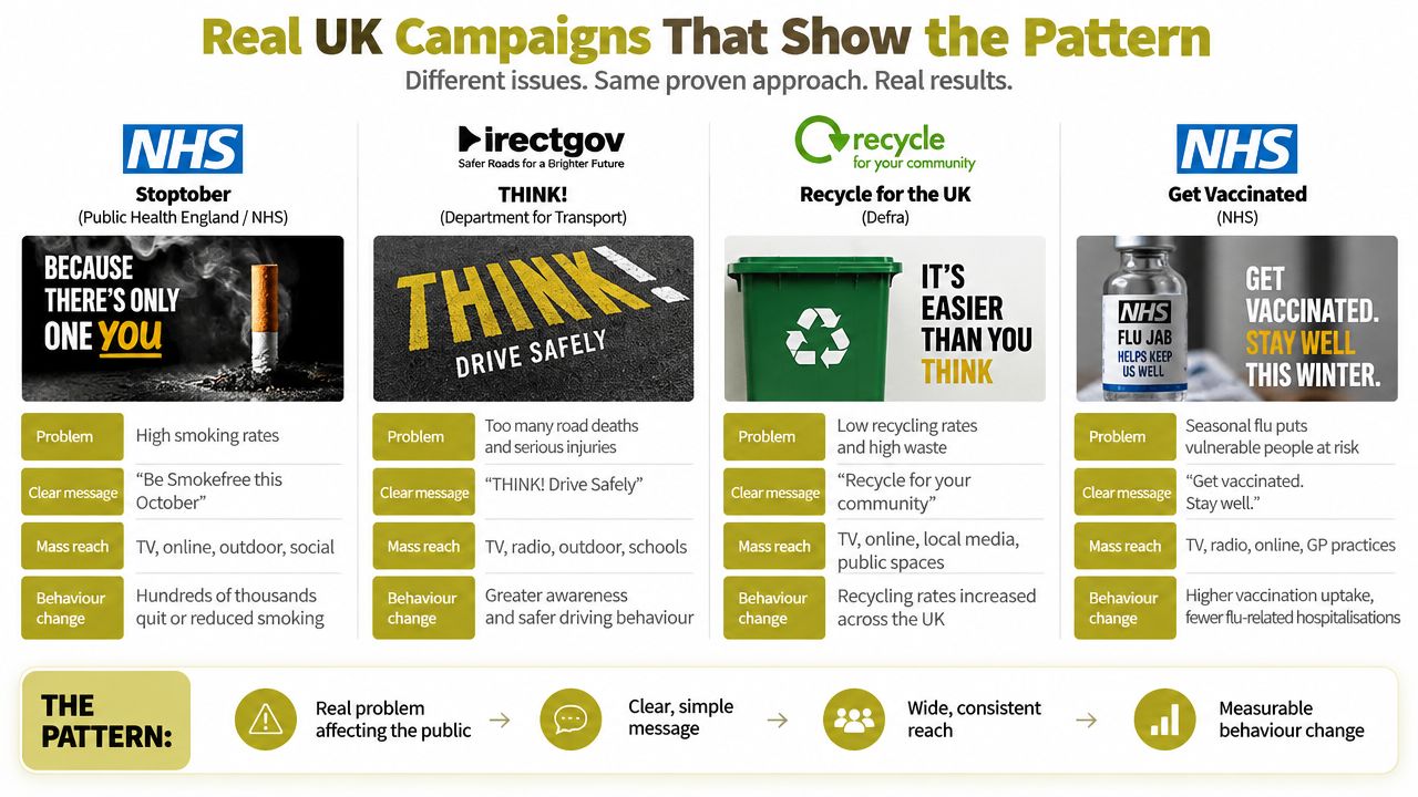
The campaign-led pattern
Consider a charity responding to a fast-moving news cycle. Its communications team secures coverage, social engagement rises and supporters arrive looking for one clear answer: what happened, and how can I help? If the landing page leads with an internal history, buries the donation route and uses language that differs from the campaign, the organisation wastes the attention it worked to earn.
A stronger response gives the campaign its own clear entry point. The page carries the same message as the media work, puts the relevant evidence near the decision and makes the donation or sign-up journey easy to recognise. The important design choice isn't a dramatic visual treatment. It's alignment between the public narrative and the user journey.
The performance-led pattern
A retailer faces a different version of the same problem. Organic search brings a visitor to a product page, but the mobile layout places key information below distracting modules, compresses product imagery badly or makes selection controls difficult to use. The retailer may respond by buying more traffic, although the immediate issue is that the existing traffic can't move efficiently through the page.
The rebuild starts with evidence. Analytics identifies where mobile users leave, search data shows which questions bring them to the page, and usability testing reveals which controls create uncertainty. The team then simplifies the hierarchy, improves content order and tests the revised path. The channel remains important, but design determines whether that channel produces a useful commercial result.
The repeatable principle: PR creates attention. Design determines whether attention becomes understanding, trust and action.
The two examples share a useful operating model:
- Match the page to the message. A campaign landing page should answer the question raised by the coverage.
- Design for the device people use. The journey must work without desktop assumptions.
- Measure the handover. Track not just visits, but the action that makes the campaign worthwhile.
- Iterate quickly. Headlines, page order and calls to action should respond to observed behaviour.
Carlos Alba Media's specialist nature sits at this intersection of media judgement and digital execution. Its teams work with the editorial instincts needed to recognise a timely story and the digital discipline needed to give that story a useful destination.
Why Template Sites Quietly Cost You More
Templates can be sensible. A small organisation with a narrow offer, limited content and modest operational needs may gain speed and control from a managed platform. The mistake is assuming that a template remains inexpensive once the site becomes an important route to sales, recruitment, press coverage or stakeholder confidence.
The visible saving is the initial build. The less visible costs appear in compromises: a page structure that doesn't reflect customer questions, plugins added to compensate for missing functionality, design rules that resist accessibility improvements and performance problems that become harder to isolate as the site grows.
The trade-off behind the quick launch
A template gives you a starting system. It may also give you unused components, third-party scripts and rigid content relationships that the team never chose deliberately. Performance-built design begins with the user journey and keeps the technical system proportionate to that journey.
| Cost area | Template build | Performance-built design |
|---|---|---|
| Information architecture | Internal categories often shape the menu, even when customers search differently | Navigation is designed around audience tasks and commercial priorities |
| Mobile experience | Desktop patterns may be compressed into a smaller viewport | Mobile behaviour is defined at component and journey level |
| Accessibility | Basic settings can leave contrast, labels, focus states or semantics unresolved | Accessibility requirements are tested throughout design and development |
| Performance | Extra features and scripts can create avoidable weight | The build prioritises critical content and measurable user journeys |
| Maintenance | Internal teams patch plugins and work around constraints | Ownership, documentation and iteration are agreed before launch |
The accessibility risk deserves particular attention. WebAIM found that 95.9% of the top one million home pages had at least one detectable WCAG 2 failure in February 2026, with home pages averaging 56.1 detectable errors (Accessibility Build). That global benchmark isn't a diagnosis of every UK template site, but it shows how easily common failures survive at scale.
UK evidence points in the same direction. Scope reported detectable accessibility errors on 97.4% of homepages in 2021, with low colour contrast affecting 86%, missing alternative text 61% and missing form labels 54% (Scope). A template doesn't automatically cause these problems, but it can make ownership unclear. Someone must still test, fix and maintain the experience.
Choose a template when it matches the organisation's needs. Choose a focused build when trust, mobile commerce, search visibility or accessibility are central to growth. The cheap route becomes expensive when the team pays repeatedly for traffic, workarounds and later reconstruction.
Accessibility and Performance as Growth Levers
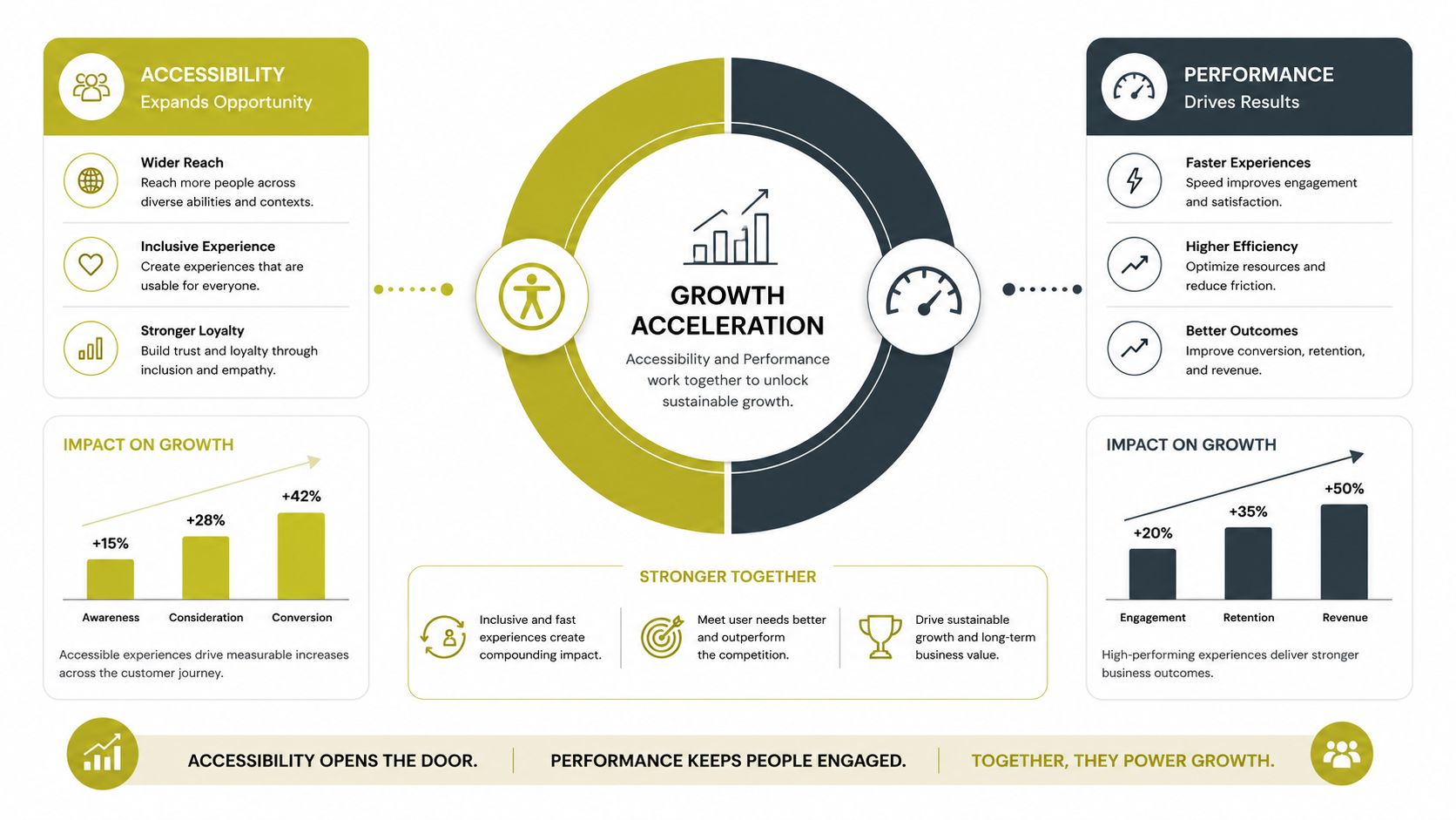
Accessibility and performance belong in the same commercial decision. Both determine whether a visitor can reach, understand and complete the task that brought them to the site.
Accessibility covers perception, movement through a page and control of its interface. Performance covers how quickly that interface becomes available and usable. A fast site that cannot be operated by keyboard still excludes users. A well-structured site that becomes interactive too slowly still loses attention.
Accessibility is market reach and risk control
Public-sector monitoring recorded a 70% compliance rate in 2022-2024, up from 59% in the previous period, and directly fixed 16,482 accessibility issues (Cloudswitched). The improvement is meaningful, but the remaining gap makes ownership a management issue rather than a one-off declaration. The 16.1 million disabled people in the UK cited earlier should be treated as part of the audience definition, not as an afterthought.
Practical quality depends on details: sufficient colour contrast, meaningful alternative text, visible focus states, keyboard-operable controls, logical heading order and labels that make forms understandable. These changes support disabled users and often improve use on small screens, older devices and busy journeys.
The compliance picture remains unfinished. A UK government annual report found 60% of surveyed organisations adhered to WCAG 2.0 medium conformance or higher, while 73% offered at least one accessibility feature (Office for Digital Identities and Attributes). A feature does not prove that the complete service is accessible. Forms, error messages, account areas and third-party components still need checking.
Performance protects the value of attention
Performance analysis should follow real user journeys. Identify pages responsible for discovery, trust and conversion, then examine loading order, image treatment, script execution and layout stability. The guide to what web performance means for business decisions helps connect technical measures with user outcomes.
Commercial rule: Don't ask whether a page is fast in the abstract. Ask whether the right content and action become usable quickly enough for the audience and situation.
The relationship is practical. Clear structure helps assistive technologies and search systems interpret a page. A lighter, more deliberate build lets users reach that structure sooner. Together, these choices can broaden the audience, strengthen confidence and reduce abandonment before the organisation has made its case.
Accessibility and performance should enter the commercial brief before development starts. Assign responsibility, define acceptance criteria and test the journeys that matter. The result is a site that treats compliance and speed as operating requirements, not post-launch repairs.
Your Web Design Checklist Before You Brief an Agency
A good agency brief does more than describe the preferred colours and pages. It gives the delivery team enough commercial and technical context to make sound decisions, while giving the founder a basis for challenging weak recommendations.
Use a sequence that reflects how a serious project should run.
Discovery
Start with the business problem. Ask the agency:
- Audience: Which groups need different journeys, language or evidence?
- Priorities: Which actions matter most, and how will the team rank competing goals?
- Evidence: What existing analytics, search data, customer research and sales insight will shape the work?
- Constraints: Which legal, regulatory, hosting, integration or governance requirements affect delivery?
A partner should be able to turn these answers into a clear project hypothesis. “Make it modern” isn't a brief. “Help mobile visitors understand our service, trust our credentials and submit a qualified enquiry” is a useful starting point.
Architecture and design
SEO shouldn't be bolted onto finished screens. Ask how URL structures, page templates, internal linking, structured data and redirect requirements will be decided before design approval.
Then test the experience itself:
- Mobile-first evidence: Request examples of how the agency prioritises content and interaction on smaller screens.
- Accessibility testing: Require WCAG 2.2 considerations, keyboard testing, screen-reader checks, contrast review and a plan for resolving findings.
- Conversion design: Ask how forms, calls to action and measurement events will be defined before development.
- Content ownership: Confirm who writes, edits, approves and maintains the information architecture.
The landing page deserves particular scrutiny because it often receives campaign traffic. Review landing page best practices alongside the agency's proposed content and measurement plan.
Build, measure and iterate
A credible technical proposal should explain how the team will monitor Core Web Vitals, test across relevant devices and protect search visibility during launch. It should also state who owns the code, content, hosting relationship, analytics setup and documentation. Ambiguity here can turn a successful launch into a long-term dependency.
Before signing, ask:
- What will be measured at launch? Include qualified enquiries, completed transactions, key engagement events and assisted conversions where relevant.
- What happens after launch? Agree the review rhythm, experiment process and responsibility for fixes.
- How will changes be prioritised? Look for a method based on user impact and commercial value, not internal preference.
- Can you show relevant UK work? The examples should demonstrate judgement across audience, regulation, media context and performance.
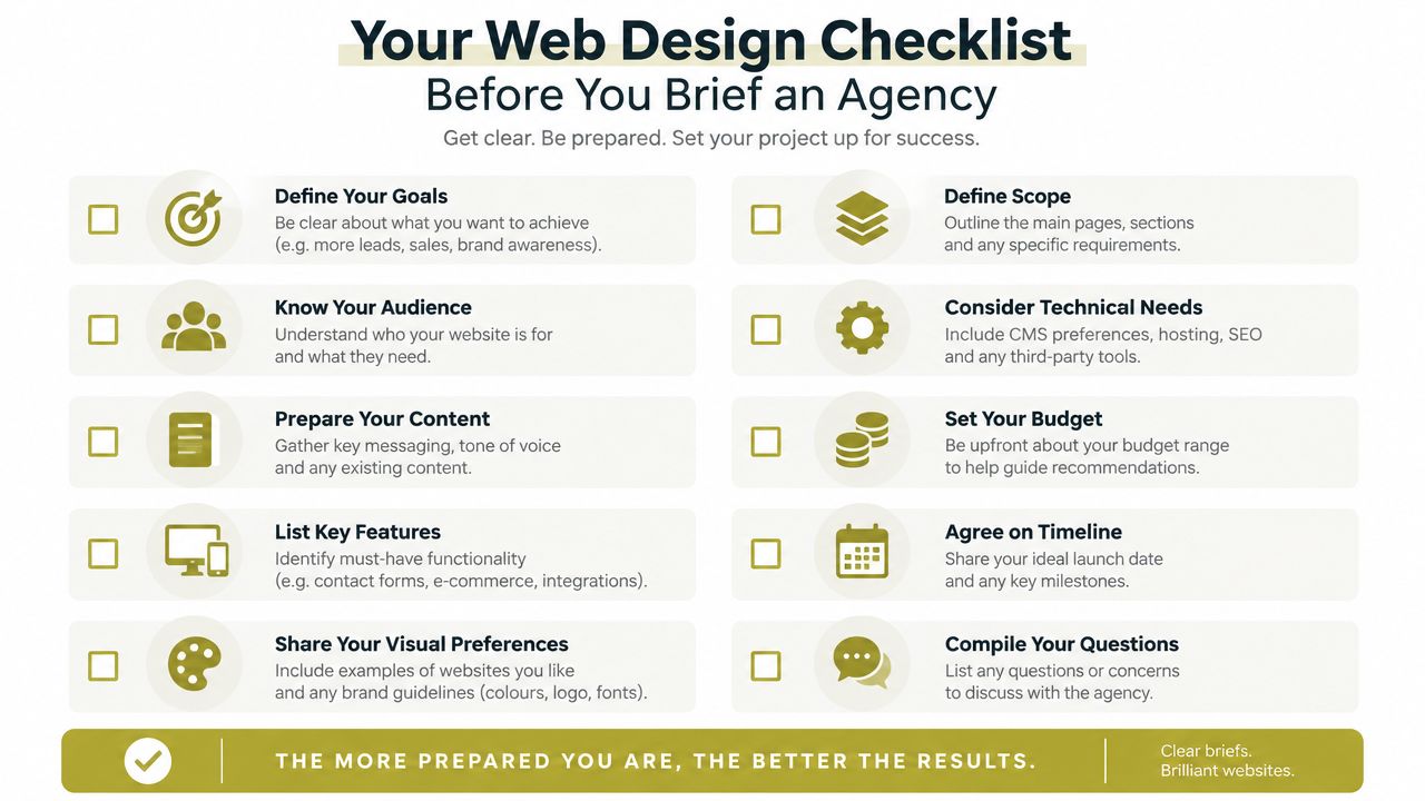
A disciplined brief is design quality control before the first wireframe exists. It prevents expensive misunderstandings, exposes weak assumptions and gives the founder an advantage when costs, scope and ownership are negotiated.
Carlos Alba Media combines PR, SEO, UX, web design and development to help UK organisations turn attention into trusted digital journeys, with teams in London and Glasgow and senior experience across national newsrooms and international brands. Visit Carlos Alba Media to discuss a performance-led website brief built around accessibility, credibility and measurable business action.