
Your service page looks finished. The photography is sharp, the design is clean, and traffic arrives every day. Yet enquiries don't follow, and visitors leave without calling, booking, or filling in the form in front of them.
That gap usually isn't a traffic problem. It's a copy problem. Learning how to write web copy starts with accepting that readers judge a page in seconds, and they keep reading only when the first lines answer a practical question.
What a Newsroom Approach to Web Copy Actually Means
A newsroom-trained writer doesn't open with your company history. They open with the most useful fact first, just as a news story puts the outcome in the top line. For a founder reviewing a polished page with steady traffic and flat enquiries, that discipline changes everything, because brochure copy describes the business while newsroom copy helps a stranger decide.
The Difference Between Sounding Persuasive and Being Useful
Brochure writing stacks adjectives. Dynamic, passionate, and bespoke appear on thousands of SME sites, and readers learn nothing from them. Newsroom writing replaces adjectives with checkable detail, such as who you help, what happens next, what it costs, and what proof supports the claim. If a sentence could sit unchanged on a competitor's site, it isn't doing any work.
That discipline reflects a trained skill set, not a generic writing flair. A 2023 Reuters Institute survey of 1,130 UK journalists found that 63% were aged 40 or over with a median age of 45, and 98% of those who began their careers between 2013 and 2015 held a bachelor's degree. Experience built over years of commissioning, verification, and deadline editing produces habits that AI drafts and template copy rarely replicate.
Those habits are directly relevant to commercial pages. At Carlos Alba Media, everyone who works for the agency is a former national news journalist or has agency experience of working with international brands. That specialist mix matters because national newsrooms teach writers to cut claims they cannot stand up, and brand work teaches them to keep a consistent voice while doing it.
Editorial rule: If you cannot prove a claim on the page, either find the evidence or delete the claim.
What Conversion Actually Depends On
Conversion rarely turns on one clever headline. It turns on three things working together:
- Answer-first structure: The reader sees what you do and who it's for before background detail appears.
- Visible evidence: Named clients, specific outcomes, and clear conditions sit next to the claims they support.
- Plain English: Short sentences and familiar words let less confident readers act without re-reading.
There's a trade-off here. Cutting warm, brand-led introductions can feel like losing personality, and stakeholders often resist it. Personality survives, though, because tone lives in word choice and rhythm, not in delaying the point. A Guide from PinDrop on publishing structured, discoverable content makes a related point about clarity helping both readers and search systems find what matters.
Keep the voice. Lose the preamble. Your reader hasn't agreed to give you five minutes, so your first paragraph has to earn the second one.
Planning the Page Around How UK Visitors Read
A buyer reaches your services page from Google, thumb already near the back button. The page has seconds to prove it was written for that visit and the decision behind it. A sub-editor would call that the splash meeting: what is the story, who needs it, what can we prove.
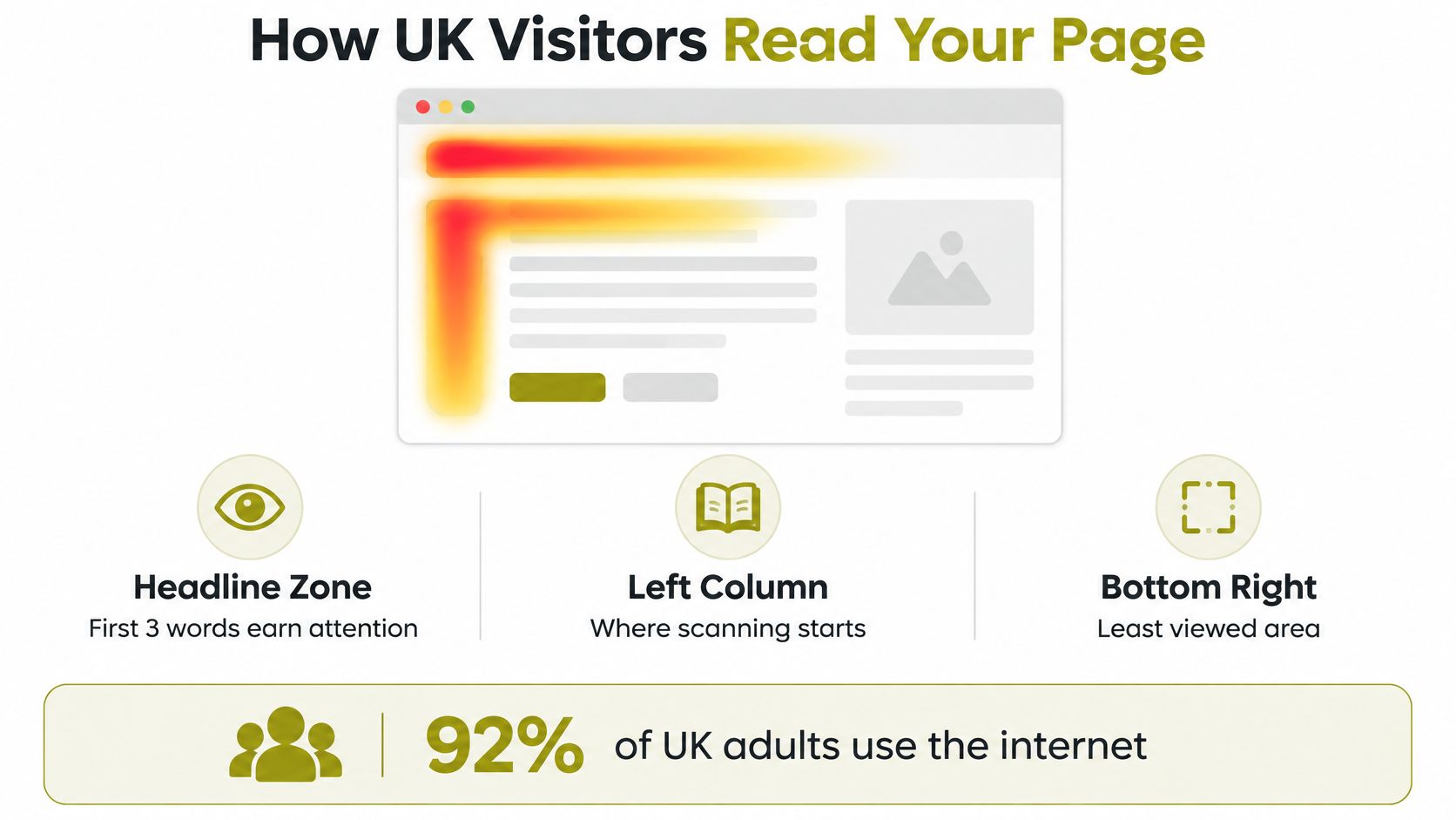
GOV.UK content research on digital reading behaviour describes an F-shaped reading pattern: across the top, a shorter pass lower down, then a vertical scan. The same guidance cites the 1997 Morkes and Nielsen finding that extremely scannable text helped users complete tasks faster, make fewer errors, and recall information better.
The practical order follows. Put the value proposition, reader relevance, proof point, and one primary call to action in the first screen, with extra weight on mobile. History, credentials, and technical detail can sit lower for readers who have already decided you are worth a scroll.
| Visitor question | Page element that answers it |
|---|---|
| What do you do? | One-sentence service line under the headline |
| Is it for me? | Sector, size, location, or problem cue |
| What does it cost? | Price range, rate card, or clear route to a quote |
| Why should I trust you? | Named client outcome beside the claim |
| What happens if I enquire? | Button plus a short expectation of the next step |
Set design and copy in one wireframe, because user experience design best practices decide what the eye meets before the headline has to carry it alone. Then draft to the questions. A block that answers none of them moves down the page or out of the plan.
Give the page one job. A pricing page can lead with “Request a proposal” and keep “See recent work” as the quieter route; equal buttons make a hurried visitor do your planning for you. Once the lead is fixed, the rest of the page becomes editing, not negotiation.
Writing Headlines, Leads and Body Copy That Earn the Scroll
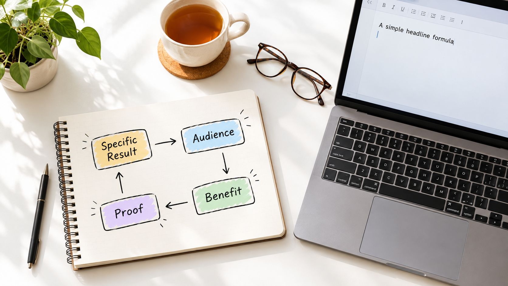
Headline writing is where non-copywriters feel the most pressure, so use a formula instead of waiting for inspiration. Combine a specific result, the audience, a time frame where you can state one, and a proof cue. "PR support for growing businesses" says little. "National media coverage for Scottish tech firms, led by former national newspaper editors" names the outcome, the reader, and the reason to believe it.
The workspace image below reflects the practical reality. Strong headlines come from structured drafting and testing, not a single inspired line.
Front-Load the Lead
UK Government guidance on writing for websites reports that 80% of phone or tablet users don't scroll beyond the first quarter of a page. A narrative opening that withholds the point for three paragraphs therefore loses most mobile readers before it delivers anything. Put the answer in the opening sentence, then use later paragraphs for context, method, and reassurance.
Before and After Rewrites
Consider a typical SME services paragraph. Before: "We offer a full range of PR solutions built around your needs, drawing on our extensive experience to deliver results." After: "We secure broadcast, print, and online coverage for UK SMEs. You'll work directly with senior journalists, not account juniors, and you'll see a media plan before you commit." The second version names channels, people, and the next step.
A second example shows the same shift on pricing. Before: "Our flexible packages offer excellent value for businesses at every stage." After: "Choose monthly retainer support or a one-off campaign. Each proposal states deliverables, fees, and reporting dates upfront, so you can compare like for like." Neither rewrite is clever. Both are outcome-stacked rather than feature-stacked, and that's why they work harder.
If you want a complementary small-business perspective on drafting service pages, these website copywriting tips for small businesses cover practical structure choices that sit well alongside the newsroom approach here. Consistent voice matters across those pages too, so align drafts with your tone of voice guidelines before multiple writers touch the site.
The short video below walks through headline and lead construction in a format you can pause and apply to a live draft.
Keep paragraphs short, use descriptive subheadings at a steady rhythm, and bold the phrases a scanner needs. Decoration doesn't earn the scroll. Useful information, arriving early, earns it.
Microcopy, CTAs and On-Page SEO Working Together
A visitor reaches your contact form on a phone, one thumb free, standing on a station platform. They mistype the date field and the form replies "Invalid input." Those two words just decided whether you get the enquiry.
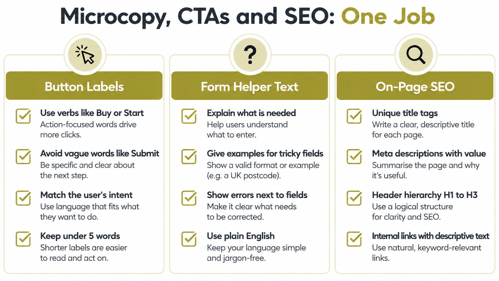
Microcopy is the small text read at the exact moment of decision: button labels, form helper text, error messages, navigation labels. It carries more conversion weight per word than any hero paragraph, yet on most sites it gets written last, by whoever happened to be nearest the keyboard.
The Read-Back Test for Buttons and Forms
"Submit" tells nobody what happens next. "Tell us about your project" or "Request my proposal" names the action and lowers the hesitation. Run the same discipline through helper text, explaining why you need a phone number or when the reader will hear back, and through error messages. "Enter a valid email address, like name@example.co.uk" fixes the problem. "Invalid input" only reports it.
The audience for that copy is wider than any specialist readership. Ofcom research and statistics on UK internet use includes ONS reporting that 92% of UK adults were recent internet users in 2020, rising to 99% among people aged 16 to 44. Your form serves almost everyone, including someone completing it between train stops.
Search Snippets Earn the Click Before the Page Loads
Title tags, meta descriptions, heading order and link anchors are reading experiences first and ranking signals second. A meta description that repeats the headline wastes the one advert you control in search results, so write it as a promise with a reason to click. Keep every page title unique too, since both crawlers and humans rely on it to tell pages apart.
Anchor text pulls double duty. "Click here" tells screen reader users and search engines nothing, while a link describing SEO content creation services tells both exactly where it leads.
Before publishing, read the page aloud the way a sub-editor would check a front page. One H1, headings in logical order, every anchor naming its destination, every button a verb that matches the next screen. Each string is a small piece of journalism. It answers a question or it gets cut.
Plain English, Accessibility and Proof as Conversion Tools
"Trusted by leading organisations." I've cut that line from more SME homepages than any other phrase, and it always survives stakeholder review because nobody can object to it. Nobody can verify it either. A sub-editor would call it unsourceable: shaped like a claim, built to collapse the moment someone asks who, how many, or checked by whom.
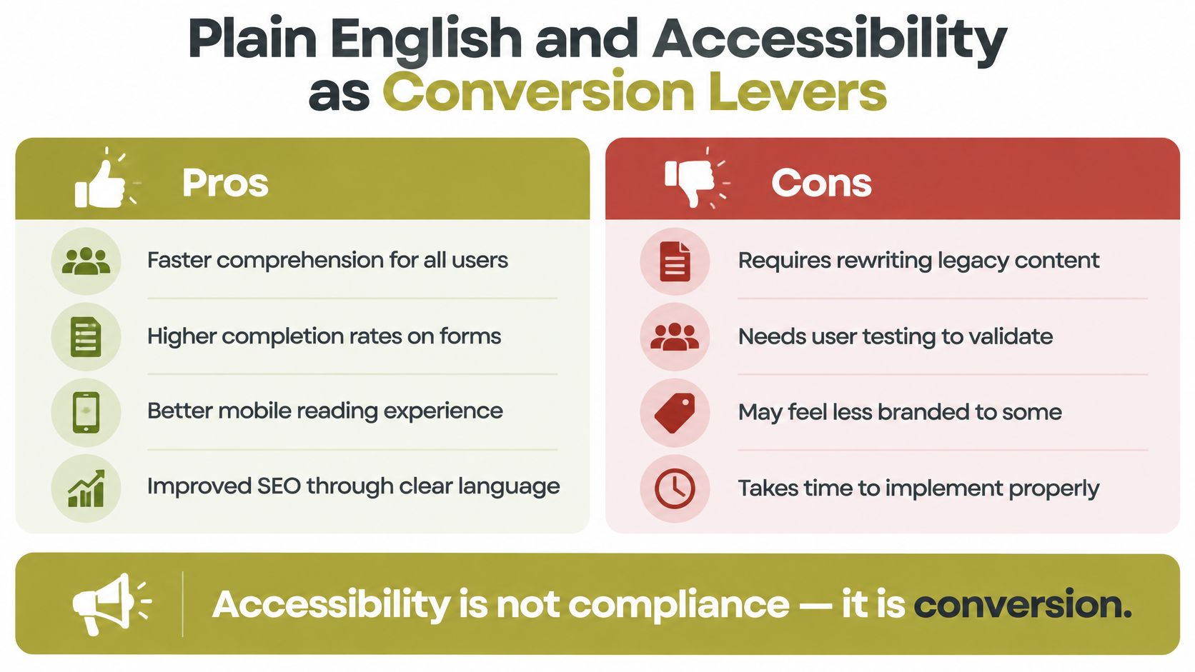
Problems like that sit alongside a bigger one. How-to guides for SME sites tend to file accessibility under development work, a compliance chore for whoever builds the page. Treating it that way is a commercial mistake, because copy that fewer people can parse converts fewer people, whatever the design budget bought.
A Measurable Editing Specification
The UK Government Analysis Function guidance on writing about statistics recommends 15 to 20 word sentences and one concept per paragraph. GOV.UK also reports that 1 in 6 adults in England have very poor literacy skills while 1 in 4 adults in Scotland experience literacy challenges. In that context, jargon and unexplained acronyms are a measurable conversion risk.
Apply the spec mechanically, before anyone argues about tone. Inventory every specialist term on the page, swap each one for the words customers use, and explain the unavoidable ones at first mention. Compound claims get split into separate sentences. Active voice, familiar words, and HTML rather than PDF for information visitors need.
Spec first. Tone second.
Then test comprehension with representative users, including people using screen readers, since heading order and link text decide whether they can follow your argument at all.
Reframe: Accessible copy and conversion copy share the same mechanics. Clearer headings, meaningful button labels, and shorter sentences reduce friction for every visitor.
Proof That Reduces Risk Instead of Adding Noise
Sceptical readers pricing a high-cost or regulated purchase want verifiability more than reassurance. Before a major claim ships, run it through the same three questions a news desk puts to a reporter. What is the evidence: name the client, method, or document behind it. Who does it apply to: state exclusions and conditions rather than implying universal results. How can the reader check: link to coverage, publish the methodology, or state your regulatory status plainly.
The difference shows on the page:
| What ships now | After the source check |
|---|---|
| "Trusted by leading brands." | "Payroll software for [named clients], live since [year], method published below. We don't take on [excluded sector]." |
The second version can feel less glossy in review. It gives a cautious buyer something solid to act on, and cautious buyers are often the ones carrying budget and a genuine problem to solve.
Testing, Editing and a Launch-Week Measurement Plan
Publishing isn't the finish line. It's the first honest test of whether your copy answers real questions for real visitors.
Pre-Publish Editing Checklist
Run one final pass against five checks. Confirm the audience is named in the opening lines, benefits are specific rather than adjectival, sentences meet the plain English specification, on-page SEO elements are complete, and every major claim carries its proof nearby. Accuracy sits above all of it. A 2018 Cision survey of UK journalists found that 81% said ensuring content was 100% correct was paramount, and that newsroom standard maps directly onto pricing, credentials, and results claims on SME sites.
What to Measure in Launch Week
You don't need a data team. You need four routines:
- Scroll depth on mobile: Check whether visitors reach the primary call to action or stall earlier.
- Form completion funnel: Find the field where people abandon, then rewrite its label or helper text first.
- One headline test: Change a single variable, since testing headline, image, and button together teaches you nothing. If you sell online, this walkthrough on how to run Shopify A/B tests shows the single-variable discipline clearly.
- Five-user task test: Ask representative customers to find a price or start an enquiry while you watch.
Judge copy by task completion and enquiries, not page views alone. A page can attract steady traffic for months while failing at its only job. Edit, measure, and edit again, because web copy is a working asset rather than a one-off launch task.
If your website gets traffic but doesn't generate the enquiries it should, Carlos Alba Media can audit your key pages, rewrite them using newsroom discipline, and align the copy with your SEO and PR goals. Visit Carlos Alba Media to discuss your homepage, service pages, or a full site rewrite with a senior team.