

UK retailers lost an estimated £34.4 billion annually to online basket abandonment in 2024, according to Retail Economics and GFS. Not all of that demand is recoverable, but it reframes the job of a website conversion audit. You're not looking for a prettier website. You're finding where willing customers encounter a reason, or a technical barrier, to stop.
For SMEs, tourism operators and service businesses, those barriers extend beyond checkout. An inaccessible booking calendar, an enquiry form that loses information or an unexpected delivery restriction can undo otherwise effective marketing.
The Website Conversion Audit Checklist at a Glance
Internet sales represented 27.1% of total retail sales in Great Britain in 2024, compared with 19.3% in January 2019, and reached 30.3% in November 2024, according to the Office for National Statistics. Conversion performance deserves commercial attention, not just a discussion about colours and button placement.
Start by defining the job of each page. A service page should help a suitable prospect decide whether to enquire. A booking page should let a visitor select and secure an available experience. Judge each finding against that job.
Audit areas, checks, tools and red flags
| Audit area | What to check | Tool or source | Red flag |
|---|---|---|---|
| Analytics accuracy | Conversion events fire once, with consent handled | GA4 DebugView, Google Tag Assistant | Enquiry or purchase counted twice on the thank-you page |
| Page speed | LCP, INP and CLS for each key template | PageSpeed Insights, WebPageTest | Key templates receive a poor Core Web Vitals assessment |
| Mobile journeys | Full path from landing page to confirmation on real phones | Physical iOS and Android devices | Form submit button hidden behind the keyboard |
| Forms | Labels, input types, error messages and data retention | Manual testing with sample data | Error message clears entered details |
| Accessibility | WCAG 2.2 AA at enquiry, booking and purchase points | Keyboard-only run, screen reader, axe DevTools | No visible focus state on the submit button |
| Calls to action and landing relevance | Headline and offer match the ad, search term or referral | Session recordings, heatmaps such as Microsoft Clarity | High bounce from paid traffic on a single page |
| Checkout | Steps, guest checkout and payment options | Funnel report in analytics | Account creation forced before purchase |
| Delivery and returns | Costs, dates, VAT and return terms shown before the basket | Site review and checkout walkthrough | Delivery cost first appears on the final step |
The order is deliberate. Establish trustworthy measurement before interpreting speed or form results. Then examine whether visitors can understand, operate and complete the journey.
The commercial promise sits last because teams often overlook it, not because it's unimportant. Nobody can optimise a visitor into accepting delivery terms the business concealed until payment.
Audit output: A short, ranked list of changes tied to specific pages and controls, not a long report of generic recommendations.
Record the affected URL, evidence, likely consequence and proposed fix for every finding. That makes the checklist usable by whoever has to implement the work.
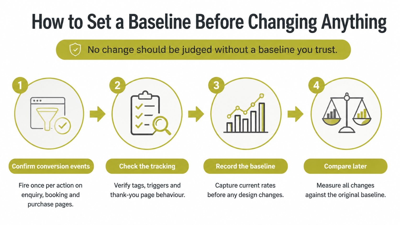
How to Set a Baseline Before Changing Anything
No change should be judged without a baseline you trust. Otherwise, a tracking correction can look like falling sales, while duplicated events can make a broken journey appear successful.
Establish a reliable measurement record
Confirm conversion events. Complete an enquiry, booking and purchase where applicable, watching GA4 DebugView or Google Tag Assistant. Check that the completion event fires once per successful action, not just when someone clicks submit.
Inspect the tracking implementation. Look for duplicate tags, missing consent handling and gaps between your website and an external booking or payment domain. Refresh the confirmation page and return through browser history to check whether either action creates another conversion.
Segment the last 90 days. Break sessions down by device, acquisition channel, landing page, geography and funnel stage. Use that period as a practical starting window, then mark any closures, seasonal offers or campaign launches that make comparisons uneven.
Calculate meaningful rates. Divide completed conversions by sessions for a session-based conversion rate, keeping the definition consistent. Calculate revenue per session separately, and distinguish qualified enquiries from spam or unsuitable requests.
Locate the busiest material drop-off. Inspect progression from product or service page to form, and from basket to checkout. Consider both the exit rate and how many visitors encounter that step, rather than chasing the largest percentage on a quiet page.
Save the baseline. Put the segment, exact date range, conversion rate, revenue measure and named drop-off on a shared sheet. Note tracking changes and anything that could distort the period.
Use this flow to keep measurement ahead of design decisions.
Separate the signals from the noise
A blended mobile and desktop average can conceal a mobile form that performs much worse than its desktop equivalent. Equally, a rise in low-intent campaign traffic can lower the overall conversion rate without making the website worse.
Your useful baseline is a clearly defined measure per segment, a named drop-off and an explanation of distortions. Don't treat analytics as a complete record of customer behaviour when consent choices or cross-domain gaps limit what you can observe.
Testing Speed and Mobile Journeys on Real Devices
75% of UK users say page-load speed has the greatest effect on their overall experience, while 53% of users abandon a mobile site that takes more than three seconds to load, according to Google's Mobile Site Speed Playbook. These are directional benchmarks, not a promised uplift for your website.
Core Web Vitals thresholds for mobile templates
Use the following bands as working diagnostic thresholds. Keep loading, responsiveness and visual stability separate rather than treating a headline performance score as the verdict.
| Metric | Good | Needs improvement | Poor |
|---|---|---|---|
| LCP (loading) | 2.5 seconds or less | Over 2.5 to 4 seconds | Over 4 seconds |
| INP (responsiveness) | 200 milliseconds or less | Over 200 to 500 milliseconds | Over 500 milliseconds |
| CLS (visual stability) | 0.1 or less | Over 0.1 to 0.25 | Over 0.25 |
A lab pass doesn't prove that a booking journey works on a mid-range phone over a mobile connection. Test key templates on a physical Android device and an iPhone, including menus, calendars, consent controls and payment hand-offs.
- Record the failure: Capture available field measurements in PageSpeed Insights, then use browser performance tools to investigate the interaction.
- Inspect the waterfall: In WebPageTest, identify oversized hero images, render-blocking resources, third-party tags and consent scripts.
- Remove the largest avoidable cost: Compress media, defer non-critical scripts and remove unused tags before considering a larger rebuild.
For a hardware-testing workflow, practical device testing with 99tests provides useful context. Carlos Alba Media's guide to web performance also explains how technical behaviour affects the usable experience.
Pass performance changes into a controlled test. Credit the faster template only when traffic intent, seasonality and other concurrent changes have been accounted for.
Auditing Landing Pages, Calls to Action and Checkout
Start with the page receiving paid or search traffic, not automatically the homepage. Read the incoming ad or search snippet alongside the landing page. Does the visitor find the offer they expected, with its qualifications visible?
Run the commercial journey in sequence
Check relevance before appearance. Compare the headline, location, price presentation and availability with the referring message. A tourism campaign promoting a particular experience shouldn't land on a general page that makes visitors search for it again.
Open Microsoft Clarity recordings and heatmaps to investigate where visitors stop scrolling, repeatedly click or leave. Treat recordings as clues, not proof of motive, and mask personal information before collecting them.
Inventory action buttons and links. Replace ambiguous wording with a clear outcome, such as Get a quote or Book a consultation. Make sure the destination fulfils that description rather than opening an unexpected registration process.
Count the clicks from arrival to confirmation, but don't assume fewer always means better. An extra step that explains eligibility or confirms a booking date can prevent mistakes; an unnecessary account screen adds effort without equivalent value.
Inspect the checkout funnel. Reproduce the step with the largest material exit, checking guest checkout, available payment methods and error recovery. Arlo Inc.’s explanation of why shoppers leave before paying offers a useful diagnostic checklist alongside your own funnel evidence.
High bounce is a symptom. It doesn't tell you whether the cause is irrelevant traffic, missing information or a broken interaction.
A paid landing page with unusually high bounce warrants a relevance check first. Confirm the cause before commissioning a redesign, and record the precise element that needs changing.
Auditing Forms and Accessibility at the Point of Enquiry
Between January 2022 and September 2024, the Government Digital Service monitored 1,203 public-sector websites and 21 mobile apps, identifying 29,787 accessibility issues, of which 16,482, or 55.3%, were fixed. This is a public-sector benchmark, not a commercial conversion study, but it demonstrates why accessibility needs direct testing.
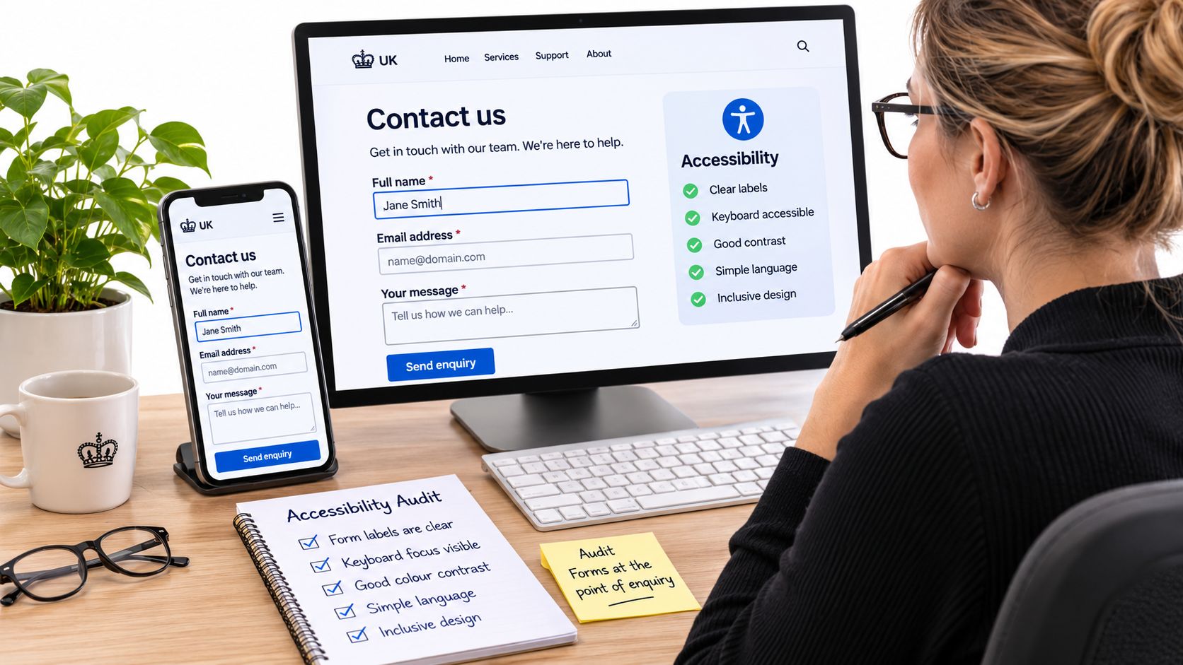
A visitor blocked by a form may appear in analytics as an ordinary abandonment. Inspect the controls at the point where someone tries to enquire, book or buy.
Test completion, not just appearance
Use only the keyboard. Move through navigation, fields and submission controls. Confirm visible focus, logical focus order and no keyboard traps, including inside pop-ups.
Inspect programmatic labels, appropriate input types and autocomplete for name, email, phone and postcode. Placeholder text isn't a substitute for a persistent label.
Trigger errors deliberately. Leave required fields empty and enter invalid values. Messages should identify the relevant field, explain recovery, be announced to screen readers and preserve information already entered.
Test date pickers and file uploads without a mouse. For tourism bookings, check unavailable dates, month changes and selection confirmation rather than stopping when the calendar opens.
Zoom to 200% and 400%. Check that content reflows and that sticky banners don't obscure fields or the submit button. Examine the actual task, not just whether the page remains visible.
Check ordinary body text against the 4.5:1 WCAG AA contrast minimum. Include error text and instructions, not only headings and primary buttons.
Finish with assistive technology
An automated axe DevTools scan detects only a subset of failures. Complete a full journey using a screen reader such as NVDA or VoiceOver, listening for field names, instructions, state changes and confirmation.
Use the accompanying video alongside the manual checks.
Test interior product, service and contact pages, where conversion controls sit. Carlos Alba Media's user experience design best practices provide broader context for making those tasks understandable as well as operable.
Checking the Promise Beyond the Landing Page
A faster page can't fix an unavailable delivery option. DHL's 2025 UK shopper research reports that three in four shoppers abandon baskets when preferred delivery and returns options are unavailable, while 69% have returned an online purchase.
That challenges the page-first habit. Sometimes the interface works, but the proposition doesn't suit the customer.
Map what the business actually promises
Walk through the journey as a customer from a relevant UK region. Check Scottish islands and Northern Ireland explicitly where delivery coverage differs, rather than assuming a UK-wide statement is sufficiently clear.
Inspect delivery dates and costs before the basket, return costs and time limits, payment options, and VAT or import information for overseas shoppers. Then examine the confirmation page and delivery email: do they explain what happens next and how to get help?
- Follow the promise end to end. Start with the ad, search snippet or social post and continue through purchase to the operational email.
- Record each promise and where the customer first encounters it. Flag important restrictions introduced only after substantial effort.
- Validate it with fulfilment. Check coverage, dispatch cut-offs, stock availability and the returns process against what the business can deliver.
- Separate suitable visitors who reject the terms from visitors attracted by an offer the business can't support.
For a service business, substitute appointment availability, service area, response expectations and cancellation terms. A tour operator should check meeting points, accessibility information and weather-related arrangements against the booking message.
Commercial rule: If the campaign attracts customers you can't serve, correct the targeting or offer before changing the page.
Use customer journey mapping to assign responsibility across marketing, the website and fulfilment. Record whether each finding needs clearer communication or an operational change. Showing an unpopular restriction earlier may reduce basket starts while improving the quality of completed orders, so don't judge that change by an intermediate metric alone.
Turning Findings into a Prioritised Fix List
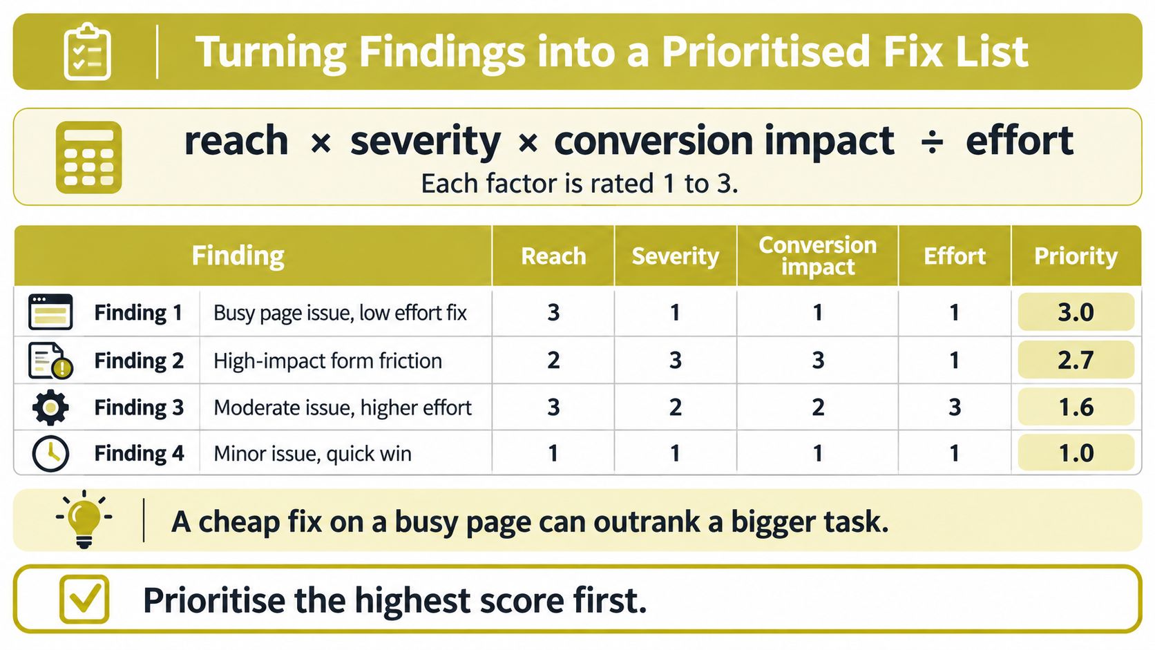
Score findings using reach × severity × conversion impact ÷ effort, rating each factor from 1 to 3. These are judgement scores, not measured returns: use low, medium and high consistently and document the reasoning.
Scoring four findings for priority
The examples below illustrate how observed findings can sort. Their ratings should change if your traffic or implementation evidence says otherwise.
| Finding | Reach | Severity | Conversion impact | Effort | Priority |
|---|---|---|---|---|---|
| Delivery cost first shown on the final checkout step | High | High | High | Low | Fix now |
| Enquiry form clears entered data after an error on mobile | Medium | High | High | Medium | Fix next |
| Oversized hero image slows the product page on 4G | High | Medium | Medium | Medium | Test next |
| Low contrast on secondary buttons in the blog template | Low | Medium | Low | Low | Schedule |
The delivery disclosure ranks first because it affects a commercially important step and may be cheap to correct. The form failure blocks completion; the image affects a busy template but needs measurement. Scheduling the contrast fix isn't permission to ignore an accessibility defect.
Use this visual as a reminder of the scoring method.
Make each change testable
Write a hypothesis connecting observation, change and metric. For example: because checkout exits coincide with late delivery charges, displaying charges earlier should improve completed purchases per eligible session. Set the minimum worthwhile improvement from your own baseline, not a borrowed uplift claim.
Before launch, agree:
- Primary metric: Choose the completion measure that decides success.
- Guardrails: Monitor revenue, checkout completion and error rate.
- Decision rule: Cover at least a full weekly cycle and continue until the planned evidence requirement is met. Don't stop at an encouraging early result.
Keep the list to ten items or fewer, give each item an owner and log failed tests as carefully as successful ones. Fix demonstrably broken controls without withholding repairs merely to create an experiment.
Confirm Your First Test and Owner This Week
A conversion audit only changes revenue when somebody ships a fix. Pick the highest-priority finding from your list, assign one named owner and agree a launch date before anyone touches another cosmetic change. The owner's ticket should state the affected page, the evidence, the proposed change, the acceptance check and the primary metric.
A high-volume drop-off makes a sensible first test because relevant observations arrive faster there. Volume alone won't produce a quick answer. Where traffic is limited, combine task testing and technical verification with cautious outcome monitoring rather than claiming certainty from a small movement. If your top finding is an accessibility barrier or a delivery charge revealed too late, it belongs in the same queue as any checkout fix, not a separate workstream.
Decide who will do the work
If in-house capacity is short, Carlos Alba Media can handle the website conversion audit and the fixes. Our team combines newsroom insight with commercial website experience, and we've completed 100+ web development projects. Clients don't need to be based in Glasgow or Scotland to use our PR and digital marketing services.
To start a conversation, use our contact form, which asks for a name, phone number, email address and message. Include the suspected drop-off step, the main devices visitors use and whether an external booking or payment platform is involved.
Write down the decision
Keep the commitment visible:
- Baseline: The current measure and its date range.
- First fix: The exact change being shipped.
- Owner: The person responsible for completion.
- Launch date: When measurement of the change begins.
Review the outcome at the agreed end of the test window. Record what happened, whether the evidence supports the hypothesis and what you'll do next. A short written log beats a shared memory of what was agreed.
Carlos Alba Media offers website design, development and digital marketing focused on helping customers complete meaningful actions. Visit Carlos Alba Media to discuss a website conversion audit, bringing your main drop-off point and device mix so we can focus the work on the right journey.