
You're seeing the same pattern in different dashboards.
Website traffic looks healthy. Social posts get attention. Sales calls suggest interest is there. Yet enquiries stall, abandoned forms keep piling up, and customer feedback doesn't point to one obvious problem. One person says your pricing page is confusing. Another says they couldn't tell what happens after booking. A third says they emailed, then heard nothing for days.
That usually means the problem isn't one channel. It's the gaps between them.
At Carlos Alba Media, we approach that kind of problem with the same instinct a good newsroom brings to a messy story. People on the team are former national news journalists or agency professionals who've worked with international brands, so the habit is the same. Follow the evidence, compare accounts, find the missing context, and work out what happened rather than what people assume happened.
That's why customer journey mapping matters. It isn't a nice workshop exercise for a whiteboard and some sticky notes. It's a practical way to see your business as customers experience it. Not as your departments are organised, not as your funnel is supposed to work, but as it really feels to move from first impression to enquiry, purchase, service, and repeat business.
This matters more in the UK because digital behaviour is now close to universal. In 2024, 96% of UK households had internet access and 91% of adults bought goods or services online, which means your customer's path probably moves across search, social, reviews, email, mobile, desktop, and human contact before they decide what to do next, as noted in GWI's overview of customer journey mapping. If you're still judging performance channel by channel, you're likely looking at fragments rather than the full story.
Introduction Why Your Customer View Might Be Incomplete
Founders usually know when the picture doesn't add up. They can feel it before they can prove it.
A campaign drives strong visibility, but the contact form underperforms. The sales team says leads aren't ready. The service team says buyers arrive with the wrong expectations. Marketing says the message is clear. Everyone has part of the truth, but nobody owns the whole journey.
Where businesses lose clarity
Most SMEs don't lack data. They lack a joined-up view of it.
One team looks at Google Analytics. Another watches inbound emails. Someone else reviews CRM notes. Social comments sit in one place, customer complaints in another, and nobody maps the handoff from one stage to the next. That's where journey work becomes useful. It gives you a single narrative of what customers do, what they need, and where they get stuck.
Practical rule: If your teams describe the same customer in different ways, your customer view is incomplete.
This is especially common in businesses that have grown quickly. The website has been updated in phases. Messaging has changed. Sales scripts evolved. Support processes were added later. From the inside, each change made sense. From the customer's side, it can feel disjointed.
What an incomplete view looks like in practice
You'll recognise it if any of these sound familiar:
- Traffic rises but conversions stay flat: Attention is reaching you, but the route to action is weak.
- Leads ask basic questions late in the process: Your content didn't answer them when it should have.
- Customers repeat themselves to different teams: Internal handoffs are breaking the experience.
- Complaints cluster around “confusing” or “slow”: The issue may be process design, not promotion.
A proper map doesn't just show touchpoints. It shows cause and effect. It helps you see that the weak enquiry page may not be the root issue. The underlying problem could be a mismatched ad promise, unclear service explanation, or a slow response after first contact.
That shift in thinking matters because businesses don't grow by optimising isolated moments. They grow by removing friction across the full experience.
What Customer Journey Mapping Really Means
A sales funnel shows the route you want people to take. A customer journey map shows the route they take.
That's the difference most businesses miss.
If the funnel is your internal blueprint, customer journey mapping is the CCTV footage. It captures hesitation, detours, repeat visits, unanswered questions, moments of doubt, and the points where someone drops out because your business asked for one step too many or failed to connect one channel to the next.
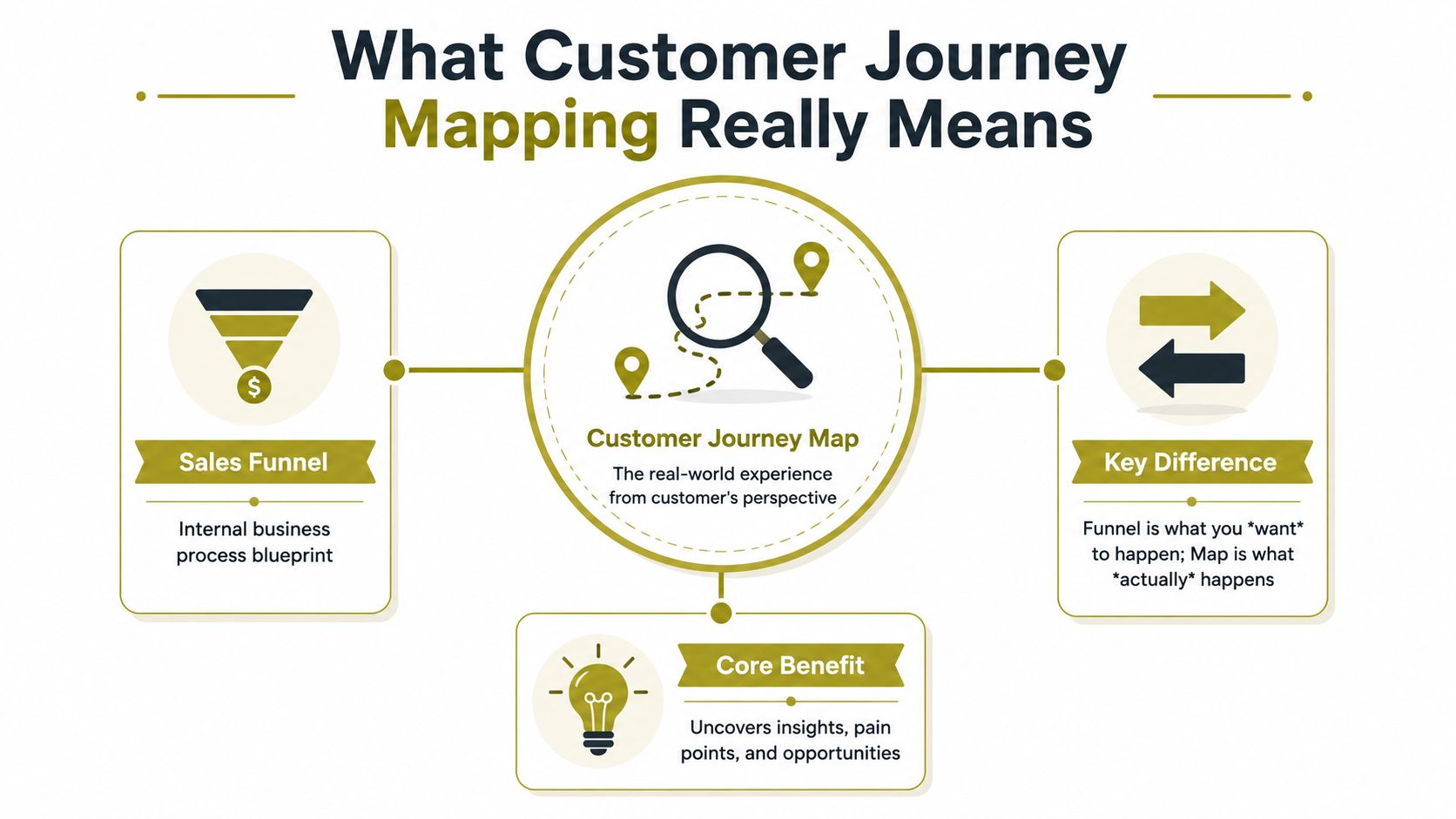
It's not a diagram. It's a diagnostic
The weak version of journey mapping is a workshop output. It looks tidy, uses generic stages, and tells you very little you didn't already think.
The useful version is operational. It tracks how customers move between touchpoints, what they're trying to do, what they're thinking at each stage, and where the experience breaks. That gives you something your marketing, sales, PR, and service teams can use to make decisions.
A sensible plain-English definition is this:
A customer journey map is a working view of how one specific customer type moves through one specific scenario with your business, across channels, and what gets in the way.
That's also why a map is broader than a funnel. Funnels focus on progression. Journey maps focus on experience.
What the map should reveal
A strong map answers practical questions:
- Discovery: Where did the customer first hear about you, and what expectation did that create?
- Evaluation: What information did they need next, and where did they go to find it?
- Action: What nearly stopped them from enquiring, buying, booking, or calling?
- Aftercare: What happened once they became a customer?
- Return behaviour: What would make them come back, recommend you, or disappear?
If you want a good external explanation that keeps the concept grounded in marketing reality, Sensoriium's customer journey mapping guide is a useful companion read.
Why this matters for SMEs
Larger organisations can absorb some inefficiency. SMEs usually can't.
If you're working with tighter budgets, every unclear page, delayed reply, or messy handoff costs more. A map helps you stop debating opinions and start fixing what customers experience. That's why the best customer journey mapping work is less about drawing a process and more about exposing friction you can act on.
The Essential Components of an Actionable Map
A journey map becomes useful when it has enough detail to guide action, but not so much that it turns into wallpaper.
The strongest maps are built in layers. Miss one of those layers and you usually end up with a document that describes the business, not the customer.
Start with the right subject
A map needs a clear point of view.
That means one persona, not “all our customers”. It also means one scenario. A first-time buyer researching your service is not on the same journey as a returning customer trying to resolve a problem. Mix them together and the map loses value.
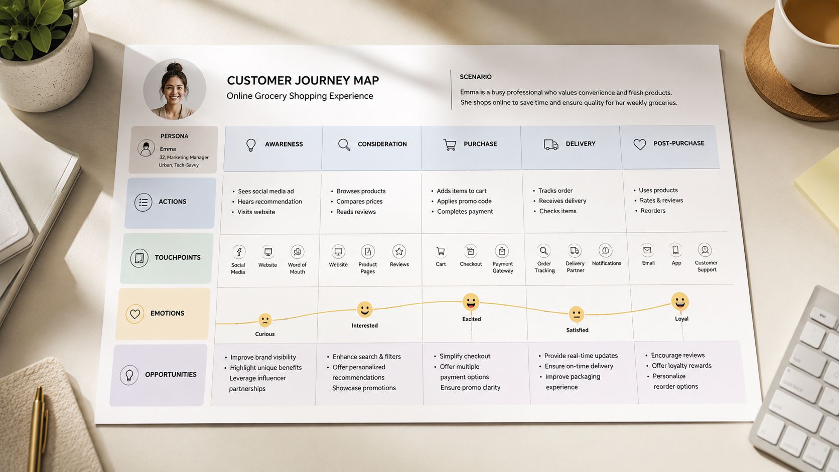
The core layers usually look like this:
- Persona: A specific customer type with a specific need.
- Stages: The broad phases they move through, such as awareness, consideration, decision, service, and loyalty.
- Touchpoints: The places where they interact with you, including search, social, website pages, phone calls, emails, review sites, live chat, or in-person contact.
- Actions and questions: What they're doing and what they need answered.
- Emotion: How confident, confused, reassured, frustrated, or motivated they feel.
- Pain points and opportunities: The points where a fix would improve the experience or support conversion.
The emotional line matters more than most teams expect
Public guides often underplay emotion because it sounds soft. In practice, it's where many of the most commercial insights sit.
Effective journey maps typically chart a minimum of 5–7 touchpoints and must explicitly track the customer's emotional curve. The most critical insights often emerge at the emotional lows, which correspond to abandonment, complaints, and lost sales, or at the boundaries between channels where handoffs fail, as explained in Fullstory's guide to customer journey maps.
That means a map should show more than actions. It should show what the person feels when they hit a comparison page, get redirected to a form, wait for a reply, or need to repeat information to another team.
The stage with the strongest commercial impact is often the stage your internal teams barely discuss.
What makes a map actionable
An actionable map gives every stage a reason to exist. If a touchpoint is on the map, it should help explain a commercial outcome.
A simple way to test that is to ask whether the map helps you decide what to fix first. If it doesn't, it's too abstract.
For example:
| Map layer | Weak version | Actionable version |
|---|---|---|
| Persona | “Prospective customer” | “Owner of a small tourism business comparing agency support” |
| Touchpoint | “Website” | “Homepage, service page, case study page, contact form” |
| Emotion | “Interested” | “Interested but unsure what happens after first enquiry” |
| Pain point | “Needs more info” | “Drops out because service scope and response expectations aren't clear” |
That's also why website experience belongs inside the map, not outside it. If your key friction is happening on-page, it's worth reviewing practical UX fixes alongside the broader journey. Carlos Alba Media's advice on how to improve website user experience fits that stage-level thinking well.
How to Create Your First Customer Journey Map
Most first maps fail because teams start with assumptions. They gather people in a room, ask everyone what they think customers do, and produce a polished version of internal opinion.
A better method is simpler. Start like a reporter. Get the evidence first, then build the story.
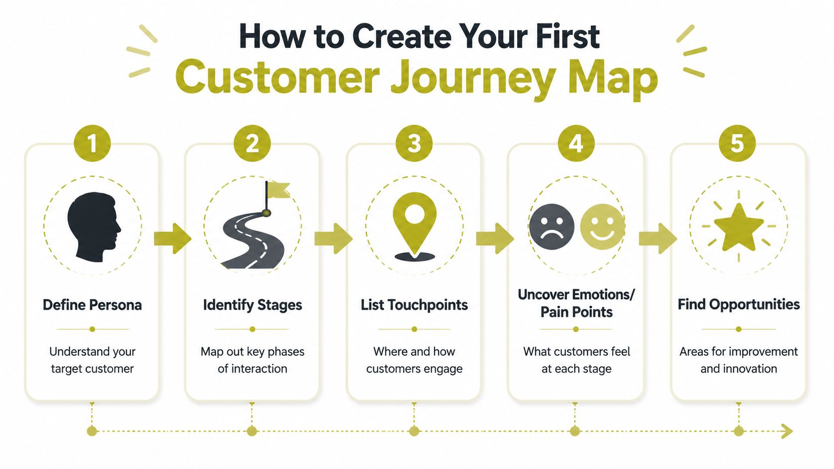
Step one and step two
The first decision is scope. Be strict.
A best-practice journey map is built from a single persona, a single scenario, and a single business goal. It must be validated with a combination of qualitative evidence such as interviews and support transcripts, and quantitative data such as analytics and conversion funnels, so it reflects actual behaviour rather than internal assumptions, according to Smaply's customer journey mapping guidance.
Start with a clear business question. Examples include:
- Lead generation: Why do visitors reach the enquiry page but fail to submit?
- Sales quality: Why do booked calls arrive poorly informed?
- Service friction: Why do new customers ask the same onboarding questions repeatedly?
Then gather evidence from places teams often ignore:
- Customer interviews: Ask recent buyers and non-buyers what they were trying to do.
- Support inboxes and call notes: These expose recurring confusion in the customer's own language.
- Analytics and behaviour flow: Look at landing pages, exits, and key path disruptions.
- Social comments and DMs: These often reveal objections earlier than formal enquiries.
- CRM history: Useful for spotting delays, handoffs, and follow-up gaps.
If your team handles calls or demos, tools and methods around transcript review can sharpen this stage. A practical primer is HypeScribe's guide to conversation intelligence, which helps teams think more clearly about what customer conversations reveal.
Step three and step four
Once you have enough raw material, define the journey.
Choose one persona. Choose one scenario. Then lay out the stages in plain language. Don't overcomplicate the structure. Most SME maps work well when they follow the customer from first awareness through research, action, and immediate post-purchase or post-enquiry experience.
At this point, add a few columns that make the map useful:
- Stage
- Customer action
- Touchpoint
- Question or need
- Emotion
- Pain point
- Opportunity
A short explainer can help if your team is visual and needs a worked example before starting:
The map doesn't need design polish yet. A spreadsheet is fine. A Miro board is fine. A wall of printouts is fine. What matters is whether each stage is grounded in real behaviour.
Step five
Now analyse where effort will pay off.
Look for repeated signs of friction. Customers may visit pricing before trust content. They may hit a contact page before they understand your process. They may move from social to site, then disappear because the page doesn't match the message that brought them there.
Editorial test: If you can't point to the evidence behind a pain point, it's still a theory.
Prioritise fixes with two filters:
- Impact on the journey: Does this friction affect conversion, trust, or service load?
- Ease of action: Can the team fix it with clearer copy, a better page structure, a stronger follow-up email, or a process change?
That's how customer journey mapping becomes manageable for SMEs. You're not trying to map everything. You're identifying the few moments where confusion, delay, or disconnect does the most damage.
Journey Mapping for Different UK Sectors
The map changes depending on the sector. The principle doesn't.
A tourism brand, a regulated business, and a tech startup all need to understand customer behaviour. But the friction points, trust signals, and handoffs they need to diagnose are very different.
Tourism and destination brands
For tourism, the journey often begins with inspiration. A customer sees a striking destination image on Instagram, reads an article, checks availability, compares accommodation, and starts figuring out cost, logistics, travel timings, and cancellation terms.
The drop-off rarely happens because the photo was weak. It happens because planning becomes hard. The website may inspire but fail to reassure. Booking information may exist but be scattered. Mobile browsing may feel clumsy just when the user wants confidence.
A useful tourism map pays attention to moments like these:
- Discovery through visual media: Does the promise in PR or social match the booking experience?
- Research across tabs and devices: Are key planning details easy to find without hunting?
- Decision pressure: Does the visitor understand what to do next?
Regulated sectors
Finance, legal, health-related services, and other regulated environments usually have a different problem. The customer often expects friction. What they won't tolerate is unexplained friction.
If onboarding asks for documents, identity checks, or multiple approvals, the map should reveal where trust is built and where it drops. A page may be technically compliant but still fail to explain why a step matters. A service team may be following process perfectly while leaving customers uncertain about timelines.
In regulated settings, the emotional journey matters because reassurance is part of the service. Clarity, sequence, and tone often do as much work as the process itself.
If a customer has to guess why you need something, trust starts leaking out of the journey.
Tech startups and lean growth teams
Startups usually need a narrower map. Not because the journey is simpler, but because focus matters more.
A typical map might follow a founder or department lead from LinkedIn ad to landing page, product page, demo request, follow-up email, and sales call. That's enough to expose whether the message is too broad, the page asks for too much too early, or the follow-up sequence fails to answer the objection.
This kind of lean map works best when the team can act fast. You don't need a big CX programme. You need an honest view of what blocks the next step.
A simple workshop agenda
For SMEs, the first workshop should be short and disciplined.
| Time | Activity | Objective |
|---|---|---|
| 0 to 15 minutes | Business goal and journey selection | Agree one persona, one scenario, one goal |
| 15 to 35 minutes | Evidence review | Bring in analytics, support notes, sales feedback, and customer comments |
| 35 to 65 minutes | Stage and touchpoint mapping | Plot the real path across channels |
| 65 to 95 minutes | Emotions and pain points | Identify uncertainty, frustration, delay, and drop-off moments |
| 95 to 120 minutes | Prioritisation and action list | Choose the fixes with the strongest business value |
The key is restraint. Don't try to solve every issue in the room. Build enough shared clarity to decide what happens next.
From Map to Momentum How PR and Digital Teams Take Action
A map only matters if it changes decisions.
That's where many businesses stop too soon. They identify friction, nod in agreement, then treat the map as a finished piece of strategy. It isn't. It's a working brief for the teams responsible for growth, trust, and conversion.
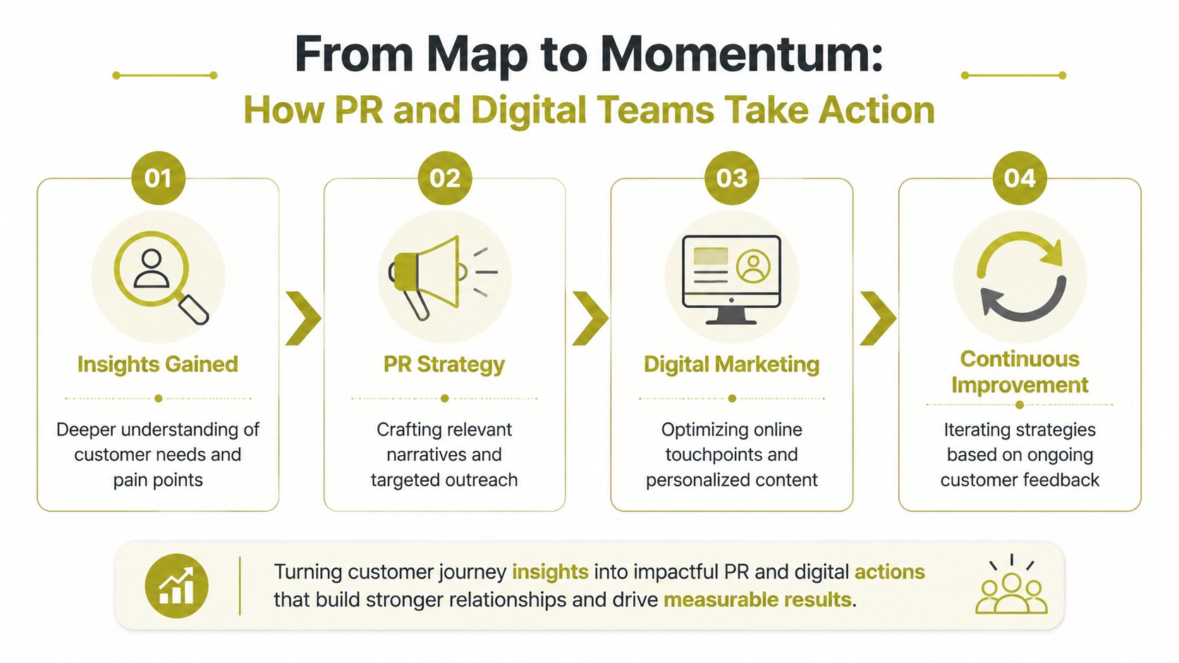
One insight should trigger coordinated action
A common source of friction is poor internal handoff.
A major source of customer friction is poor handoffs between marketing, sales, and service teams. Journey maps help diagnose this by visualising the end-to-end experience, allowing SMEs to fix root-cause issues at channel boundaries rather than just optimising isolated touchpoints within a single department, as described in McKinsey's article on moving from touchpoints to journeys.
That insight should immediately shape action across functions.
If the map shows that customers arrive informed enough to enquire but not informed enough to commit, the response might look like this:
- PR team: Build explainer-led coverage, expert commentary, and founder profiling that tackles the trust gap.
- Content team: Create service pages, FAQs, and comparison content that answer the exact questions delaying action.
- SEO and UX team: Improve the pages where uncertainty peaks.
- Sales team: Adjust outreach and follow-up to address the same objections in the same language.
- Service team: Feed recurring complaints back into messaging and onboarding.
What good coordination looks like
A map gives all teams one source of truth. That's useful because customer problems rarely respect departmental lines.
A media story might set expectations your website doesn't support. A strong landing page might pass leads to a sales sequence that feels generic. An excellent sales conversation might end with a weak onboarding email. The customer doesn't see separate teams. They see one experience.
The right fix is often not “more marketing”. It's better alignment between the moments customers already experience.
For SMEs, practical agency support can help when internal capacity is stretched. A joined-up service that covers PR, content, UX thinking, and conversion work can turn the map into an action plan rather than another document. Carlos Alba Media's approach to a public relations campaign sits in that broader context of message, journey, and commercial outcome.
Turn the map into a live action board
A simple format works best. Create a short working list with:
| Insight from the map | Owner | Action |
|---|---|---|
| Customers don't understand the service process | Content or PR | Publish clearer service explainer and founder commentary |
| Enquiry page creates uncertainty | UX or web lead | Rewrite page structure and reduce friction in the form |
| Follow-up feels slow or disconnected | Sales or client service | Tighten response workflow and message consistency |
Once teams work this way, customer journey mapping stops being theoretical. It becomes the mechanism that ties visibility, trust, and conversion together.
Avoiding Common Pitfalls and Ensuring ROI
The biggest mistake is creating a map that looks clever and does nothing.
The second is trying to map too much at once. If you include every audience, every product, and every stage, the result becomes vague. You can't prioritise from a blurred picture.
Three traps show up repeatedly:
- The pretty picture trap: The map is visually polished but based on workshop opinion rather than evidence.
- The everything map trap: The team tries to cover all customer types instead of one meaningful journey.
- The archive trap: The map gets built once, then never updated when behaviour changes.
The last one matters most. Public guides often portray journey mapping as a one-time workshop exercise. The key to ROI is treating it as a continuously updated decision tool, refreshed with live data from analytics, service logs, and customer complaints to keep it current with shifting behaviour, as discussed in this recent research summary on customer-journey work.
If your map isn't influencing page changes, messaging, follow-up process, or campaign planning, it's not earning its keep. The useful question isn't whether the map is perfect. It's whether it helps your team make better decisions this month.
That same logic applies when you review conversion performance more broadly. Journey friction and website performance often overlap, which is why practical work on how to increase website conversion rates should sit alongside journey analysis rather than apart from it.
If your customer signals feel fragmented, Carlos Alba Media can help you turn them into a clearer growth picture. The work starts with evidence, not assumptions, then connects PR, digital, and sales activity around the points where customers get stuck.