
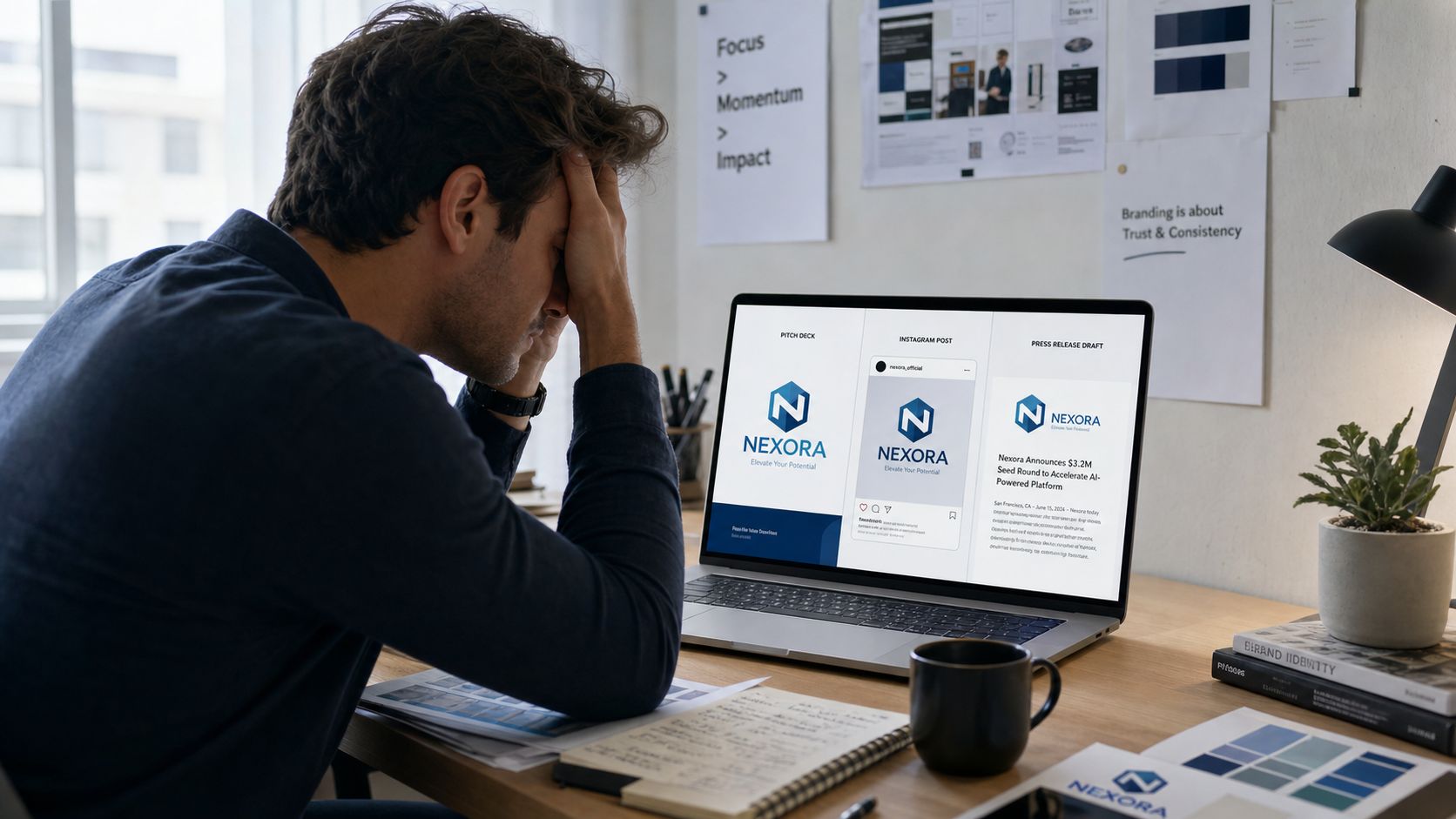
You already know the feeling. The logo looks right on the website, then someone drops a slightly different version into a deck, a sales rep uses another blue in a social post, and a press release goes out with a font nobody approved. By Friday, the brand feels like three different businesses wearing the same name badge.
That's why how to create brand guidelines isn't really a design question. It's an operations question. The goal isn't a pretty PDF that lives in a folder, it's a working system that helps founders, marketers, designers, agencies, and suppliers make the same decision without chasing the CEO every time.
At Carlos Alba Media, that distinction matters because the team works like a newsroom and a brand studio at the same time. The agency is specialist by nature, and everyone there is either a former national news journalist or has agency experience working with international brands, so the instinct is always the same, lock the rules first, then move fast. That approach is what keeps multi-office teams aligned across London, Glasgow, and remote hubs, where inconsistency is usually created by speed, not bad intent.
For a quick sanity check on the wider branding basics, strengthen your brand with ShortsNinja is a useful external read before you start building anything formal.
Why Most Brand Guidelines Fail Before They Are Finished
The failure usually starts with a founder who spots the problem too late. The pitch deck uses one blue, the Instagram grid uses another, and the press release lands with a logo that looks thinner than the one on the website. Nobody sat down and decided to break the brand, they just built assets before they built rules.
That's the trap. Most guidelines are made backwards, visuals first, strategy second, and then the document gets treated like a style reference instead of a decision-making tool. Frontify's guidance is blunt on this point, first align on the brand core, then inventory the logos, colour values, and other assets already in use, because the job is to document rules before you start polishing files.
A brand PDF is not enough
A PDF can show examples. It cannot stop drift. A true brand operating system tells people what to do when the founder is in a meeting, the designer is off sick, and a supplier needs the answer by 4 p.m. That's the difference between a document that gets admired and a system that gets used.
Practical rule: if the guide can't help a new starter make the right choice on their own, it's not finished.
The easiest way to see the gap is in multi-team businesses. One office sends a polished brochure, another sends an informal social template, and a third reuses an old logo because it was the easiest file to find. If you're building with multiple locations, suppliers, and channels in play, that kind of inconsistency becomes normal unless the rules are written down early.
For brands trying to fix the issue at the root, what is brand positioning in marketing matters because positioning shapes what the visual and verbal system should say.
Why this matters before design gets involved
Frontify also advises writing the guide for the least experienced user, which is the right starting point for SMEs. If a founder can use it, a junior marketer can use it, and an agency can use it without a long email thread, the document is doing its job. That's the standard I'd use before signing off any colour palette or logo mock-up.
Building the Strategic Foundation Before Any Design Work
Start with a brand audit that captures the brand as it exists, not as the founder wishes it existed. Screenshot every live touchpoint. That means the homepage, service pages, email footers, Instagram posts, LinkedIn banners, sales decks, brochures, signage, press releases, and any other place a customer can see the brand. Look for contradictions, not decoration. A playful social feed paired with stiff sales material, or different logo treatments across print and digital, tells you the brand has already drifted.
Then speak to the people who shape the brand in practice. Founders bring the ambition. Sales hears the objections. Operations sees the friction. Customer-facing staff hear the questions customers repeat again and again. That alignment work saves money because it stops the usual panic, the “we need a rebrand” reflex that often turns into a redesign of the wrong problem.
Audit what exists before you redraw anything
A useful checklist is simple, and merciless.
| Touchpoint | What to capture | Owner | Current inconsistency flag |
|---|---|---|---|
| Website | Screenshots of header, footer, homepage, key service pages | Marketing | Logo, colour or tone drift |
| Social channels | Profile images, banner images, post templates, highlights | Social lead | Mixed styles across platforms |
| Signature, newsletter layout, outbound sales emails | Sales or marketing | Old logo, mismatched fonts | |
| Decks | Title slide, charts, case study layouts | Commercial team | Uncontrolled slide variants |
| Brochures, flyers, press kits, stationery | Operations or marketing | Incorrect colour or logo use | |
| Signage | Office, event, vehicle or exhibition graphics | Operations | Outdated asset files |
Ask three questions while you audit. What keeps appearing? What keeps changing? What is being improvised because no one can find the approved file? Those answers show you where the guideline needs hard rules and where the team needs a template, not a lecture.
A supplier is often the first place bad consistency shows up. One agency exports a tidy proposal deck with one font family, another sends a sales sheet rebuilt from an old template, and a print vendor uses a logo file that was never meant for a brochure. By the time customers see the output, the brand feels patched together. A proper guideline stops that by telling external partners what is approved before they start guessing.
Positioning comes before personality
Once the audit is done, write down mission, vision, audience, and brand personality. The point is to stop visual design from making strategic decisions by accident. If the brand serves founders who want reassurance, it should not sound like a swaggering challenger brand. If it sells into regulated sectors, the voice and visuals need more discipline than a lifestyle label.
Evidence-led positioning matters here. Research should combine quantitative surveys and qualitative interviews, because numbers show the pattern and interviews explain the reasons behind it. That blend matters for brands that need the strategy pinned down before design starts. It also connects directly to brand positioning in marketing, because positioning sets the boundaries for what the visual and verbal system should communicate.
Frontify's advice to document rules before assets fits a broader strategic approach, and the guide should be easy to find inside the systems people already use, not buried in a forgotten folder. Canva's implementation guidance points in the same direction. A guide only works when founders, marketers, and external partners can open it quickly and use it without a chain of email replies. For the font side of brand control, see fonts and brand protection insights.
Defining the Visual System That Holds Everything Together
Once the strategy is clear, lock the visuals down with the same level of discipline. Most guides get lazy here and start talking in vague terms like “modern” or “clean”. Those words are useless unless they translate into rules a designer, marketer, and printer can all follow.
Logo rules must leave no room for guesswork
Write down the approved logo versions, the clear space, the minimum size, and the misuse rules. If there's a full lock-up, a stacked version, and a monochrome version, say so clearly. Then show what not to do, stretching, recolouring, adding shadows, rotating, or dropping the mark on a busy background where it vanishes.
Keep the logo simple in the guide, but ruthless in the rules. If someone has to ask whether a version is allowed, the guide isn't clear enough.
This is also where you should define spacing and misuse with examples, not abstract language. A logo that looks fine on a white slide can disappear on a photograph, and a mark that looks acceptable on screen can become unreadable in print when someone shrinks it too far. Vistaprint's practitioner guidance is useful on this point because it recommends explicit minimum-size rules, spacing, and exception handling so teams update the guide rather than inventing local fixes.
Colour needs separate screen and print specifications
Do not publish one colour code and hope for the best. For UK teams moving between website design, social posts, printed press kits, and event collateral, the guide should list RGB, CMYK, and Pantone equivalents. Screen and print are different environments, and if you leave that distinction out, someone will guess.
That's also the point where accessibility starts to matter. High-contrast combinations are easier to read, especially on mobile and in low-light environments. If a colour pairing looks stylish but fails in real use, cut it. Style that creates friction isn't style, it's a liability.
For a deeper web-specific reference on how colour and layout choices support digital execution, best practices for web design belongs in the toolkit for the digital side of the system.
Typography and imagery should be documented like specs, not taste
Typography needs hierarchy, not vibes. Name the primary and secondary typefaces, the weights, heading sizes, body text rules, line spacing, and any special cases such as captions or pull quotes. If a team member can't tell what to use for a heading versus a subheading, you don't have a type system yet.
Imagery should be just as specific. Define the photography style, the illustration approach, and any accessibility expectations. That means saying whether the brand uses candid shots or composed portraits, whether illustrations should feel technical or editorial, and how contrast should be handled so text remains readable.
For font choice and brand protection, fonts and brand protection insights is a helpful reminder that typography isn't just an aesthetic choice, it's part of brand control. The reason to document it properly is simple, uncontrolled fonts create a visible gap between what the brand says it is and what people see.
Writing Voice and Tone Guidelines People Can Actually Use
A visual system won't save a brand that sounds random. Teams can usually spot a bad logo in seconds, but a weak voice is more dangerous because it slips into everything, from a customer email to a crisis statement.
Build voice rules people can apply without asking permission
Start with three to five attributes. Not twenty. Pick qualities that are usable, such as confident, clear, direct, warm, expert, or calm. Then show how those traits sound in practice with a short do-and-don't list.
- Do use plain language: Say what the service does in words the customer would use.
- Don't hide behind jargon: If a junior colleague wouldn't say it out loud, cut it.
- Do keep sentences active: Put the subject first so the message lands quickly.
- Don't flatten every channel: A homepage headline, a LinkedIn update, and a press quote shouldn't sound identical.
Tone shifts with context. Voice stays steady, tone changes with the moment. That distinction matters for teams spread across London, Glasgow, and remote hubs, because they need one shared identity and enough flexibility to adapt it properly.
One announcement, three versions
Take a product launch or service expansion. On LinkedIn, the tone can be sharp and public-facing. In a customer email, it should sound helpful and practical. In a national press release, it should be formal, factual, and quote-led.
For a simple structure, the LinkedIn version might lead with the opportunity, the email might lead with what customers should do next, and the press release might lead with the announcement itself. The content is related, but the framing changes because the audience changes.
A good guide gives teams a quick tone-shifter. That can be as simple as a one-page note saying what happens when the message is urgent, celebratory, reassuring, or regulatory. It keeps the founder out of every draft and still protects the voice.
For brand story and narrative discipline, what is brand storytelling is the natural companion resource, because voice only works when it supports a broader narrative.
Give people sample lines, not theory
Write sample headlines for a website, a social post, a press release, and a crisis update. Then show a short approved list of words and a short banned list. That's what helps a non-writer make the right call fast. A voice guide that reads like marketing philosophy won't survive daily use.
Templates That Make the Guidelines Stick in Daily Work
Templates are where guidelines either become routine or get ignored. If the team has to rethink layout, spacing, tone, and file names every time they build something, they'll improvise, and improvisation is where brand drift starts.
Build the handful of templates people actually use
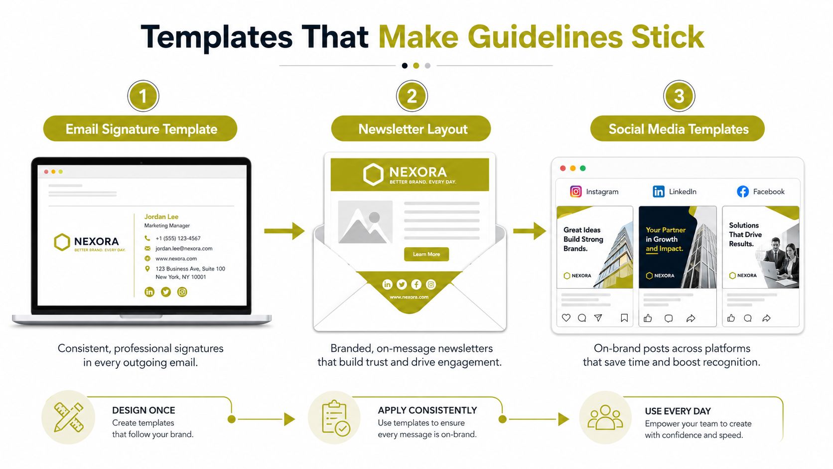
Start with an email signature and a newsletter layout. Then add a social post template for the two or three platforms that matter most, usually the ones where the brand already gets real attention. After that, create a press release layout with slots for spokesperson quotes, boilerplate, and contact details, plus a pitch deck master for sales and partnerships.
The point is not to create a huge library. The point is to make the approved version faster to use than the wrong one. That's why the template needs to inherit the visual rules and the voice rules already set earlier, rather than reinterpreting them.
Give the team a file system that prevents bad habits
If people can't find the right asset, they'll use the wrong one. So name files clearly, store them in one central location, and separate working files from approved assets. The guide should tell people which logo file to use, which deck is current, and where the source files live.
A simple structure beats a clever one. Keep the folder labels obvious, keep version names visible, and make it easy to spot the approved file at a glance. That single move saves endless back-and-forth with designers and non-designers alike.
You can also use a tool-led approach here. Carlos Alba Media builds this kind of operational content as part of its broader brand and digital work, but the method matters more than the vendor. Whatever tool you use, the files need to enforce the rules instead of relying on memory.
Templates should reduce decisions, not create new ones
A press release template should not invite styling experiments. A social template should not leave room for a random colour swap because someone liked a shade better. If the template can be edited into something off-brand too easily, it isn't doing its job.
Adapting the Guidelines for AI and Short-Form Content
This is the part most guides still miss. The problem isn't only consistency anymore, it's speed, remixing, and machine-assisted production. A brand can look disciplined in a PDF and still fall apart when a team starts turning one campaign into short-form video, slide decks, partner assets, and AI-generated variants.
Some rules must stay rigid
Logo integrity stays fixed. So do prohibited colour combinations, font use, and any mandatory disclosures in regulated sectors. If a brand sells in a sensitive category, the guide needs to say exactly what can't be changed, even when the campaign is moving quickly.
That same discipline applies to AI output. The guide should say which approved assets AI tools may use, which files need human approval, and which content types are off limits. If you leave that vague, teams will treat the model as a shortcut around the brand system instead of a tool inside it.
Other rules should flex by format
Short-form video needs its own rules for hooks, captions, on-screen text, and logo placement. A presentation deck that a sales team remixes should allow controlled adaptation, because the live-selling environment is different from a homepage or a brochure. If a campaign goes viral and partners start reusing assets, the guide also needs a fast answer for what can be republished and what can't.
Best practice: when a workaround keeps happening, treat it as evidence that the guide needs an update, not as permission to drift permanently.
That's where an exception process matters. If the team keeps bending one rule, log it, review it, and decide whether the guideline should change. Otherwise, temporary fixes become permanent habits, and the guide slowly stops matching the way the brand works.
Why this matters for modern SMEs
Tourism, hospitality, lifestyle, and tech brands now publish across more formats, more often, with less time than before. A static style guide won't survive that pace. A living one will.
Current practitioner guidance increasingly points to imagery, templates, and accessibility, but the gap is governance for new formats. If you want the guide to stay useful through constant channel changes, it needs update cycles, named ownership, and a system for exceptions, not just a pile of examples.
Rollout, Governance and the Starter Checklist
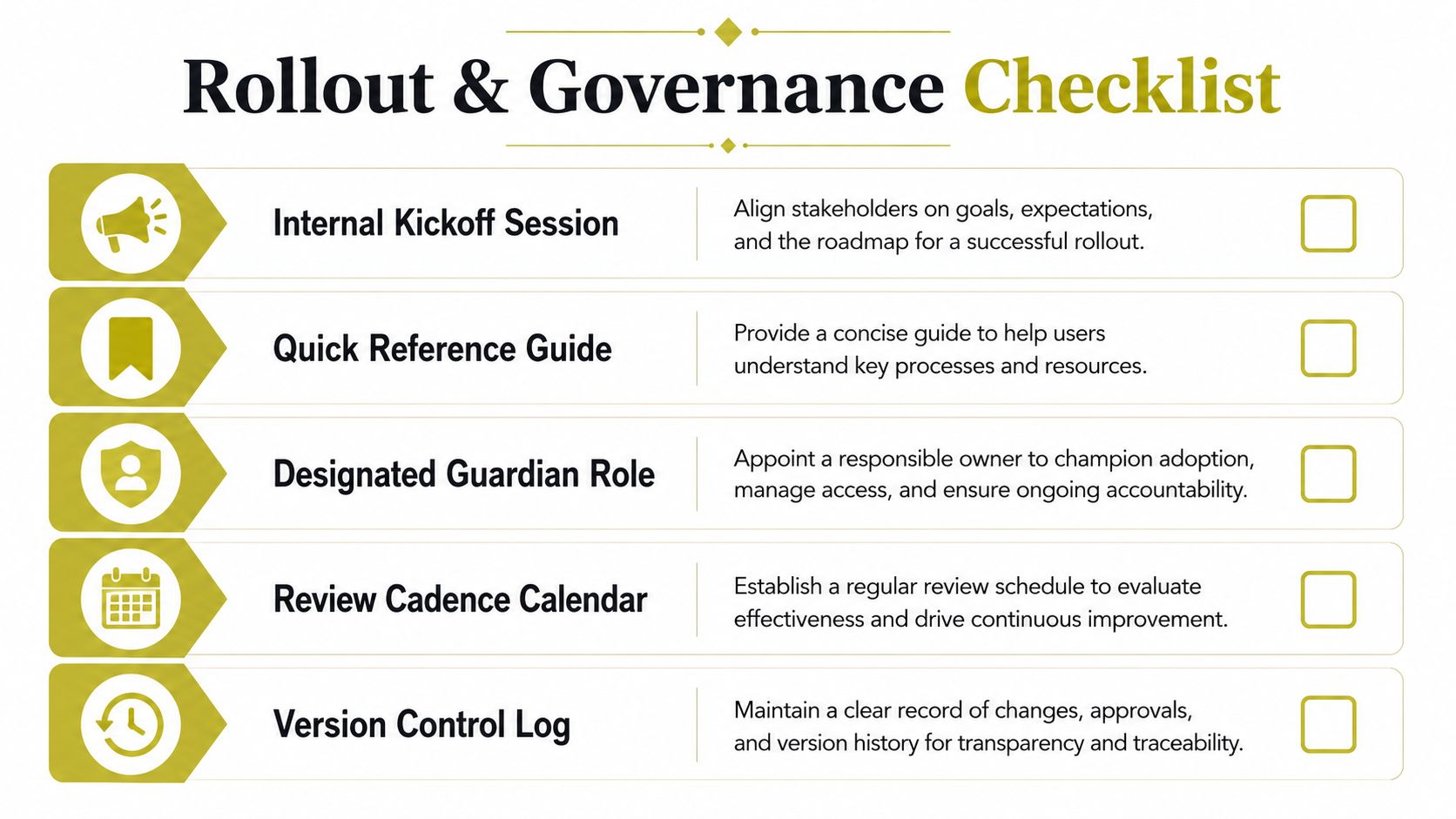
Launch the guide internally before you share it externally. Run a short kickoff session, send a quick Loom walkthrough, and attach a simple FAQ doc that answers the obvious questions, such as which logo file is current and who approves exceptions. Then circulate the same guide to agencies, freelancers, and suppliers so they're working from the same source of truth.
The legal side matters too. Protect trademark use, check third-party logo rights, confirm image and font licences, and define how AI-generated assets can be used. If the guide ignores legal usage, it's incomplete.
Treat the guide like a live document
Assign ownership to one person or one function. Set a review cadence for at least annual updates, and trigger an immediate review after a rebrand, a major campaign, or a crisis. That's the only way the guide keeps pace with real-world use.
Keep a version control log inside the document or beside it. When a workaround becomes common, update the guide and tell the team why. That feedback loop is what turns brand guidelines into an operating system rather than a static PDF.
A founder's starter checklist
- Audit the live brand: Capture the website, social, email, decks, print, and signage.
- Write the strategy first: Lock mission, vision, audience, and personality before design.
- Define the system: Set logo, colour, typography, imagery, and voice rules.
- Build the templates: Create the assets the team uses every week.
- Publish and train: Make the guide easy to find, easy to use, and easy to update.
If you work through those five points properly this week, you'll already be ahead of most companies that say they have brand guidelines but really just have a file of old logos.
Carlos Alba Media helps founders and teams turn brand rules into a working system across PR, digital content, web, social, and crisis communications. If you need guidelines that your team can use in London, Glasgow, and beyond, visit Carlos Alba Media and start a conversation about building a brand operating system, not just another PDF.