Most advice on digital marketing agency website design still overvalues polish and undervalues proof. You see endless galleries of sleek homepages, generous white space, animated transitions, and vague claims about “elevating brands”. Buyers aren't hiring a moodboard. They're hiring a commercial partner.
A serious agency site has to answer harder questions fast. What do you do? Who do you help? Why should a buyer trust you? What process do you follow? What outcome can you credibly influence? In the UK, that standard matters because design shapes trust almost immediately. Independent web-design research compiled by Hostinger notes that web design influences 94% of potential customers' first impressions, 75% of people judge a website's credibility based on its design, and users form an opinion in about 0.05 seconds (Hostinger web design statistics).
That changes the brief. An agency website isn't a gallery first. It's a sales asset, a credibility asset, and often the first live demonstration of how the agency thinks. For a specialist firm such as Carlos Alba Media, that standard is even higher. The agency's bench is unusual by design: the team is made up of former national news journalists or people with agency experience working with international brands. That journalistic instinct matters online. Claims need evidence. Messaging needs structure. Credibility has to be visible, not implied.
Laying the Strategic Blueprint Before a Single Pixel
Design goes wrong early. Usually not in Figma, Webflow, WordPress, or development, but in the brief. If the business hasn't decided what the site is meant to do, the finished product tends to become a compromise between internal opinions.
A practical approach starts with governance. For digital marketing agency website design, that means defining scope, roles, timeline, budget, SMART goals, and success criteria before work begins, then monitoring traffic and conversion-rate changes after launch so decisions are driven by evidence rather than taste (DesignLoud on website design project management).
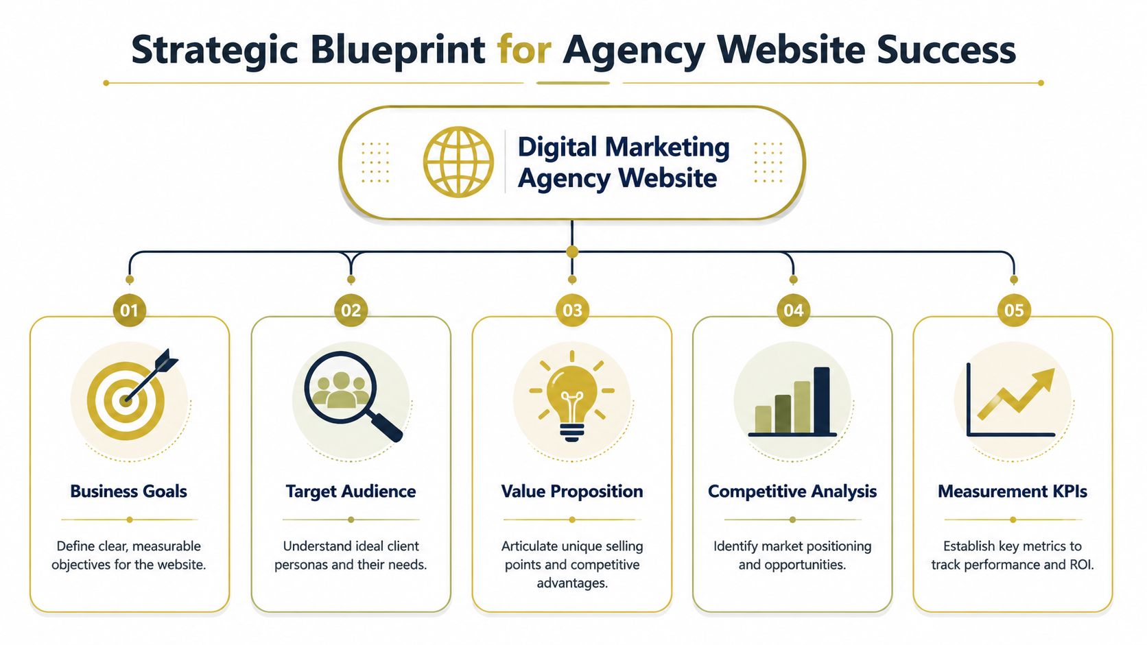
Set the commercial job of the website
Start with one primary objective and a small number of secondary ones. If everything is a priority, nothing is.
For most agencies, the site usually needs to do one of these jobs first:
- Generate qualified enquiries from buyers already looking for help
- Support authority building through thought leadership, speaking, and PR visibility
- Reassure prospects who already know the brand and are checking credibility
- Help recruitment by showing team quality, culture, and standards
- Convert campaign traffic from search, social, digital PR, and referral activity
That decision affects everything that follows. A lead-generation site needs tighter calls to action, stronger service-page structure, and more proof near the top. A recruitment-led site needs team depth, values, and a different content hierarchy.
Practical rule: If the board or founder can't state the site's main commercial purpose in one sentence, the design brief isn't ready.
Define audiences by buying questions
Demographics aren't enough. An SME founder and an in-house marketing director may both want SEO, content, web design, or PR support, but they arrive with different anxieties.
A founder often wants clarity, speed, and confidence that they won't waste budget. A corporate marketing lead may need evidence, process transparency, and reassurance that the agency can operate with internal stakeholders, legal review, and reporting discipline.
A useful planning grid looks like this:
| Buyer type | Main concern | What the website must show |
|---|---|---|
| SME founder | “Will this generate leads?” | Clear outcomes, simple packages or service scope, obvious next step |
| Marketing manager | “Can this team execute properly?” | Process, reporting model, proof of delivery, specialist capability |
| Established brand lead | “Is this agency credible enough?” | Senior team, sector evidence, polished UX, risk reduction signals |
If you want a practical companion resource for this phase, Uxia's practical data-driven design guide is useful because it frames design decisions around user evidence rather than internal preference.
Audit competitors for messaging, not decoration
Many competitor reviews are shallow. Teams compare colours, menus, hero banners, and typography. Buyers don't shortlist agencies that way.
Review competing sites with a notebook and a stopwatch. Check how quickly they explain services, who they serve, what evidence they show, and how they ask for contact. Then look for gaps. Most agencies still hide their best proof too deep, write service pages in abstract language, and fail to make the next step feel low-risk.
The strongest opportunity is often not to look more creative. It's to be more legible, more specific, and more commercially direct.
Building an Architecture for Clarity and Conversion
Agency websites rarely fail because they lack visual polish. They fail because buyers cannot get to the proof fast enough.
Structure does commercial work. If a procurement lead cannot find service scope in one click, or a marketing manager has to dig through vague menu labels to locate relevant case studies, trust drops before anyone reads the copy. Strong architecture reduces that friction and helps the right visitor reach the right evidence with less effort.
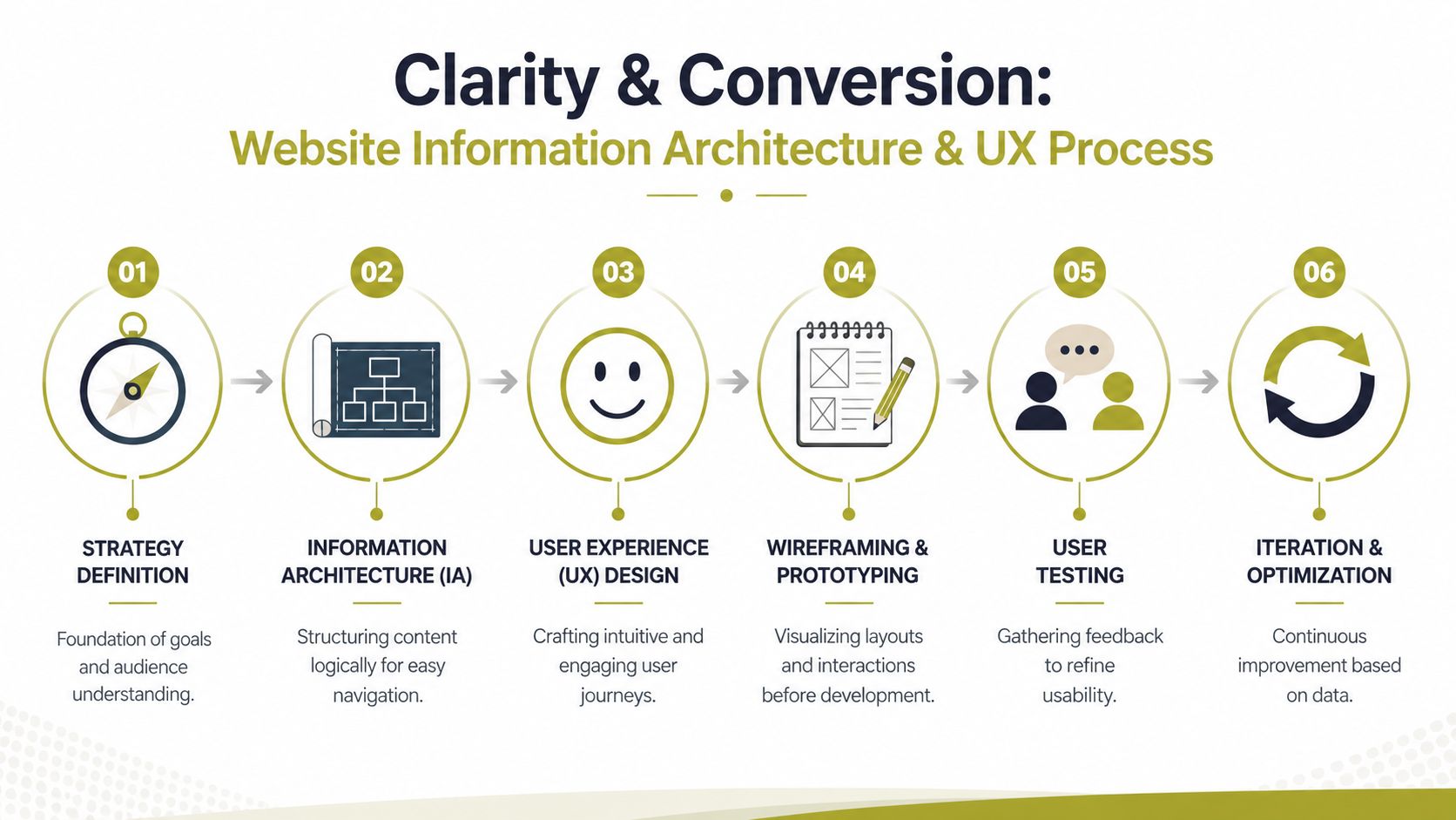
Build the sitemap around buyer intent
Top-level navigation should use plain language. “Services”, “Case Studies”, “About”, “Insights”, and “Contact” remain effective because they do not make the visitor interpret clever branding before taking action.
For a digital marketing agency, the core sitemap usually includes:
- Home with positioning, proof, and clear route options
- Service pages for each revenue-driving offer
- Case studies organised by service, sector, or business result
- About page showing senior team credibility and delivery model
- Insights hub supporting search visibility and authority
- Contact page with a low-friction enquiry path
That sounds simple. In practice, agencies often make two expensive mistakes. They bury money pages under broad categories, or they force different buyer types through the same journey even though their questions differ.
A founder may want fast reassurance on lead generation potential. A brand-side marketer may want delivery process, reporting, and specialist depth. Good architecture accounts for both without bloating the menu.
For teams shaping structure with SEO in mind, this modern site architecture blueprint is a useful reference for hierarchy, internal linking, and crawl logic that still keeps the user journey clear.
Wireframe key journeys before visual design
The pages that deserve the earliest attention are the ones closest to revenue. Usually that means the homepage, a priority service page, a case study template, and the contact page.
Wireframes should answer practical questions first:
- Can the visitor tell what the agency does within seconds?
- Is there proof near the top of the page?
- Does each section move the buyer toward a decision?
- Is the next step visible without scrolling to the footer?
Many redesigns drift off course. Teams spend hours debating motion, typography, and style references before they have agreed on page purpose. That usually produces a prettier version of the old problem.
A strong homepage wireframe gives distinct routes based on intent. One visitor wants paid media support. Another wants evidence in their sector. Another wants to understand how the engagement will run and what happens after an enquiry. Those paths should appear early and clearly.
Carlos Alba Media's guidance on how to improve website user experience is useful here because it focuses on reducing friction and helping visitors make decisions with less hesitation.
Here's a practical walkthrough of UX thinking in motion:
Reduce choices at the point of conversion
A lot of agency sites handle the final step poorly. After doing the hard work of building interest, they present too many calls to action, ask for too much information, or leave the response process unclear.
Use a tighter conversion model:
| Conversion point | What works | What hurts performance |
|---|---|---|
| Homepage CTA | One primary action, clearly labelled | Three equally prominent buttons |
| Service page CTA | Contextual next step tied to the service | Generic “learn more” links |
| Contact form | Minimal fields and clear expectation | Long forms with unclear response process |
The best-performing contact journeys also remove ambiguity. State who will reply, how soon, and what the first conversation covers. That lowers perceived risk, especially for buyers comparing several agencies at once.
If a prospect has to pause and work out what happens after the click, the architecture has not finished its job.
Content That Proves Commercial Outcomes Not Just Creativity
Most agency sites often fail. They present capability as atmosphere. They show polished visuals, broad claims, and testimonial snippets, but they don't answer the buyer's central question. What result is this agency likely to help me achieve?
Independent guidance on agency website design points to a stronger model: build pages around conversion proof, use case studies with quantified outcomes, explain your process in plain English, and keep visible next-step CTAs on the page (Huemor on agency website design examples). That matters because proof reduces perceived risk. Buyers don't just want to admire the work. They want to understand the business logic behind hiring you.

Lead with evidence, not adjectives
A lot of agency copy is full of words like strategic, cutting-edge, bespoke, award-winning, and data-led. None of those terms are useless, but none of them prove anything on their own.
Commercial content does three things quickly:
- Names the problem the client faced
- Shows the intervention the agency delivered
- Connects it to an outcome the buyer cares about
That's where a journalistic mindset gives agencies an advantage. At Carlos Alba Media, that instinct is baked into the business model. The team is drawn from former national journalists and agency practitioners with experience of international brands, so the standard for claims is naturally higher. Evidence isn't decoration. It's the story.
What a persuasive case study actually includes
Case studies should read like compact reporting, not self-congratulation. Buyers want enough detail to believe the result and enough clarity to see whether your process fits their world.
A stronger structure looks like this:
| Section | Weak version | Strong version |
|---|---|---|
| Opening | “We helped a brand grow online” | A specific client challenge and context |
| Delivery | A list of activities | Why those actions were chosen |
| Outcome | Generic praise | Clear evidence, commercial relevance, next-step implication |
Not every agency has permission to publish full numbers. That's fine. You can still be concrete without breaching confidentiality. Explain the starting position, the constraints, the channel mix, the decision-making, and the category of outcome. Vagueness usually signals weak documentation, not discretion.
Editorial test: If a case study could be swapped with another agency's logo and still read the same, it isn't persuasive enough.
Write service pages for buyers, not for internal teams
Service pages often collapse into process jargon. They explain what the agency does in operational terms but ignore what the buyer is trying to fix.
A better page architecture is:
Problem and buyer context
Open with the commercial issue. Low visibility, poor lead quality, weak media presence, underperforming organic traffic, unclear brand positioning.Approach and method
Explain how the agency works. Keep it plain. Discovery, audit, strategy, production, reporting, iteration.Proof and reassurance
Add case studies, client examples, testimonial excerpts, or team experience relevant to that service.Action and expectation
Show the next step. Consultation, audit, scoping call, or project discussion. Explain what happens after submission.
That same principle matters in related channels too. If lead generation is part of the brief, Carlos Alba Media's perspective on content marketing for lead generation is a useful reminder that content only earns its place when it supports a conversion path.
Show the team in a way that de-risks the hire
Team pages are often missed opportunities. Listing job titles and headshots isn't enough.
Buyers want signals such as:
- Relevant background that matches the brief
- Sector familiarity where that matters
- Senior involvement rather than a bait-and-switch pitch model
- Clear thinking shown through articles, commentary, or process explanations
For specialist agencies, the team itself can be part of the value proposition. Former journalists bring interviewing skill, editorial judgement, and a bias toward verification. Agency operators who've worked with international brands tend to understand approval chains, brand consistency, and delivery discipline. Those are not vanity details. They reduce risk for the buyer.
Engineering High-Performance Technical Foundations
Beautiful design that loads slowly, breaks on phones, or gives search engines a muddled structure isn't good design. It's an expensive draft. Technical foundations don't sit underneath strategy as a separate concern. They are part of how the strategy performs.
In the UK, mobile behaviour makes that obvious. Ofcom reported in 2024 that 88% of UK adults were “mobile internet users” and 19% were “mobile-only” internet users. Mobile devices also accounted for 51.4% of online spending in October 2025 according to the data cited in Figma's web design research roundup (Figma web design statistics). If an agency site is awkward on a phone, it's failing a large share of first visits.
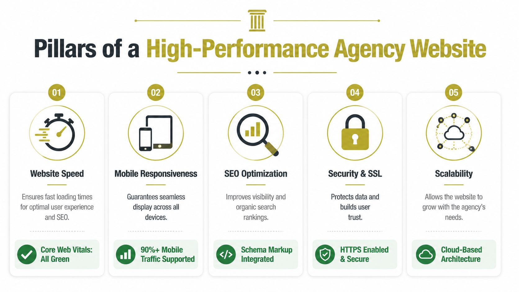
Treat mobile as the primary experience
Many agency teams still review designs mainly on large monitors. Buyers don't.
A practical mobile-first checklist includes:
- Shorter headings that still make sense on narrow screens
- Compact proof blocks rather than oversized testimonials
- Thumb-friendly buttons with enough spacing
- Fast-loading images compressed before upload
- Sticky or repeated CTAs where the next action matters
Google's mobile-first indexing raises the stakes further. If your mobile version is weaker, you're not just creating a bad user experience. You're weakening discoverability.
Get the technical basics right every time
Technical competence is visible even when users can't name it. A page that loads cleanly, reads logically, and surfaces in search for the right terms feels more trustworthy.
Focus on these essentials:
| Technical area | What to check | Why it matters |
|---|---|---|
| Page structure | Logical headings, descriptive titles, clean internal links | Helps users and search engines interpret the page |
| Performance | Compressed media, efficient scripts, stable layouts | Protects UX and conversion intent |
| Indexability | Sensible metadata, crawlable content, no accidental blocks | Makes important pages discoverable |
| Security | HTTPS, form handling, plugin hygiene | Supports trust and reduces avoidable risk |
| Accessibility | Contrast, keyboard use, descriptive labels, semantic structure | Broadens usability and improves resilience |
Accessibility is often treated as a legal afterthought. It should be part of quality control. For practical review criteria, the WCAG AAA checklist is a useful reference when auditing content, forms, navigation, and interactive components.
Build for search and AI readability
Search visibility now depends on more than ranking for classic blue links. Agency sites also need machine-readable structure. That means clear service pages, consistent metadata, useful schema where relevant, and content that answers real buyer questions without fluff.
This is one area where teams often overcomplicate things. You don't need gimmicks. You need clean information architecture, precise page intent, and enough topical depth that search engines and AI systems can understand what the business does.
If you're reviewing this side of the site, Carlos Alba Media's SEO audit checklist is a practical reference for spotting structural issues before they become visibility problems.
Launching Measuring and Optimising for Growth
Launch day shouldn't be treated like the finish line. It's the point where assumptions meet behaviour. The homepage headline that sounded right in workshops may underperform. The service page order that looked tidy in staging may create friction in real sessions. The only useful response is measurement.
That matters because agency websites are expected to justify spend. Guidance for evaluating web projects frames UK-facing sites as performance assets rather than brochures, with priority given to UX, UI, responsive design, SEO, and conversion tracking. The same guidance notes that agencies typically spend 7%–10% of revenue on marketing and are expected to justify digital investment with measurable outcomes (Big Drop on vetting web design and digital marketing agencies).
Choose a CMS your team will actually use
A site that only developers can update becomes stale. That's not a platform problem. It's usually a governance problem mixed with the wrong CMS setup.
The right setup lets marketers and account leads publish the things that matter most:
- New case studies when proof needs refreshing
- Service page updates when positioning changes
- Insight articles that support search and authority
- Team changes that affect credibility
WordPress, Webflow, and headless setups can all work. The key question isn't which one is trendier. It's whether your team can maintain high-value pages without delay or technical dependency.
Build a measurement loop, not a reporting ritual
A lot of analytics setups collect far more than they use. Better to track a smaller set of meaningful signals and act on them consistently.
A sensible operating rhythm looks like this:
Check acquisition quality
Which channels bring visitors who engage with service content and reach enquiry points?Review page performance
Which service pages hold attention, and which lose people early?Inspect conversion friction
Where do users abandon forms, bounce from key pages, or fail to find the next action?Update evidence
Which pages need fresher proof, tighter copy, or clearer CTAs?
Here, experienced teams separate from brochure-led builds. They don't ask whether the site still looks modern. They ask whether it still earns trust and supports pipeline.
Most underperforming agency websites don't need a full redesign first. They need tighter measurement and a willingness to edit what isn't working.
Optimise in small, commercial iterations
You don't need a dramatic relaunch every time the market changes. In many cases, the highest-value improvements are precise.
Examples include:
- Rewriting hero copy so the offer is understood faster
- Moving proof higher on service pages
- Simplifying forms to reduce hesitation
- Adding FAQs where sales calls reveal repeated objections
- Publishing stronger case studies when the existing ones are too generic
That's how a website becomes an operating asset. It evolves with buyer questions, sales feedback, and channel performance.
Frequently Asked Agency Website Questions
How many service pages should an agency website have
Enough to match real buyer intent, not enough to create thin, overlapping pages. If SEO, content marketing, digital PR, web design, and social media are distinct services with distinct searches and sales conversations, they usually deserve separate pages. If two offers can't be explained differently, combine them.
Should the homepage try to rank for every service
No. The homepage should establish positioning, trust, and route users to the right place. Service pages usually do the heavier work for search relevance and conversion specificity. Overloading the homepage with every keyword variation usually weakens clarity.
What makes an agency case study credible
Specificity. A convincing case study explains the client context, the commercial challenge, the approach taken, and the outcome category in plain English. It should also show why the work mattered. Buyers are trying to assess fit, not admire formatting.
Is responsive design still a differentiator
Not really. It's a baseline expectation. If a site doesn't work well across devices, buyers notice immediately and may question the agency's competence before reading a word of copy.
How often should an agency website be updated
Core pages should be reviewed whenever positioning, service mix, proof, or buyer objections change. That often matters more than a fixed publishing schedule. A website can look current and still be commercially outdated.
Should agencies publish prices on the website
Sometimes. If pricing is standardised, transparent pricing can filter poor-fit enquiries and reduce friction. If projects vary heavily by scope, it's often better to explain how pricing is shaped and what a buyer can expect in the scoping process.
What belongs above the fold on an agency homepage
Three things. A clear statement of what the agency does, evidence that supports credibility, and an obvious next action. If the first screen is all branding language and no commercial substance, the page is wasting attention.
What is the most common mistake in digital marketing agency website design
Confusing style with persuasion. Attractive design helps, but it doesn't replace strategic positioning, clean architecture, proof of outcomes, technical competence, and a disciplined conversion path.
If your agency website needs to do more than look polished, Carlos Alba Media offers web design and development alongside SEO, UX, content, and PR support. That combination is useful when the brief isn't only to redesign pages, but to build a site that shows credibility, supports discoverability, and gives buyers clearer reasons to enquire.