Your site might be live, but that doesn’t mean it’s working.
A lot of SME owners sit with the same frustration. The website looks dated, enquiries are thin, Google visibility is patchy, and every suggestion from agencies seems wrapped in jargon. You don’t need more jargon. You need a site that helps people trust you quickly, understand what you do, and take the next step without friction.
That’s the lens used at Carlos Alba Media. The team is made up of former national news journalists and people with agency experience on international brands, so the standard is simple. Be clear. Be credible. Get to the point. Good web design for a small business follows the same rules. It doesn’t try to impress with noise. It helps the right customer make a confident decision.
Your Website Should Be Your Best Employee
A small business website has one job. It should help your business when you’re in a meeting, asleep, on site, or trying to clear your inbox.
Too many sites fail that test. They act like brochures from another era. They list services, add a stock photo, tuck the contact details into the footer, and hope for the best. Then the owner wonders why nobody calls.

What an underperforming site usually looks like
The pattern is familiar. A visitor lands on the homepage and has to work too hard. The message is vague. Navigation is cluttered. Mobile performance is poor. The call to action is weak or missing.
That matters because design drives trust fast. Consumers judge a company’s credibility by its website design, and 75% make that judgment based on how the site looks according to web design credibility statistics from Tenet. If your site feels neglected, people often assume the business is too.
A good small business website doesn’t just describe your business. It handles objections, answers basic questions and makes contacting you easy.
Treat it like an asset, not a decoration
The best web design for small business isn’t about chasing trends. It’s about giving the site a job description. For most SMEs, that means some mix of these:
- Build trust quickly: Show who you are, what you do, and why someone should believe you.
- Direct people clearly: Don’t make visitors hunt for services, pricing approach, or contact routes.
- Turn interest into action: Calls, bookings, quote requests and purchases should feel easy.
- Support growth: The site should help SEO, sales conversations and brand reputation at the same time.
If you’re early stage, practical planning matters more than visual polish alone. That’s why founders often benefit from focused resources such as Arch’s MVP website development tips, which keep attention on what a first version must do.
If your current problem is that traffic arrives but doesn’t convert, it helps to review how stronger messaging, layout and calls to action influence response. Carlos Alba Media has published useful guidance on how to increase website conversion rates, and that’s the right question to ask before any redesign starts.
The Six Pillars of High-Performing Web Design
A strong website works like a well-built property. If the structure is poor, repainting the walls won’t fix much.
The six pillars below are the foundations of effective small business web design. When one is weak, the rest have to compensate. When all six are aligned, the site becomes easier to find, easier to use and easier to trust.
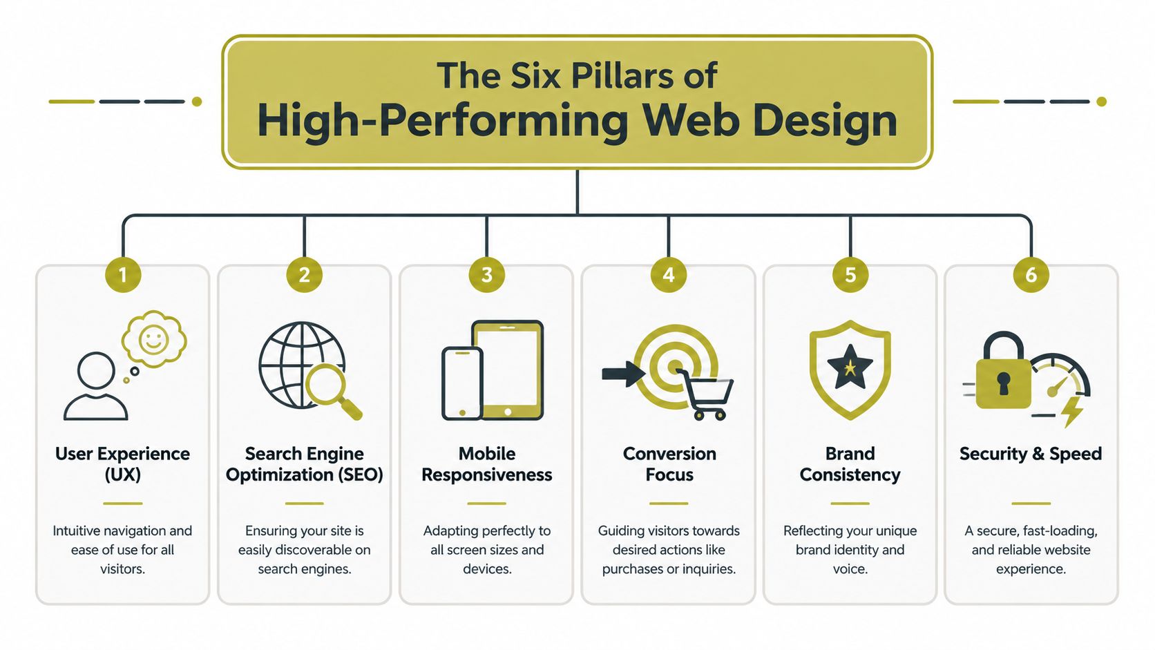
User experience
UX is the floor plan. Visitors should know where to go without thinking about it.
That means simple navigation, logical page order, readable text, and layouts that don’t force people to guess. If a user lands on your service page, they should understand the offer, the benefit and the next step within seconds. If they can’t, the design has failed even if it looks polished.
For SMEs reviewing this area, Carlos Alba Media’s guide on how to improve website user experience is a useful benchmark for what “easy to use” really means in practice.
Search visibility
SEO starts with structure, not blog posts alone.
A site needs pages built around real services and real search intent. It also needs clear headings, sensible URLs and content architecture that helps Google understand what each page is about. If you bolt SEO on later, you usually end up rewriting templates, menus and metadata after launch.
Mobile responsiveness
Responsive design isn’t solely about shrinking a desktop layout to fit a phone.
Menus need to work with thumbs. Forms need to be short. Buttons need space around them. Text must stay readable without pinching and zooming. A mobile visitor often has less patience and less context than a desktop user, so the design has to be tighter.
Conversion focus
A website should lead people somewhere.
If every page ends with no prompt, no contact route and no reason to act now, visitors drift. Conversion design means putting the right call to action in the right place. Sometimes that’s “Book a call”. Sometimes it’s “Request a quote” or “See pricing”. The wording depends on the buying journey.
Practical rule: Every core page should answer one question. What do you want the visitor to do next?
Brand consistency
Brand fit isn’t about making everything look expensive. It’s about making everything feel coherent.
Your colours, typography, tone of voice, photography style and page structure should all point in the same direction. A law firm, a boutique hotel and a tech consultancy shouldn’t share the same visual logic. The best web design for small business feels suited to the buyer it wants to win.
Security and speed
Trust drops fast when a website feels broken, slow or unsafe.
A secure setup, reliable hosting and clean front-end performance are part of the design brief, not technical extras. People won’t separate “design” from “experience”. If your site hesitates, throws errors or displays awkwardly, they judge the whole business.
Essential Features Your Website Needs in 2026
A buyer finds your business on Google at 8:30pm, taps through on their phone, skim-reads for 20 seconds, and decides whether you look credible enough to contact. That decision is rarely about clever visuals alone. For UK SMEs, the features that matter in 2026 are the ones that reduce friction, support visibility, and lower avoidable legal and commercial risk.
Mobile-first performance
A site that feels slow on a phone loses enquiries before the visitor reads a word of copy.
Mobile-first design means making hard choices. Heavy hero videos, oversized image files, animation libraries, and third-party widgets often look fine in a pitch deck and perform badly in practice. SMEs usually get a better return from fast-loading pages, clear tap targets, and forms that ask for only the information needed to start a conversation.
A practical mobile setup usually includes:
- Compressed image formats: WebP or AVIF where they make sense, with sensible dimensions before upload.
- Light page templates: Fewer decorative modules, fewer sliders, and less script-heavy clutter.
- Touch-friendly interactions: Buttons with enough space around them, simple menus, and forms that are easy to complete on a small screen.
Search-ready structure from launch
Many small firms treat SEO as something to bolt on after the website goes live. That approach usually costs more.
The build should start with a clear page hierarchy, service-led URLs, sensible internal linking, metadata, image alt text, HTTPS, and content mapped to real search intent. Design and SEO are not separate workstreams. If the structure is wrong, the site can look polished and still struggle to rank for the services that bring revenue.
For a broader planning view, Carlos Alba Media covers this in its guide to SEO strategy for small business, especially where content planning and site architecture need to support each other.
If you are benchmarking your brief, this roundup of website features to drive growth is also useful.
Conversion paths people can follow
A good-looking website still fails if visitors cannot work out what to do next.
Every key page needs one clear job. A service page should explain the offer, show evidence that you can deliver it, answer the obvious objections, and present a next step that matches buying intent. For some firms that is a quote request. For others it is a phone call, booking form, or product enquiry.
The common requirements are straightforward:
- A clear opening message: What you do, who you do it for, and where relevant, the area you cover.
- One primary call to action: A single next step that stands out visually and makes commercial sense.
- Trust signals in the right places: Testimonials, case studies, accreditations, client logos, reviews, or named team expertise.
- Visible contact routes: Phone, email, contact form, and location details where they matter.
Accessibility and legal exposure
Many SME websites often fall short.
A large-scale review by WebAIM found that the vast majority of home pages tested still contained detectable accessibility errors, as shown in the WebAIM Million accessibility analysis. That is not a public-sector-only issue. UK businesses also need to consider obligations under the Equality Act 2010. If key journeys on your site are hard to use with a keyboard, screen reader, or magnification tools, the risk is commercial as well as legal. People leave. Some complain. Fixes cost more after launch.
At minimum, check for:
- Keyboard access: Menus, buttons, forms, and pop-ups must work without a mouse.
- Readable contrast: Text should remain clear against every background.
- Useful alt text: Meaningful images need descriptions. Decorative ones do not.
- Form usability: Labels, instructions, and error messages should be plain and easy to follow.
- Logical heading structure: Pages should make sense to screen readers and assistive tech.
Accessibility works best when it is part of the brief, part of design review, and part of QA. Leaving it until the end usually means expensive rework.
Secure hosting, consent, and measurement
A serious business website also needs dependable hosting, SSL, backups, update management, and analytics configured properly from day one. For UK SMEs, cookie consent and tracking choices need care as well. There is little point paying for traffic if you cannot measure which channels bring qualified leads, where users drop off, or which pages turn visits into enquiries.
The websites that perform best for small businesses are rarely the flashiest. They are clear, fast, measurable, accessible, and built to support a commercial outcome.
Budgeting for Impact How to Prioritise Your Spend
Most SME owners don’t have unlimited web budgets. That’s normal. The mistake isn’t spending less. The mistake is spending on the wrong things first.
The tension is real. Data shows 58% of Scottish and Northern England SMEs cite unclear ROI on digital investment as a barrier to redesign, according to this UK SME digital investment snapshot. If you’ve been quoted for a redesign and still can’t tell what business problem it solves, hesitation is sensible.
Must-haves first
If budget is tight, protect the parts that directly affect trust, usability and visibility.
Start with:
- A clear site structure: Home, core services or products, about, contact, and any essential proof pages.
- Mobile performance work: Fast-loading layouts, compressed images and clean templates.
- Basic SEO setup: Titles, headings, URL structure, HTTPS and indexable pages.
- Strong messaging: Clear copy that explains what you do without waffle.
- Accessible foundations: Readability, form clarity, contrast and keyboard-friendly navigation.
These are the pieces that make a site launch-ready. They don’t win design awards. They do give you a usable commercial platform.
Should-haves when the business is growing
The next spend should improve how effectively the site converts.
That can include:
- Dedicated landing pages: For specific services, sectors or campaigns.
- Better enquiry handling: Smarter forms, booking tools, or CRM connections.
- Trust content: Case studies, team profiles, FAQs and sector pages.
- Refined UX: Better internal linking, stronger page flow and reduced friction.
This is usually the point where owners start seeing whether the website is functioning as a sales tool or just existing online.
Nice-to-haves after the core is working
Some features are useful, but only after the essentials are stable.
Examples include advanced animations, interactive calculators, complex integrations, gated resources, multilingual expansion, and highly customised visual flourishes. None are automatically wrong. They’re just easier to justify once the basics are producing results.
Spend first on the parts a customer notices when deciding whether to trust you, contact you or leave.
A sensible budget conversation should always return to one question. Which parts of this build improve findability, credibility or conversion? If the answer is vague, the proposal probably is too.
Template vs Custom Build Which Path Is Right for You
This decision doesn’t need ideology. It needs honesty about your stage, your budget and how much control you’ll need later.
A template-based site can be the right move. A custom build can also be the right move. Problems start when businesses buy one while needing the other.
When a template makes sense
Templates suit businesses that need speed, simplicity and manageable upkeep. For a startup, solo founder, consultant, small hospitality brand or local service business, a good Squarespace or Wix setup can get you live quickly with lower complexity.
That’s especially true if:
- Your offer is straightforward
- You don’t need unusual functionality
- You want to edit content yourself
- You’re validating demand before investing further
If you’re comparing platforms at this level, this guide to best website builders for small businesses is a practical starting point because it helps narrow the field by use case rather than hype.
When custom is worth it
A custom-built site earns its keep when your business needs more control over structure, content modelling, integrations or performance.
UK small business websites need SEO fundamentals embedded into their structure, including keyword-optimised titles, descriptive URLs and correct heading hierarchy, and those elements are often more controllable in a custom build, as outlined in this SEO-focused web design reference. That matters if your growth depends on organic search, sector landing pages, regional targeting, or a conversion funnel shaped around a more complex buying journey.
A custom route usually suits:
- Service firms with multiple offers or locations
- Businesses needing customized lead flows
- Regulated organisations needing tighter control
- Brands that have outgrown generic layouts
- Teams planning long-term SEO expansion
For SMEs comparing suppliers, one option in this category is Carlos Alba Media, which offers web design and development built around conversion, user experience and SEO structure.
Template vs custom in practice
| Criterion | Template-Based Website (e.g., Squarespace, Wix) | Custom-Built Website (e.g., WordPress, Agency Dev) |
|---|---|---|
| Upfront cost | Usually lower and easier to predict | Usually higher because scope is broader |
| Speed to launch | Faster for simple sites | Slower because planning and build are more involved |
| Editing content | Often easier for non-technical owners | Can be easy, but depends on how the CMS is configured |
| Design flexibility | Constrained by platform and template logic | Greater freedom over layout, functionality and components |
| SEO control | Adequate for many small sites, but can be limiting as needs grow | Stronger control over architecture and page-level optimisation |
| Scalability | Fine up to a point, then workarounds start appearing | Better for growth, integrations and complex site structures |
| Maintenance | Platform handles more of the routine upkeep | Requires clearer ownership of updates and support |
| Best fit | Startups, small local firms, brochure sites, lean launches | Growing SMEs, multi-service brands, SEO-led businesses |
Choose the path that fits your next stage, not the one that flatters your ambitions.
A founder who needs a credible site live soon shouldn’t be pushed into a heavy custom build. A growing SME with multiple services and regional SEO ambitions shouldn’t force everything into a restrictive template just to save money at the start.
Your Actionable Web Design Project Checklist
A small business website project usually goes off course before the homepage is designed.
It happens in the brief. The business wants more leads, the designer is asked to "make it look modern", someone adds extra pages halfway through, and the copy is still missing a week before launch. By that point, costs rise, decisions get slower, and the site starts serving internal opinions instead of customer needs.
A usable checklist fixes that. It gives the project boundaries, keeps the team focused on outcomes, and helps you spot expensive mistakes while they are still easy to correct.

Before design starts
Get clear on the commercial job of the site before anyone opens Figma, WordPress, Wix or Squarespace.
- Business goal: Are you trying to generate leads, sell products, support sales meetings, recruit staff, or improve credibility?
- Target audience: Who is the primary buyer, and what do they need to know first?
- Key pages: Which pages are required at launch, and which can wait?
- Primary action: What should a visitor do on each major page?
- Proof points: What evidence can you show that builds trust quickly?
This early discipline saves money. I have seen firms spend weeks debating colours and layouts when the core issue was simpler: the site did not explain the offer clearly enough, or ask visitors to take the next step.
During content and build
This stage rewards precision.
- Copy and structure: Headlines should say what the business does in plain English. Navigation should reflect how customers think, not how the team organises itself internally.
- Technical basics: HTTPS, analytics, image optimisation, redirects where needed, and metadata should all be in scope.
- Accessibility checks: Review these during design and build, not in launch week. As noted earlier, poor accessibility creates legal risk under UK law and usually leads to avoidable rework.
The cheapest time to fix accessibility is before a design pattern gets repeated across the whole site.
A short walkthrough like this can also help non-technical stakeholders understand what to review before sign-off:
Before launch
Run a final review against the basics:
- Mobile review: Test key pages and forms on actual phones, not just browser previews.
- Contact routes: Make sure phone, email, forms and maps work properly.
- SEO elements: Check titles, headings, URLs and indexing settings.
- Analytics and tracking: Confirm measurement is active from day one.
- Ownership: Know who updates the site, who hosts it, and who fixes issues if something breaks.
One final check matters more than many owners expect. Ask someone outside the project to use the site cold. Can they tell what you do, who it is for, and what to do next within a few seconds? If not, the design may be polished but the site is not ready.
A disciplined checklist is simple. That is why it works.
Conclusion From Plan to Performance
The best web design for small business isn’t the one with the flashiest homepage. It’s the one that earns trust quickly, works properly on mobile, supports search visibility, guides visitors clearly and doesn’t create avoidable legal risk.
That’s the shift many SMEs need to make. Stop judging the site as a visual object alone. Start judging it as a working commercial asset.
The strongest websites tend to follow the same principles. They are fast, clear, conversion-focused, structurally sound and accessible. Whether you launch with a well-chosen template or invest in a custom build, those rules don’t change. What changes is how much control, scalability and strategic depth your business needs.
Carlos Alba Media approaches web projects with the discipline of a newsroom and the commercial focus of an agency team. That means clear messaging, practical execution and a sharp eye on outcomes that matter to owners, directors and stakeholders.
If your website isn’t helping the business move forward, it’s time to fix the brief and build something that does.
If you want a website that supports credibility, search visibility and enquiries without unnecessary complexity, speak to Carlos Alba Media.